Tutorial: Create, train, and evaluate an uplift model
This tutorial presents an end-to-end example of a Synapse Data Science workflow, in Microsoft Fabric. You learn how to create, train, and evaluate uplift models and apply uplift modeling techniques.
Prerequisites
Get a Microsoft Fabric subscription. Or, sign up for a free Microsoft Fabric trial.
Sign in to Microsoft Fabric.
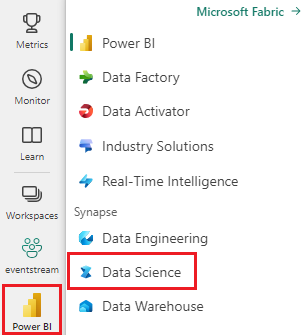
Use the experience switcher on the left side of your home page to switch to the Synapse Data Science experience.

- Familiarity with Microsoft Fabric notebooks
- A lakehouse for this notebook, to store data for this example. For more information, visit Add a lakehouse to your notebook
Follow along in a notebook
You can follow along in a notebook in one of two ways:
- Open and run the built-in notebook in the Synapse Data Science experience
- Upload your notebook from GitHub to the Synapse Data Science experience
Open the built-in notebook
The sample Uplift modeling notebook accompanies this tutorial. Visit To open the tutorial's built-in sample notebook in the Synapse Data Science experience:1. Go to the Synapse Data Science home page. 1. Select Use a sample. 1. Select the corresponding sample:* From the default End-to-end workflows (Python) tab, if the sample is for a Python tutorial. * From the End-to-end workflows (R) tab, if the sample is for an R tutorial. * From the Quick tutorials tab, if the sample is for a quick tutorial.1. Attach a lakehouse to the notebook before you start running code. for more information about accessing built-in sample notebooks for tutorials.
To open the tutorial's built-in sample notebook in the Synapse Data Science experience:
Go to the Synapse Data Science home page
Select Use a sample
Select the corresponding sample:
- From the default End-to-end workflows (Python) tab, if the sample is for a Python tutorial
- From the End-to-end workflows (R) tab, if the sample is for an R tutorial
- From the Quick tutorials tab, if the sample is for a quick tutorial
Attach a lakehouse to the notebook before you start running code
Import the notebook from GitHub
The AIsample - Uplift Modeling.ipynb notebook accompanies this tutorial.
To open the accompanying notebook for this tutorial, follow the instructions in Prepare your system for data science tutorials, to import the notebook to your workspace.
You can create a new notebook if you'd rather copy and paste the code from this page.
Be sure to attach a lakehouse to the notebook before you start running code.
Step 1: Load the data
Dataset
The Criteo AI Lab created the dataset. That dataset has 13M rows. Each row represents one user. Each row has 12 features, a treatment indicator, and two binary labels that include visit and conversion.
- f0 - f11: feature values (dense, floating values)
- treatment: whether or not a user was randomly target for treatment (for example, advertising) (1 = treatment, 0 = control)
- conversion: whether a conversion occurred (for example, made a purchase) for a user (binary, label)
- visit: whether a conversion occurred (for example, made a purchase) for a user (binary, label)
Citation
- Dataset homepage: https://ailab.criteo.com/criteo-uplift-prediction-dataset/
The dataset used for this notebook requires this BibTex citation:
@inproceedings{Diemert2018,
author = {{Diemert Eustache, Betlei Artem} and Renaudin, Christophe and Massih-Reza, Amini},
title={A Large Scale Benchmark for Uplift Modeling},
publisher = {ACM},
booktitle = {Proceedings of the AdKDD and TargetAd Workshop, KDD, London,United Kingdom, August, 20, 2018},
year = {2018}
}
Tip
By defining the following parameters, you can apply this notebook on different datasets easily.
IS_CUSTOM_DATA = False  # If True, the user must upload the dataset manually
DATA_FOLDER = "Files/uplift-modelling"
DATA_FILE = "criteo-research-uplift-v2.1.csv"

# Data schema
FEATURE_COLUMNS = [f"f{i}" for i in range(12)]
TREATMENT_COLUMN = "treatment"
LABEL_COLUMN = "visit"

EXPERIMENT_NAME = "aisample-upliftmodelling"  # MLflow experiment name
Import libraries
Before processing, you must import required Spark and SynapseML libraries. You must also import a data visualization library - for example, Seaborn, a Python data visualization library. A data visualization library provides a high-level interface to build visual resources on DataFrames and arrays. Learn more about Spark, SynapseML, and Seaborn.
import os
import gzip

import pyspark.sql.functions as F
from pyspark.sql.window import Window
from pyspark.sql.types import *

import numpy as np
import pandas as pd

import matplotlib as mpl
import matplotlib.pyplot as plt
import matplotlib.style as style
import seaborn as sns

%matplotlib inline

from synapse.ml.featurize import Featurize
from synapse.ml.core.spark import FluentAPI
from synapse.ml.lightgbm import *
from synapse.ml.train import ComputeModelStatistics

import mlflow
Download a dataset and upload to lakehouse
This code downloads a publicly available version of the dataset, and then stores that data resource in a Fabric lakehouse.
Important
Make sure you Add a lakehouse to the notebook before you run it. Failure to do so will result in an error.
if not IS_CUSTOM_DATA:
    # Download demo data files into lakehouse if not exist
    import os, requests

    remote_url = "http://go.criteo.net/criteo-research-uplift-v2.1.csv.gz"
    download_file = "criteo-research-uplift-v2.1.csv.gz"
    download_path = f"/lakehouse/default/{DATA_FOLDER}/raw"

    if not os.path.exists("/lakehouse/default"):
        raise FileNotFoundError("Default lakehouse not found, please add a lakehouse and restart the session.")
    os.makedirs(download_path, exist_ok=True)
    if not os.path.exists(f"{download_path}/{DATA_FILE}"):
        r = requests.get(f"{remote_url}", timeout=30)
        with open(f"{download_path}/{download_file}", "wb") as f:
            f.write(r.content)
        with gzip.open(f"{download_path}/{download_file}", "rb") as fin:
            with open(f"{download_path}/{DATA_FILE}", "wb") as fout:
                fout.write(fin.read())
    print("Downloaded demo data files into lakehouse.")
Start recording the runtime of this notebook.
# Record the notebook running time
import time

ts = time.time()
Set up the MLflow experiment tracking
To extend the MLflow logging capabilities, autologging automatically captures the values of input parameters and output metrics of a machine learning model during its training. This information is then logged to the workspace, where the MLflow APIs or the corresponding experiment in the workspace can access and visualize it. Visit this resource for more information about autologging.
# Set up the MLflow experiment
import mlflow

mlflow.set_experiment(EXPERIMENT_NAME)
mlflow.autolog(disable=True)  # Disable MLflow autologging
Note
To disable Microsoft Fabric autologging in a notebook session, call mlflow.autolog() and set disable=True.
Read data from the lakehouse
Read raw data from the lakehouse Files section and add more columns for different date parts. The same information is used to create a partitioned delta table.
raw_df = spark.read.csv(f"{DATA_FOLDER}/raw/{DATA_FILE}", header=True, inferSchema=True).cache()
Step 2: Exploratory data analysis
Use the display command to view high-level statistics about the dataset. You can also show the Chart views to easily visualize subsets of the dataset.
display(raw_df.limit(20))
Examine the percentage of the users that visit, the percentage of users that convert, and the percentage of the visitors that convert.
raw_df.select(
    F.mean("visit").alias("Percentage of users that visit"),
    F.mean("conversion").alias("Percentage of users that convert"),
    (F.sum("conversion") / F.sum("visit")).alias("Percentage of visitors that convert"),
).show()
The analysis indicates that 4.9% of users from the treatment group - users that received the treatment, or advertising - visited the online store. Only 3.8% of users from the control group - users that never received the treatment, or were never offered or exposed to advertising - did the same. Additionally, 0.31% of all users from the treatment group converted, or made a purchase - while only 0.19% of users from the control group did so. As a result, the conversion rate of visitors that made a purchase, who were also members of treatment group, is 6.36%, compared to only 5.07%** for users of the control group. Based on these results, the treatment can potentially improve the visit rate by about 1%, and the conversion rate of visitors by about 1.3%. The treatment leads to a significant improvement.
Step 3: Define the model for training
Prepare the training and test the datasets
Here, you fit a Featurize transformer to the raw_df DataFrame, to extract features from the specified input columns and output those features to a new column named features.
The resulting DataFrame is stored in a new DataFrame named df.
transformer = Featurize().setOutputCol("features").setInputCols(FEATURE_COLUMNS).fit(raw_df)
df = transformer.transform(raw_df)
# Split the DataFrame into training and test sets, with a 80/20 ratio and a seed of 42
train_df, test_df = df.randomSplit([0.8, 0.2], seed=42)

# Print the training and test dataset sizes
print("Size of train dataset: %d" % train_df.count())
print("Size of test dataset: %d" % test_df.count())

# Group the training dataset by the treatment column, and count the number of occurrences of each value
train_df.groupby(TREATMENT_COLUMN).count().show()
Prepare the treatment and control datasets
After you create the training and test datasets, you must also form the treatment and control datasets, to train the machine learning models to measure the uplift.
# Extract the treatment and control DataFrames
treatment_train_df = train_df.where(f"{TREATMENT_COLUMN} > 0")
control_train_df = train_df.where(f"{TREATMENT_COLUMN} = 0")
Now that you prepared your data, you can proceed to train a model with LightGBM.
Uplift modeling: T-Learner with LightGBM
Meta-learners are a set of algorithms, built on top of machine learning algorithms like LightGBM, Xgboost, etc. They help estimate conditional average treatment effect, or CATE. T-learner is a meta-learner that doesn't use a single model. Instead, T-learner uses one model per treatment variable. Therefore, two models are developed and we refer to the meta-learner as T-learner. T-learner uses multiple machine learning models to overcome the problem of entirely discarding the treatment, by forcing the learner to first split on it.
mlflow.autolog(exclusive=False)
classifier = (
    LightGBMClassifier(dataTransferMode="bulk")
    .setFeaturesCol("features")  # Set the column name for features
    .setNumLeaves(10)  # Set the number of leaves in each decision tree
    .setNumIterations(100)  # Set the number of boosting iterations
    .setObjective("binary")  # Set the objective function for binary classification
    .setLabelCol(LABEL_COLUMN)  # Set the column name for the label
)

# Start a new MLflow run with the name "uplift"
active_run = mlflow.start_run(run_name="uplift")

# Start a new nested MLflow run with the name "treatment"
with mlflow.start_run(run_name="treatment", nested=True) as treatment_run:
    treatment_run_id = treatment_run.info.run_id  # Get the ID of the treatment run
    treatment_model = classifier.fit(treatment_train_df)  # Fit the classifier on the treatment training data

# Start a new nested MLflow run with the name "control"
with mlflow.start_run(run_name="control", nested=True) as control_run:
    control_run_id = control_run.info.run_id  # Get the ID of the control run
    control_model = classifier.fit(control_train_df)  # Fit the classifier on the control training data
Use the test dataset for a prediction
Here, you use the treatment_model and control_model, both defined earlier, to transform the test_df test dataset. Then, you calculate the predicted uplift. You define the predicted uplift as the difference between the predicted treatment outcome and the predicted control outcome. The greater this predicted uplift difference, the greater the effectiveness of the treatment (for example, advertising) on an individual or a subgroup.
getPred = F.udf(lambda v: float(v[1]), FloatType())

# Cache the resulting DataFrame for easier access
test_pred_df = (
    test_df.mlTransform(treatment_model)
    .withColumn("treatment_pred", getPred("probability"))
    .drop("rawPrediction", "probability", "prediction")
    .mlTransform(control_model)
    .withColumn("control_pred", getPred("probability"))
    .drop("rawPrediction", "probability", "prediction")
    .withColumn("pred_uplift", F.col("treatment_pred") - F.col("control_pred"))
    .select(TREATMENT_COLUMN, LABEL_COLUMN, "treatment_pred", "control_pred", "pred_uplift")
    .cache()
)

# Display the first twenty rows of the resulting DataFrame
display(test_pred_df.limit(20))
Perform model evaluation
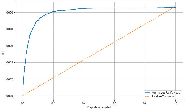
Since actual uplift can't be observed for each individual, you need to measure the uplift over a group of individuals. You use an Uplift Curve that plots the real, cumulative uplift across the population.
The x-axis represents the ratio of the population selected for the treatment. A value of 0 suggests no treatment group - no one is exposed to, or offered, the treatment. A value of 1 suggests a full treatment group - everyone is exposed to, or offered, the treatment. The y-axis shows the uplift measure. The aim is to find the size of the treatment group, or the percentage of the population that would be offered or exposed to the treatment (for example, advertising). This approach optimizes the target selection, to optimize the outcome.
First, rank the test DataFrame order by the predicted uplift. The predicted uplift is the difference between the predicted treatment outcome and the predicted control outcome.
# Compute the percentage rank of the predicted uplift values in descending order, and display the top twenty rows
test_ranked_df = test_pred_df.withColumn("percent_rank", F.percent_rank().over(Window.orderBy(F.desc("pred_uplift"))))

display(test_ranked_df.limit(20))
Next, calculate the cumulative percentage of visits in both the treatment and control groups.
# Calculate the number of control and treatment samples
C = test_ranked_df.where(f"{TREATMENT_COLUMN} == 0").count()
T = test_ranked_df.where(f"{TREATMENT_COLUMN} != 0").count()

# Add columns to the DataFrame to calculate the control and treatment cumulative sum
test_ranked_df = (
    test_ranked_df.withColumn(
        "control_label",
        F.when(F.col(TREATMENT_COLUMN) == 0, F.col(LABEL_COLUMN)).otherwise(0),
    )
    .withColumn(
        "treatment_label",
        F.when(F.col(TREATMENT_COLUMN) != 0, F.col(LABEL_COLUMN)).otherwise(0),
    )
    .withColumn(
        "control_cumsum",
        F.sum("control_label").over(Window.orderBy("percent_rank")) / C,
    )
    .withColumn(
        "treatment_cumsum",
        F.sum("treatment_label").over(Window.orderBy("percent_rank")) / T,
    )
)

# Display the first 20 rows of the dataframe
display(test_ranked_df.limit(20))
Finally, at each percentage, calculate the uplift of the group as the difference between the cumulative percentage of visits between the treatment and control groups.
test_ranked_df = test_ranked_df.withColumn("group_uplift", F.col("treatment_cumsum") - F.col("control_cumsum")).cache()
display(test_ranked_df.limit(20))
Now, plot the uplift curve for the test dataset prediction. You must convert the PySpark DataFrame to a Pandas DataFrame before plotting.
def uplift_plot(uplift_df):
    """
    Plot the uplift curve
    """
    gain_x = uplift_df.percent_rank
    gain_y = uplift_df.group_uplift
    # Plot the data
    fig = plt.figure(figsize=(10, 6))
    mpl.rcParams["font.size"] = 8

    ax = plt.plot(gain_x, gain_y, color="#2077B4", label="Normalized Uplift Model")

    plt.plot(
        [0, gain_x.max()],
        [0, gain_y.max()],
        "--",
        color="tab:orange",
        label="Random Treatment",
    )
    plt.legend()
    plt.xlabel("Porportion Targeted")
    plt.ylabel("Uplift")
    plt.grid()

    return fig, ax


test_ranked_pd_df = test_ranked_df.select(["pred_uplift", "percent_rank", "group_uplift"]).toPandas()
fig, ax = uplift_plot(test_ranked_pd_df)

mlflow.log_figure(fig, "UpliftCurve.png")
The analysis and the uplift curve both show that the top 20% population, as ranked by the prediction, would have a large gain if they received the treatment. This means that the top 20% of the population represents the persuadables group. Therefore, you can then set the cutoff score for the desired size of treatment group at 20%, to identify the target selection customers for the greatest impact.
cutoff_percentage = 0.2
cutoff_score = test_ranked_pd_df.iloc[int(len(test_ranked_pd_df) * cutoff_percentage)][
    "pred_uplift"
]

print("Uplift scores that exceed {:.4f} map to Persuadables.".format(cutoff_score))
mlflow.log_metrics(
    {"cutoff_score": cutoff_score, "cutoff_percentage": cutoff_percentage}
)
Step 4: Register the final ML Model
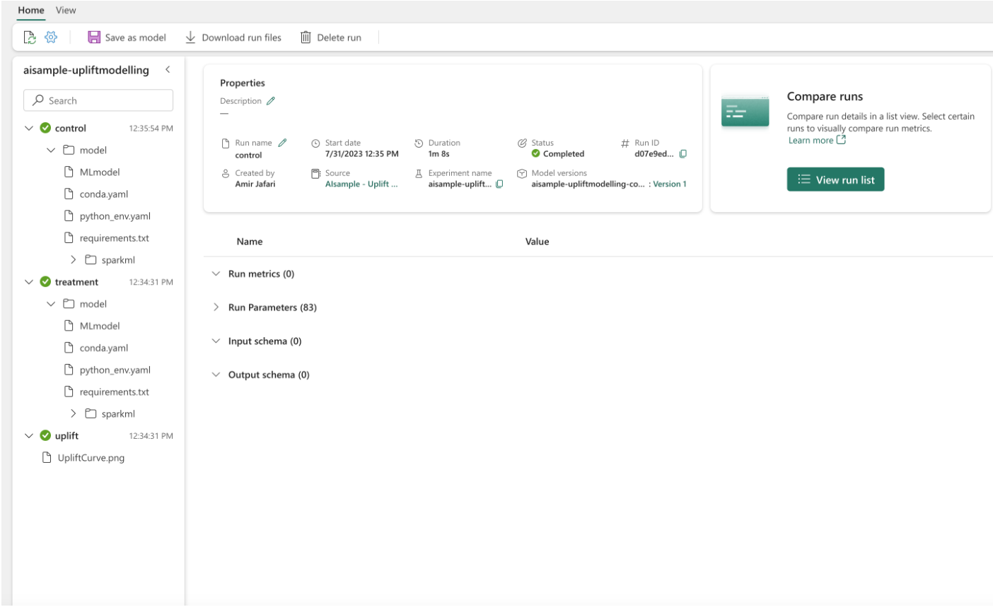
You use MLflow to track and log all experiments for both treatment and control groups. This tracking and logging include the corresponding parameters, metrics, and the models. This information is logged under the experiment name, in the workspace, for later use.
# Register the model
treatment_model_uri = "runs:/{}/model".format(treatment_run_id)
mlflow.register_model(treatment_model_uri, f"{EXPERIMENT_NAME}-treatmentmodel")

control_model_uri = "runs:/{}/model".format(control_run_id)
mlflow.register_model(control_model_uri, f"{EXPERIMENT_NAME}-controlmodel")

mlflow.end_run()
To view your experiments:
- On the left panel, select your workspace.
- Find and select the experiment name, in this case aisample-upliftmodelling.
Step 5: Save the prediction results
Microsoft Fabric offers PREDICT - a scalable function that supports batch scoring in any compute engine. It enables customers to operationalize machine learning models. Users can create batch predictions straight from a notebook or the item page for a specific model. Visit this resource to learn more about PREDICT, and to learn how to use PREDICT in Microsoft Fabric.
# Load the model back
loaded_treatmentmodel = mlflow.spark.load_model(treatment_model_uri, dfs_tmpdir="Files/spark")
loaded_controlmodel = mlflow.spark.load_model(control_model_uri, dfs_tmpdir="Files/spark")

# Make predictions
batch_predictions_treatment = loaded_treatmentmodel.transform(test_df)
batch_predictions_control = loaded_controlmodel.transform(test_df)
batch_predictions_treatment.show(5)
# Save the predictions in the lakehouse
batch_predictions_treatment.write.format("delta").mode("overwrite").save(
    f"{DATA_FOLDER}/predictions/batch_predictions_treatment"
)
batch_predictions_control.write.format("delta").mode("overwrite").save(
    f"{DATA_FOLDER}/predictions/batch_predictions_control"
)
# Determine the entire runtime
print(f"Full run cost {int(time.time() - ts)} seconds.")


