Menus and Commands for Visual Studio
Applies to: ![]() Visual Studio
Visual Studio ![]() Visual Studio for Mac
Visual Studio for Mac
Note
This article applies to Visual Studio 2017. If you're looking for the latest Visual Studio documentation, see Visual Studio documentation. We recommend upgrading to the latest version of Visual Studio. Download it here
Command usage
Overview
Unlike Microsoft Office, which is a suite that comprises many separate products, Visual Studio contains many products that each contribute their command sets to the global Visual Studio IDE. The IDE manages the complexity of thousands of commands by filtering the functionality available to the user based on context.
When a user's context changes - such as switching from a design window to a code editing window - functionality unrelated to the new context disappears. At the same time, new functionality surfaces together with related dynamic information, such as Properties and Toolbox options. The user should not notice the swapping of the available command set. If the user is distracted or confused by commands appearing or disappearing, then the UI design needs adjustment. The user's current context is always indicated in one or more ways, such as in the IDE title bar, the Properties window, or the Property Pages dialog box.
Command bars allow for flexibility in the UI. The only command structures inherent to the Visual Studio environment are the main menu and the main command bar, which can both be customized and even hidden. Other command bars appear and disappear based on the state of the application. Tool windows and document editors can also contain embedded toolbars within their window edges.
Basic guidelines
Use existing shared commands, command groups, and menus whenever possible.
Since commands are typically shown based on context, use of existing shared menus and command groups ensures that the command structure remains relatively stable between changes in context. Reusing shared commands and placing new commands close to related shared commands also reduces IDE complexity and creates a more user-friendly experience. If a new command needs to be defined, try to place it in an existing shared command group. If a new group needs to be defined, place it in an existing shared menu close to a related command group before creating a new top-level menu.
Do not create icons for every command.
Think carefully before you create a command icon. Icons should be created only for commands that:
appear on a default toolbar.
are likely to be added by users to a toolbar through the Customize... dialog.
have an icon associated with the same action in another Microsoft product.
Limit the addition of keyboard shortcuts
The vast majority of users employ a tiny fraction of all available shortcuts. When in doubt, don't bind your feature to a keyboard shortcut. Work with your user experience team before adding new shortcuts.
Give commands a default menu placement.
Be aware that your commands will be customized by others and design them accordingly. There is no such thing as a hidden command. All Visual Studio commands appear in the Tools > Customize dialog, the Command Window, auto-complete, the Tools > Options > Keyboard dialog, and the Development Tools Environment (DTE). Make sure to give your commands a name and tooltip in your .ctc file so that users can find them easily.
Do not duplicate shared commands on an embedded toolbar.
It is useful to place commands in close proximity to the area of the user's focus. One way to do this is to create an embedded toolbar at the top of your tool window or document editor. The commands placed on the toolbar should be specific to the content region within the window. Do not duplicate shared commands on these toolbars. For example, never place a "Save" icon within an embedded toolbar.
Content and command visibility
Commands exist in the following scopes: Environment, Hierarchy, and Document. Know each scope in order to have confidence in command placement.
Commands in the Environment scope establish primary context and are shared between multiple contexts. They alter the visibility or arrangement of documents and tool windows. Among the commands in the environment scope are New Project, Connect to Server, Attach Process, Cut, Copy, Paste, Find, Options, Customize, New Window, and View Help.
Commands in the Hierarchy scope manage hierarchies in Visual Studio including Project, Team, and Data. They relate to a project's subcontext - for example, Debug, Build, Test, Architecture, or Analyze. Among the commands in the Hierarchy scope are Add New Item, New Query, Project Settings, Add New Data Source, Launch Performance Wizard, and New Diagram.
Commands in the Document scope act on the contents of a document, such as code, design, or a work item query (WIQ). They also act on the view of a tool window or are otherwise specific to that tool window. Document scope commands also act on the file objects that are themselves hierarchy-specific, such as Remove from Project. Among the commands in the document scope are Refactor > Rename, Create Copy of Work Item, Expand All, Collapse All, and Create User Task.
Command placement decisions
Once you've decided to create a command, you'll need to determine its appropriate placement and whether to create a keyboard shortcut. Follow this decision path to establish where to place the command:
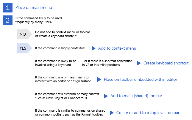
Decision path for command placement in Visual Studio
Command placement in menus
Main menu bar
The main menu bar should be the standard location for commands of any context-specific menu packages that contribute to the UI. The main menu bar differs from other command structures in that the environment uses it to control which commands are visible. All other command bars simply disable commands that are out of context, whether they are placed on a menu or on a toolbar.
The environment defines a set of commands built into the main menu bar that are common across the entire IDE and multiple task domains. These commands are always visible regardless of which VSPackages are loaded into the environment. Although VSPackages can extend this set of commands, the command set from each product and the placement of their commands is the responsibility of each team.
The structure of the Visual Studio main menu can be broken down into the following menu categories:
Core menus
File
Edit
View
Tools
Window
Help
Project-specific menus
Project
Build
Debug
Context-specific menus
Team
Data
Test
Architecture
Analyze
Document-specific menus
Format
Table
When designing main menus, adhere to these rules:
Do not exceed 25 top-level items in a given context
Menus should never exceed 600 pixels in height.
Evaluate a main menu in multiple contexts, such as in the Ultimate SKU and the General Profile.
Flyout menus are acceptable.
Flyout menus should contain at least three items and no more than seven.
Flyout menus should go only one level deep - some Visual Studio menu items have cascading submenus, but this pattern is not encouraged.
Use no more than six separators. Groupings should adhere to the following illustration:
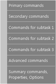
While it is not required to have each grouping in the figure, adding additional groupings is restricted.
Each grouping should have from two to seven menu items.
Main menu ordering
Before adding a new top-level item, consider placing the command in an existing top-level menu. When adding a new top-level menu, be sure to place it in the correct location. Decide whether the menu is specific to project, context, or document. Keep the name of the top-level menu concise and use only one word.
The core menus should bookend the rest of the commands. File, Edit, and View should always be to the left, and Tools, Window, and Help should always be to the right.
Context menus
Placing too much functionality within the context menus results in a difficult-to-learn interface. All major functionality should be available through the main menu bar. Placement of commands should be reconciled with existing commands to avoid duplicate commands. For context menus, the shell defines standard menu groups that should be included depending on whether the context menu is for the solution, a project node, or a project item.
When designing context menus, adhere to the same rules as for the main menu, and in addition:
Do not exceed 25 top-level menu items.
Flyout menus are acceptable but must not exceed one level deep - never use cascading flyouts.
Use no more than six separators.
Command placement in toolbars
General toolbars
When designing and arranging toolbars, follow these standards:
Don't use more than one verb per button. One button = one action.
Use text alongside the icon only if it needs to be reinforced with the label.
Use a combo box exclusively for properties that will be switched multiple times in one session. Otherwise, expose the property elsewhere.
The width of a combo box should equal the width of the longest item within the box + 30%. For instance, if the longest item is 200 pixels, then the combo box should be 260 pixels wide.
Limit the use of separators. The use of a separator next to a dropdown is an anti-pattern, because the shape of the dropdown itself acts as a visual separator.
Icon groups should contain from three to six icons.
If qualifiers result in multiple useful commands, use a split button that stores the last setting:
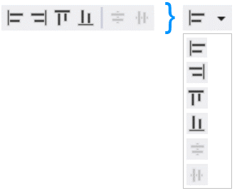
Example of a split button. The six commands on the left can instead fit into a single button.
Product-specific toolbars
Each product can provide a default toolbar that contains frequently used and important commands, and each product's default toolbar should appear the first time Visual Studio is started after the product is installed.
Products should also leverage shared command groups and menus provided by the IDE. Each shared command group is placed in a shared menu meant to organize related commands in a meaningful way for the user. It is important to leverage this shared command structure in order to reduce complexity.
Global toolbars
Global toolbars are required to fit on one row right out of the box. When creating a new global toolbar, follow the guidelines for that toolbar type.
General toolbar guidelines:
Each toolbar has 24 pixels in common controls (gripper, overflow).
Each toolbar button is 22 pixels wide including padding. Making the icon a split button adds another 11 pixels of width.
Duplication of commands across toolbars is allowed.
Document-specific toolbars appear when a certain file type is active and disappear when a different file type becomes active.
Document-specific toolbars may not have more than 12 buttons.
The total width of the toolbar may not exceed 300 pixels.
Each file type can have either one embedded toolbar or one document-specific global toolbar, but not both.
Context-specific toolbars appear when a certain context is set and tend to stay active for extended periods.
The button limit for all context-specific toolbars is 18.
If most users won't consistently employ this toolbar's commands when the context is active, then don't associate this toolbar with a context.
Ensure that the toolbar disappears when exiting context. None of these toolbars should appear on startup.
Toolbars with no context never appear automatically. These show only when the user activates them. Keep the maximum width below 200 pixels.
General organization and shell-defined groups
Use existing shared commands, command groups, and menus. If a new command needs to be defined, try to place it in an existing shared command group. If a new group needs to be defined, try to place it in an existing shared menu close to a related command group before creating a new top-level menu. This reduces command complexity while ensuring consistent command placement in the IDE.
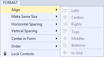
The shared Format menu, typically shown in the context of designer-style document windows, is illustrated in the following image:
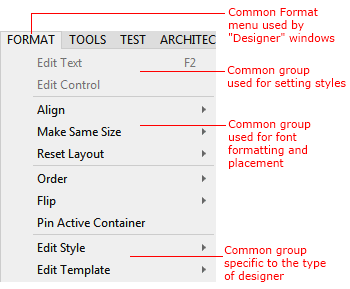
Menu groups in Visual Studio
Reducing and reusing commands
Commands are typically shown based on context, in order to reduce the number of commands the user sees at any given time. However, you should also reuse existing shared menus and command groups to ensure that the command structure remains relatively stable between changes in context.
Reusing shared commands and placing new commands close to related shared commands reduces IDE complexity and creates a more user-friendly experience.
Naming commands
Naming conventions
Consistent command naming is critical so that users can find and execute commands, either by using the command line or binding to a keyboard shortcut. Command names also help the user understand what purpose a command serves when it is displayed on a toolbar or in a cascading or context menu.
When naming commands:
Construct text so that it is easily localizable. For more about localizing text, see Localization best practices.
Be concise. Commands should use no more than three words.
Use title-case capitalization: the first letter of each word should be capitalized. For more information about text formatting in Visual Studio, see Text style.
Take into consideration where the command will be placed. Is it in a top-level menu or a flyout? For example, when grouping alignment commands in a flyout, the top-level command should be "Align" and the flyout commands should be "Left," "Right," "Center," "Justify," and so on. It would be redundant to name the flyout commands "Align Left" or "Align Right."
Using icons with commands
Be sparing in the use of icon pairing with commands. Although associating a unique image with a command hastens the user's ability to identify that command, visual clutter and inefficiency occur with image overuse. The following rules help when deciding whether to create a command icon.
Use an icon with a command only if:
The same command has an icon associated with it in another prominent Microsoft product, such as one of the Microsoft Office applications.
The command will be placed in a default toolbar.
The command is a specialty command that users are likely to add to a toolbar using the "Customize..." dialog.
Access and shortcut keys
Overview
There are two kinds of keyboard key assignments:
Access keys (also known as accelerators) allow keyboard access via the menus for commanding and to each label in dialog UI. Access keys are mostly for accessibility purposes, are assigned to all menus and most dialog box controls, are not meant to be memorized, affect only the current window, and are localized.
Shortcut keys mostly use Control (Ctrl) and Function (Fn) key sequences. They are designed more for advanced users and aid in productivity. They are assigned only to the most-often used commands and allow quick access while bypassing the main menu. Shortcut keys are intended to be memorized, and for that reason must be assigned consistent with the profile scheme. Shortcut key schemes may vary from profile to profile. A user may customize shortcut keys through Tools > Options > Keyboard.
Assigning access keys
Access keys consist of Alt plus alphanumeric key(s). Assign an access key to each menu item without exception. Follow Windows and common conventions for assigning access keys. for example, the access key for File > New should always be Alt, F, N.
Do not use single-pixel-width letters such as 'i' (in uppercase or lowercase) or a lowercase 'l,' and avoid using characters with descenders (g, j, p, q, and y) as these are difficult to distinguish.
Avoid using duplicate keys when possible. In cases where duplication is unavoidable, the menu system handles conflicts by cycling through all commands that use the key. As an example, for a hypothetical "Number" command under the File menu that duplicates the "N" access key, Alt, F, N would create a new file, and Alt, F, N, N would perform the "Number" command.
Assigning shortcut keys
Avoid assigning new shortcut keys, because they are not required for every command and tax the system (and user memory) if overused. Data from the Customer Experience Improvement Program (CEIP) indicates that Visual Studio users use only a small subset of the integrated shortcuts.
When defining shortcuts, follow these rules:
Use Control (Ctrl) and Function (Fn) key sequences.
Preserve frequently used shortcuts. Maintain the most popular shortcuts.
Make editor shortcuts easy to type. Bind easy-to-type shortcuts to commands that developers need most while writing code. For example, Edit.InvokeSmartTag needs to have a quick shortcut key like Ctrl+/ and not Alt+Shift+F10.
Strive for consistently themed shortcuts.
Follow Windows guidelines to determine which modifier keys to employ. Use Ctrl key combinations for commands that have large-scale effects, such as commands that apply to an entire document. Use Shift key combinations for commands that extend or complement the actions of the standard shortcut key. Don't use Ctrl+Alt combinations.
Remove extraneous shortcuts. If you have a legacy feature, consider removing shortcuts that are used with extreme infrequency (fewer than 10 times from the CEIP data) or moderate infrequency (fewer than 100 times from the CEIP data) if an access key provides quick access to the same command. For example: Alt, H, C will open Help/Contents.
There is not a simple way to check shortcut availability. If you want to add a shortcut, follow these steps:
Check the list of Visual Studio 2013 shortcuts to determine if there are similar commands to group yours with.
Go to Tools > Options > Environment > Keyboard and test your shortcut. Check each keyboard mapping scheme listed under "Apply the following additional keyboard mapping scheme." Check General, C#, VB, and C++ profiles, as those share unique shortcuts. Your shortcut is available if it's not mapped in any of those places.