Extending the Chronometer Windows Phone 7 app – introducing NuGet, Pivot, and the TimeSpanPicker control!
I am back to coding this weekend, and would like to add a second feature to the Chronometer application – a countdown timer. You will remember that I started building the application a few weekends back, and you will find the opening post here. I have since added a series of posts that has introduced different concepts and evolved the app – you can find those posts on my blog as well.
The concept of the Timer is of course very simple – you put in a text box with a value of hour : minute : second, and then put in some logic to change the values, and count it down to zero. However, I was looking for a control that would allow me to edit the countdown value with a nice experience – like you get when you set the alarm on the Windows phone 7!. I looked around, and found that there is control built by the community – called the TimeSpanPicker – which has the exact functionality I need. However, I would need to load the package, copy down the files, get any dependent packages (if any), add references to my project – and that is a lot of work!
This then provided me the opportunity to talk about the NuGet extension to Visual Studio. NuGet is a beautiful thing! You can read more about it here. It solves exactly the problem I have alluded to above, and I simply include an excerpt from the above link that explains the basic functionality.
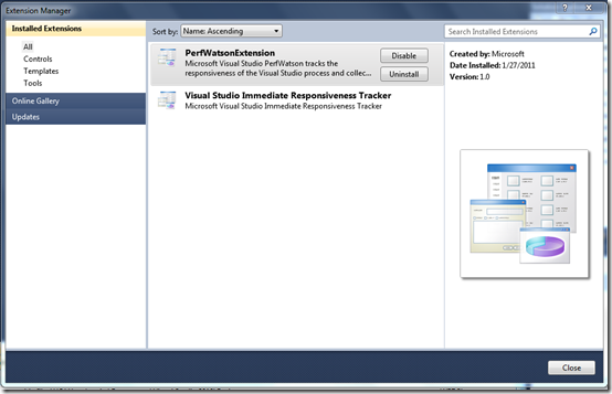
Let’s install the Library Package Manager (NuGet) extension. Click Tools and the Extension Manager – you can see below the packages I currently have installed.
Now, click the Online Gallery tab. Visual Studio now searches the gallery and presents a list of packages, based on their ranking (the community rates the packages). The view on my system is displayed below, and you notice that the NuGet Package Manager is already listed at the top, with a 5-star rating from 70 voters!
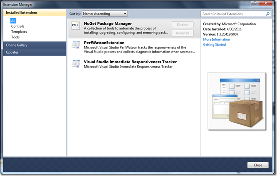
Simply click on the Download button to download and install the NuGet Package Manager package. It will download and install (once you accept the license agreement). After the installation you will be prompted to restart Visual Studio. If you now get back to the Extension Manager, you can see that the NuGet Package Manager is now installed.
Now we want to install the WP7 TimeSpanPicker control. For this, we go to the Tool, Library Package Manager, Add Library Package Reference option, and then select the Online tab to be able to pick from a list of packages out there. In the Search box now type “TimeSpan”. I got the following search results
I select the second one in the list (where the description says – “Just the timespan selector …”).
That’s all! The NuGet Package manager now downloads the package and adds references to the control into our project automatically, making it very simple to use the package.
I can now add the following line to the MainPage.xaml file to use the control in my layout – notice the last line in the xaml snippet below
Adding a Countdown timer to the Chronometer
We will now add a Countdown timer to the Chronometer. The way I want this to work is that the Stopwatch will still be the default functionality. However, I would like to slide the Stopwatch page out and get a new “page” where I will have a countdown timer functionality – that is, a control where I can set a time duration (hh : mm : ss), allow the user to start the timer, and then count it down to 00 : 00 : 00 and sound an alert.
Introducing a Pivot Control, and making the Stopwatch a PivotItem
Once I add the Countdown timer, the Chronometer application will have two discrete features – the Stopwatch and the Countdown timer. On the Windows Phone 7, we have two different controls – the Pivot Control and the Panorama Control – that will allow me to arrange these two discrete features horizontally in a virtual space that is several times wider than the width of the phone. I can then move through the controls – and hence the two feature areas – by simply sweeping the application surface with the fingers. Each control allows you to have a collection of items called PivotItem and PanoramaItem, respectively, to define the discrete feature areas
I will use the Pivot control rather than the Panorama control for two specific reasons:
- The Pivot control sweeps each control completely to the next, where as the Panorama allows the items to overlap on the display as they sweep them in. For this application, allowing each of the features the full viewing surface will give a better user experience
- More importantly, the Panorama control does not allow the Application Bar (at least, that is my understanding at this time), and I want that functionality. In fact, I will let each of the two features to have their own Application Bar
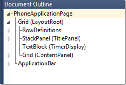
So far, the structure of the MainPage.xaml file looks like the following – with the fully expanded tree of controls shown on the right
I will now introduce the Pivot Control and Pivot Items, and move the earlier definition of the Stopwatch Layout inside it. This is done, by adding the following xaml code for the Pivot control and the PivotItem
Note, that the name of the Pivot control has been set as the Name of the Application, and the PivotItem has the name of the first feature – the Stopwatch. The rest of the original layout of the Stopwatch feature is now included within the PivotItem definition, and the definition is then closed off with the following tags. (The only other change I did was to move the Stopwatch display time TextBlock control a bit to the left, as it had gotten moved because of the above embedding)
Also, as the application will have one of two ApplicationBar controls, I am moving the definition of ApplicationBar items into a resource block as shown below, and will programmatically select the one that is the right one for the context. This is done by the following xaml code snippet
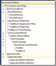
With this, the definition of the layout now looks as follow – contrast that with the one shown above.
Also, since we will now explicitly need to set the ApplicationBar. To do this, we first create a handler for the SelectionChanged event of the Pivot control. The code that sets the event handler and the code for the handler is shown below.
A quick compilation of the code and running of the application shows that all of the functionality is intact – as shown below.
Adding a second PivotItem for the Countdown timer
We will now introduce the Countdown timer as a second feature, by adding another PivotItem and including the TimeSpanPicker control that we have installed above. This is very simply done with the following xaml code for adding a second PivotItem in the Pivot control xaml that was shown above.
We then add a second ApplicationBar resource as shown below
Here we have a two buttons – the play button to start the timer, and a cancel button to cancel the timer before it counts down. We have defined a handlers named “countdown_play_Click” and “countdown_cancel_Click”. We will add code for it soon, but for now, we will simply add the handler as an empty function (likewise for the other handler too).
Note that the cancel button is disabled by default. Also, we have copied down the cancel icon into the images folder and have set the build action to content.
Changing the properties of the TimeSpanPicker control
It is now time to beautify the TimeSpanPicker control and set some properties so that it is consistent with the properties we had set for the Stopwatch display timer TextBlock. If you click on the PivotItem in the xaml file that represents the TimeSpanPicker control, you will get it displayed in the designer mode as shown below
To beautify the control, I would like to set the background color to black, the text color to yellow (just to add a bit of color, like we set Stopwatch display to blue), set the font to be a fixed width font (courier new), and set the font size to 64.
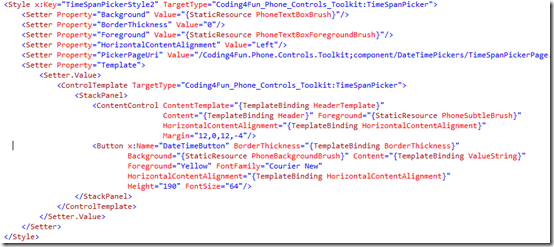
As in the case of the Stopwatch Display Timer, I found the most effective way to do this is to create a style in Expression Blend and apply it to the control. Here is the style that I have created and saved in App.xaml file
I simply apply the style – TimeSpanPickerStyle2 to the TimeSpanPicker control, as shown below, and you can also see the control now looks a lot nicer in the design view. I have also adjusted the location of the TimeSpanPikcer control to be around the same place as the Stopwatch Display Timer control.
The beautiful editing capability of the TimeSpanPicker control
The TimeSpanPicker control has a very nice built-in editing capability for changing the hour, minute, second portions of the display. The display is a TextBox, but when the user selects it, you can change the values using the infinite scrolling capability that it provides, keeping in mind the range of the values for hour, minute and second!
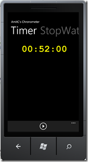
Notice below, how it looks like in real time. The picture on the left shows the display mode of the control. When you click on any of the three fields, it brings up the infinite scrolling control and you can get it scrolling by swiping it and then selecting the value you want. In this mode, the bottom of the screen shows the save and cancel buttons which can be used to save the new value. Thus, by clicking the save button, you get the new value for the control as shown in the right most image.,
However, note that to get the save and cancel images to show properly, you have to few steps explicitly (I presume this is an issue with the control – it should really have done all of these at the time of the package installation time).
You have to create a folder at the top level of the solution called "Toolkit.Content" and put the icons in there. You will need to copy the icons from the Coding4Fun.Phone.TestApplication project. They need be named "ApplicationBar.Cancel.png" and "ApplicationBar.Check.png", and the build action must be "Content"!
Finally, the logic for the Countdown timer
To keep the logic for the Countdown timer simple, here is what I will do:
- Introduce a new DispatchTimer, let’s call it countdowntimer and a stopwatch called the countdownstopwatch.
- When the “play” button on the Timer screen is hit, we will
- Convert the value in the timer to number of ticks, saving it, and setting that as the timespan interval for the counter
- Set an event handler for the timer
- Start the timer and the stopwatch
- Disable the play button and enable the cancel button
- In the event handler of the timer
- We will get the elapsed timer time from the stopwatch, subtract it from the total number of ticks saved above to get the remaining time
- If the remaining time is still positive, we will set the value of the TimespanPicker control to the remaining time
- If the value has reached zero, we will stop the timer (we will soon sound a beep too)
- We will also enable the play button and disable the cancel button
- When the cancel button is clicked, it simply resets the remaining time to zero and the event handlers take care of the rest
The code looks as follows:
Sounding a beep when the Countdown reaches zero
Playing a sound when the countdown goes down to zero turned out to be harder than I thought. I will investigate if there is an easier way, however, for now I am accomplishing this using XNA.
First, I add couple of XNA class library references
Next, I add a audio file - Piano.wav - to the root of the Application. I also changed the “Piano.wav” as Content and “Always copy to Output Directory” in the properties of the .wav file. Finally, I add the code below when the countdown reaches zero.
How does the application looks?
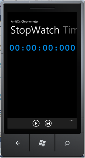
It is time now to build and show-off the features we have added. First notice the main screen of the application in the image shown on the left. You will notice that next to the “StopWatch” title, you will see a portion of the “Timer” feature shown in gray. This is a view of the Pivot control. It shows that there is another feature in the application! If you swipe the surface of the phone, it brings the second feature into view – as shown in the image on the right. Notice how the titles of the features are positioned – the Timer is now active, and the Stopwatch title shows partially and is grayed.
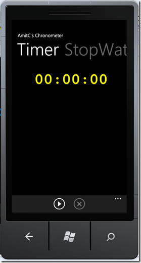
I can use the TimeSpanPicker editing capabilities discussed earlier and set a countdown value – as shown on the left below. When we save the value, you get the second image from the left – notice that the play button is enabled and the cancel is disabled. I then hit the play button and the third picture shows the countdown in progress and I also show it in a flipped view. Notice that the cancel button is now enabled, and when I click that the count goes to zero, as shown in the last picture below, and the piano sound plays as well!
That was truly a lot of fun! I have touched upon a ton of functionality, and I really enjoyed getting the application into shape and posting this!
Cheers!

