Control Styling Tips: RadioButton
Hello!
In this article, I’d like to provide you with some information and tips that you’ll find useful when styling a Silverlight 3 RadioButton.
Template binding. CommonStates (Normal, MouseOver, Pressed and Disabled), CheckStates (Unchecked, Checked and Indeterminate), FocusStates (Unfocused and Focused) and ValidationStates (Valid, InvalidUnfocused and InvalidFocused).
Template parts. None.
Template binding. Try template binding Background, BorderBrush, Foreground, BorderThickness or Padding.
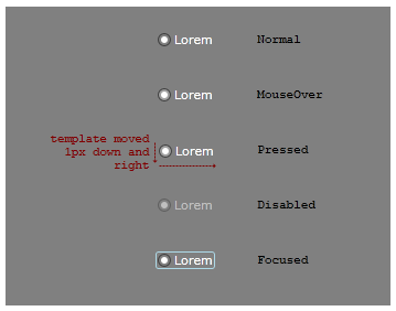
Make Into Control. A visual designer has comped out some RadioButton states.

The comp artwork is then imported into Blend 3. Here’s the XAML for the Normal state. Note, this XAML is not yet a styled RadioButton, it is still just artwork consisting of Panels and Shapes and text:
<Grid>
<Ellipse Stroke="#FF3C3C3C" Width="12" Height="12" HorizontalAlignment="Left" Fill="Transparent"/>
<Ellipse x:Name="bullet" Fill="White" Width="6" Height="6" HorizontalAlignment="Left" Margin="3,0,0,0"/>
<TextBlock Foreground="White" Text="Lorem" Margin="15,0,0,0" VerticalAlignment="Center"/>
</Grid>
Practice making the artwork into a RadioButton with the following steps.
- Paste the XAML into a new Silverlight 3 Application project, inside a container with a Gray background.
- Select [Grid] and click Tools > Make Into Control > RadioButton > OK. Blend has done a lot of work in this one step. First, Blend removed the Grid (and everything inside it) and put a new RadioButton in its place. Next, it turned the Grid into the template of a new RadioButton style and applied that new style to the new RadioButton. The TextBlock in the Grid had a White forground, so the new RadioButton style has a White foreground too. The TextBlock’s text was ‘Lorem’ so that becomes the content of the new RadioButton. And, in the template, the TextBlock has been replaced with a ContentPresenter that has the same layout properties as the TextBlock had.
- Now to make the template’s states look like those in the visual designer’s comp. Ensure the States panel is open and select the MouseOver state. Select [Ellipse] ’s Fill property and set the A (Alpha) value to 25. Note that the Ellipse now has a name: ellipse.
- You can make the same change to Pressed, or you can copy the MouseOver state to Pressed. With MouseOver still selected, click Tools > Copy State To > Pressed.
- Select the Pressed state. To offset the template to look like it does in the comp, select [Grid] and set RenderTransform.Translate.X and .Y to 1. Note that the Grid now has a name: grid.
- Select the Disabled state. Select grid and set its Opacity to 50.
- To give some life to the MouseOver state, click the ‘Add transition’ button on the Normal state and click Normal -> MouseOver. Set the transition’s duration to 0.2 seconds. When we move the mouse onto the RadioButton, the transition from Normal to MouseOver will take 0.2s. All other transitions, including the transition back to Normal when the mouse is moved away, and the transition from Pressed to MouseOver when the mouse button is released after a click, will happen instantly. Instant transitions are the default, and that’s what we want in all these other cases.
- Select Base and set bullet’s Opacity to 0. Select the Checked state and set bullet’s Opacity to 100.
- The visual designer drew a light blue rounded rectangle in the Focused state. But the rectangle is not present in the XAML of the Normal state so we’ll need to draw it into the template now. Creating a new object with a state selected is called ‘drawing into state’ and it means that the new object is only visible in the state you drew it into. This is a useful feature that we can make use of now. Select Focused, select grid, and double-click the Rectangle tool to create one default-sized.
- We now want to change the size and color of the new rectangle (rectangle) but we want those changes to be made to Base and not to the Focused state. We can’t select Base because the Rectangle is transparent in Base so we won’t see the changes we’re making. So, instead, click the ‘Turn off record mode’ button on the Focused state (or click Ctrl+R). Now change rectangle’s Margin to Left:-2, Right:-2, Top:0, Bottom:0, set its Fill to No brush, its Stroke color to LightBlue and its RadiusX and RadiusY to 2.
- Return scope to [UserControl] . Copy-Paste the RadioButton a few times and set one copy’s IsEnabled to false. Build and run your application and test your states.
You should now have a working RadioButton!
- Steve