Black and Blue
As was to be expected, the publishing of new Office 2007 screenshots last Thursday brought along a scary amount of attention. In its first eight hours, that article had already had received 100x more hits than the next-most-popular article I've ever written has in its entire lifetime. So there were a lot of people seeing Office 2007 for the very first time.
And, as I alluded to last Wednesday in my roundabout way, we knew there were going to be a lot of passionate opinions. It's beautiful! It's ugly. I want it now! I would never use it. The black rocks, the blue is ugly. The blue is great, the black is oppressive. All of us have intrinsic, emotional responses to visual designs--and so it's no surprise that there were so many comments all over the web about the screenshots. Brad probably said it best on Friday; he predicted 1/3 of the people would love it, 1/3 would hate it, and 1/3 would be indifferent.
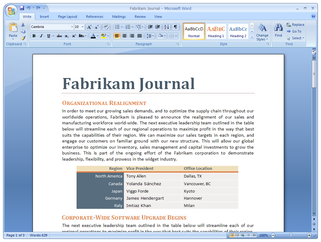
A sample of the new blue skin - Click to enlarge picture
At the same time, it's clear that many people were introduced to this whole UI project for the first time through seeing these screenshots and, if there's anything we've learned, it's that screenshots don't translate well the power of the new UI.
If you're just starting to learn about the Office 2007 UI, there's so much more than just visuals--there's a new interaction model throughout the programs. A great way to get up-to-speed is by watching Julie's video; it's six months old now, but the concepts are still up-to-date. (We're working on an updated one to debut soon.)
If you want to learn more about why we've changed Office's UI, the "Why the UI?" series of articles is the best resource.
OK, so there's a lot to get to this week, including a hopefully definitive look at the "size" of the UI, both mathematical and in common practice.
But today, I wanted to touch on the reasoning behind an aspect of the visuals that seemed to attract a lot of opinions: the colors.
As you probably know by now, there are two skins you can choose from: blue and black. Brad talked about some of the choices behind the visuals last Friday; I wanted to add some additional perspective today.
In Beta 1, the temporary skin was very gray. Although some people liked it (and are now sad that it's gone), the overwhelming feedback was that people thought it was unfriendly and depressing. Fair enough. (By the way, the anecdotal feedback from people actually using the new visuals has been very positive.)
But another reason the Beta 1 skin was wrong was that it didn't follow from the operating system. Why is the "blue" skin blue? Because the default appearance of Windows XP is based on blue, and we designed Office to complement the appearance of the operating system.
The black theme then (you guessed it) is designed to complement the upcoming Windows Vista release, with its darker, glass-like appearance.
A common question people asked last week is "which theme is the default?" The answer: it depends on your operating system. On Windows XP blue, you get the blue skin by default. On Windows Vista, you get the black skin by default. If glass is turned on in the operating system, we will enable glass in Office. However, unlike in past Office releases, you can choose a non-default skin--so if you like black better, by all means use it. Personally, I think I'll use blue with glass in Vista.
Last thing about visuals for now: are we done? Not even.
Although the overall direction is set, there are a lot of tweaks to the visual appearance still to come (we're not even to Beta 2 yet!) Some good issues were brought up in comments here and elsewhere which will inspire us to continue to improve the visuals as we continue this journey towards Office 2007 RTM.
Comments
Anonymous
March 13, 2006
I guess that you're doing the right thing.I really loved grey Office 12 look, so I'm a bit dissapointed by that light blue interface, but i'm glad that I can change it to black,which I like more.
Anyways, I'm glad that you're not stopping there though it may look so... (cause even now the UI looks almost perfect, so many people might think, that the UI is done with).
Though most important are the new features that are implemented and without which I cannot now work on office 2003 anymore (switched to vista, where Office 12 beta 1 doesn't work), so I can hardly wait until Refresh version is available. (not a good thing of you to say the release day like "next week" :-), it puts us into too much impatience)
By the way,wanted to say, that I admire the work of your team, cause I do submit bugs and I can REALLY see, how the team does their work to fix those bugs, testers can really feel that their work is needed!
Great work, btw, hope you're glad that i can hardly sleep until the Refreash comes out and I can install it on my computer :-)Anonymous
March 13, 2006
I understand the reason for the two defual skins, but woder how will these two skins look when people slected an included but non defualt OS colour scheme, such as silver or olive. (or in the non defualt vista colour schemes)
Have you ensured that to at to some group of testers that at least one of the two look fine with each of Vista's proposed included non-defualt colour schemes? (I just want to make sure you haven't just looked at the defualt appearence of an OS, I'm sure you have but until you say so :)
Kepp up the great work, and keeping un informedAnonymous
March 13, 2006
Jensen: i'm dying to see these themes with glass enabled!!! i can't imagine which part of the UI becomes glass, because on the top and on the bottom as weel you have controls on the window border. when are you going to show us?
btw: i like the idea of blue on XP and black on vista. cool.Anonymous
March 13, 2006
As a UI geek, one question immediately springs to mind: are the people who drew this stuff aware of the concept of affordances?Anonymous
March 13, 2006
Two skins only, that's not good...
1. How about a color mixer?
2. What about people using "Windows Classic" setting? How about a RGB(212,208,200) based theme for them?
3. Please make a skin based on the Beta 1 colors. I don't see what could possibly be stopping you from doing that, and a greater percentage of users will be satisfied.Anonymous
March 13, 2006
does the ui change the color with the glass settings in vista?Anonymous
March 13, 2006
The comment has been removedAnonymous
March 13, 2006
"Brad probably said it best on Friday; he predicted 1/3 of the people would love it, 1/3 would hate it, and 1/3 would be indifferent."
If this really is the Office team's standard for a good interface, it is a frightening thing. It's true you can't please anyone, but the bar should be much higher than 1/3rd liking it and 1/3rd not hating it.Anonymous
March 13, 2006
Jensen, this question has been posed some times, but still lacks an answer:
What will Office 2007 look like if you are running Windows XP in "Classic Mode" or running Windows 2000?
Will it look like a Windows application or still be skinned?Anonymous
March 13, 2006
Two thoughts:
1) Some people loved the gray w/gradient of beta 1, so if it's not a big problem, why not give them the option (or as some suggested, why not a color mixer; there are other themes to match also, as others have pointed out)? You could make more than a mere 1/3 happy.
2) Is the "Restore, Move, Size, Minimize, Maximize, Close" menu still available by pressing Alt + Space? Usually this pops up where the program icon is in the upper-left corner of the window, but that is now gone, according to these screenshots.
Overall, though, the new UI looks quite nice so far, and the concepts seem like a fantastic answer to the aging toolbar metaphor's problems. I can't wait to start testing the beta and see how it will work in our environment (legal)!Anonymous
March 13, 2006
The comment has been removedAnonymous
March 13, 2006
I'm all for the Office 2007 "Ribbon" UI, however I am not happy with Office 2007's redrawing the titlebar and window borders; you mention making the blue skin to be "consistent" with Windows XP's default blue color. But what if the user is running the Homestead (Green) or Metallic (Silver) XP visual-styles instead? What if they're not using XP's visual-styles engine at all?Anonymous
March 13, 2006
Please Consider that there are people who like the silver theme and can't stand blue or the rainbowy icons in the other theme that comes with the OS and that the beta 1 theme fit it very well!Anonymous
March 13, 2006
"What will Office 2007 look like if you are running Windows XP in "Classic Mode" or running Windows 2000?"
Make that just "Windows XP in Classic Mode", since I believe Office 2007 won't work on Windows 2000 at all.Anonymous
March 13, 2006
The comment has been removedAnonymous
March 13, 2006
Make it look like Mac Office, and I'd be a happy.Anonymous
March 13, 2006
Not to be annoying, but MY operating system theme is grey.Anonymous
March 13, 2006
mnerec, Office 2007 does not run on Windows 2000. Jensen, why didn't you utilize that colour changer thingy in Media Player 10 where you can customize colours for office apps individually?Anonymous
March 13, 2006
Hi,
I wonder why Office apps don't follow the operating system theme?
If you did, the consistency of the apps would be much higher and it would be much simpler for the users to figure out.
Why reinvent the wheel?Anonymous
March 14, 2006
Now THIS is innovation! I am really glad to see that visual design is FINALLY playing a major role in the development of applications at Microsoft. For the first time, Office will become a joy to use.
Even though I have not yet experienced the ribbon, I am certain that it is a great addition. In apps like CorelDraw, this concept already exists (though in a simpler toolbar format) in the form of the PowerBar. Button sets are swapped in and out according to the current selection. It has long been an excellent selling point over other graphics applications that suffer from pallet clutter.
I am especially excited about the improvements to PowerPoint and OneNote. Now that I am back full-time in an educational setting, these are programs that I work with all the time. Compared to Apple's Keynote, PowerPoint was really starting to show its age. Thanks for improving its design and functionally. This will go a long way to improving the hundreds of presentations I watch each semester!
Regarding the "skin" of the apps... Like others, I hope your system remains OS-theme aware or that coloring can be controlled by the user. But if it comes down to a choice between the screenshots shown here and a DEGRADED version that is theme-aware, I'll take what you have here instead.Anonymous
March 14, 2006
The comment has been removedAnonymous
March 14, 2006
I know this isn't strictly a UI question, but watching Julie's very informative video, I noticed the references and citations tab in the ribbon. This looks to add significantly new features to Word. Can you point me to any info on the web about this feature or comment on it yourself?Anonymous
March 14, 2006
The comment has been removedAnonymous
March 15, 2006
I agree with the comments on the blue skin.
I run Windows XP with the standard silver theme and now the Office UI looks so out of place with it's blueness.
I agree with people saying that Office should just use the theme from the OS, not override it with something else.
But then I have that issue with a number of MS products at the moment. Like media player and live messenger - it's always blue, no matter what your OS looks like.Anonymous
March 16, 2006
Ryan -- Actually, Media Player has a color slider, where you can pick any hue you want for the window. So it's not quite as rigid as Office 2007.
Unfortunately, these "skinned" UIs are becoming more and more prevalent at MS, despite the XP and Vista style guides. Feedback from standards mavens like myself seems to be falling on deaf ears.Anonymous
March 17, 2006
The comment has been removedAnonymous
March 21, 2006
Please provide some means to adjust the colors of the UI. Some have suggested obeying Vista's UI color sliders or implementing your own color sliders like those in Windows Media Player. Also good would be allowing people to develop their own Office skins, a la Windowblinds.
However, if you insist on providing only two skins and no means of customization, please at least make the neutral (black) skin completely neutral -- not "almost" or "mostly" neutral as it is now.
Compare this original screenshot:
http://blogs.msdn.com/photos/jensenh/images/547386/original.aspx
with this one, which I have adjusted:
http://www.smugmug.com/photos/60918635-O.jpg
In the original, the "gray" parts of the UI are actually a slight bluish gray; in the adjusted version, the grays are totally neutral.
The problem with non-neutral UIs is they interfere with color discrimination. For most average users, this isn't a problem, but it can be a big problem for design professionals trying to make accurate color choices. In this environment, "almost neutral" is almost worse than something really obvious, like neon blue -- it's close enough to gray/neutral that your mind is tricked into thinking it is neutral, and it can lead to color choices that look correct in the application but wrong when published.
For more background in this area, see ISO 3664:2000, ISO 12646, or http://www.creativepro.com/story/feature/12054-1.html .Anonymous
March 22, 2006
“Also good would be allowing people to develop their own Office skins, a la Windowblinds.”
No. The only user-customizable skinning facility that would make sense is allowing to develop skins for the whole Windows system. Applications have no business choosing window look-and-feel.Anonymous
March 22, 2006
Will it be posssible to turn off the custom theme in any later releases?
I can tell you now that people are going to request that by the thousands.Anonymous
March 23, 2006
"The only user-customizable skinning facility that would make sense is allowing to develop skins for the whole Windows system."
Of course. However, given the unique UI elements of Office 2007 (e.g. the ribbon), Office is going to require unique graphic elements that aren't in the system skin. Now, if there were some way to programmatically generate the required UI elements for Office based on the available system elements, that would be the ideal solution. But that sounds like a very difficult algorithm to develop, and one that in the end could probably achieve no better than mediocre results.
No matter how much of the system skin they use (and I agree they should follow the system skin wherever possible), there are likely to be additional, unique Office skin elements, and it should be possible to customize these as well.Anonymous
March 23, 2006
"Of course. However, given the unique UI elements of Office 2007 (e.g. the ribbon), Office is going to require unique graphic elements that aren't in the system skin."
or they could be added to the OS standard controls and system skin in order to promote a consistent appearance across the entire platform.Anonymous
March 28, 2006
I agree very much that screenshots don't adequately express the designs in many modern applications. It's to be expected, I think, because interaction is being considered a lot more today than it has been in the past. You need context to appreciate the screenshot. Videos help, but they're not perfect, either. Interactive demos might be worse than videos because the mock-up demos often don't capture the precision of the interaction design in the actual product.
The same is true of games, and it started to appear around the time when 3D started to appear and realistic motion and in-game physics began to have an impact on the experience.Anonymous
March 30, 2006
Xin chao, Minh den tu HL, minh mong muon duoc lam quen voi tat ca cac ban. Thanks youAnonymous
March 30, 2006
Xin chao, Minh den tu HL, minh mong muon duoc lam quen voi tat ca cac ban. Thanks youAnonymous
March 30, 2006
Xin chao, Minh den tu HL, minh mong muon duoc lam quen voi tat ca cac ban. Thanks youAnonymous
June 15, 2009
PingBack from http://unemploymentofficeresource.info/story.php?id=4902Anonymous
June 16, 2009
PingBack from http://workfromhomecareer.info/story.php?id=9302