Communication is Optional
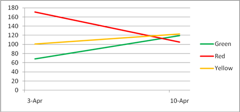
Clear communication is essential to our jobs and yet it always amazes me how poorly we do it. I received this chart in an email (about stress results).

Now, the interesting part: I've just given you as much context as to the meaning of the chart (and the email) as the author did. From the legend, I now know what color green, yellow, and red are, but aside from that, I've learned absolutely nothing. I may be able to go away with a little bit of comfort since the "red" line has gone down (and hopefully that is a good thing), but otherwise this email has done nothing but waste my time (especially since I've emerged from my blogging hiatus to write about it).
When you communicate with someone, you are hopefully trying to deliver some kind of message. If that message isn't brutally clear, then you have failed. In the case of the stress email, what was missing was a substantial amount of context. But even if you had been privy to the dark mysteries which made up that missing information, you would still have had to do your own analysis and basically connect the dots between what a "green" line is and what it actually represents, because that link itself was not brutally obvious to begin with.
If you are going to take the time to deliver a message, then take the time to actually think about what you are saying and how you are saying it. If the author had actually thought about the chart for a second he probably would have realized that units would be a good thing and the default/existing legend was completely useless.
Comments
- Anonymous
April 15, 2009
PingBack from http://www.alvinashcraft.com/2009/04/15/dew-drop-april-15-2009/