Evolving the Backstage View
For those of you who are dogfooding the Technical Preview build, thanks for all of the great feedback you’ve sent us so far on the new Backstage view! We’ve been getting a lot of requests for a sneak peak at the design changes that we’ve been making to the Backstage view since the Technical Preview builds have been released. I’ll talk through some of these changes in this post. Please note that these screenshots are still subject to change - they are from an interim build on the way to our Beta later this fall. We continue to tweak the designs based on what we learn in our usability labs and appreciate continued feedback from those of you that are dogfooding the Technical Preview.
File Button
From the early days of this release, we have been working on making the common commands like Print, Save, and Open more discoverable than in Office 2007. When we created the Office Menu in Office 2007, we optimized for Fitt’s Law – making it super easy to put your mouse in the upper left corner and get to these commands. For those folks who discovered the Office Button right away, this was a great little feature that made Office easier to use. Unfortunately, because this design was unconventional and different from the rest of the Ribbon UI we added, it was hard for some customers to find the Office Button the first time. Many who saw the Office Button believed it to be a branding decoration, rather than a functional button.
In the Technical Preview build, we took steps towards addressing this feedback. First off, we put the Office Button within the same row as the other Ribbon tabs. The location of the Office Button contributed most to people confusing it with a decorative logo. Another thing that we changed was the shape – instead of a fancy round button, we turned it into a button that looked much more like a tab. Lastly, we added an arrow to the button to try to encourage people to click on it.
With these changes, we started seeing some significant improvements in the usability tests in terms of people finding this button quickly the first time. But we still thought the initial discoverability needed to be better - we want to be sure people have no trouble finding the functionality under this button. Over and over in the usability lab, customers told us the word “File” was something they were looking for in the UI – all the years of using the File menu to use commands like “Save As” and “Print” is a hard habit to break. So we’ve listened to our customers and in our Beta release you’ll see we’ve added the “File” label to the tab. This has been a tremendous success in the usability labs and we’ve seen an incredible surge in initial discoverability of the Backstage view.
| Technical Preview: | Beta (coming later this fall): |
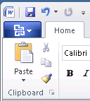 |
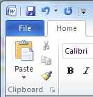 |
No More Back Button
One of the things we’ve been working on has been improving the navigation to and from the Backstage. Because the Backstage view covers up the document, we created the Back button mechanism to allow you to navigate back to your document. Unfortunately, this design had some issues that we’ve been working through – it led to some confusion around what the “X” (close) button in the top right corner should do, set incorrect expectations around what “Back” actually implies (does it work like in the browser?), and was not an easy target to hit.
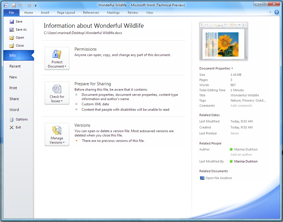
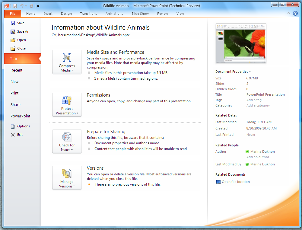
An important change has been to keep the Ribbon tabs visible and usable while you’re in the Backstage view. This makes the Backstage work much more like any other Ribbon tab – a metaphor people are already familiar with. In addition to clicking on the document thumbnail or pressing ESC, you can simply click on any one of the other Ribbon tabs to get back to your document and use those commands, just as you would switch between other Ribbon tabs.
Technical Preview:

Beta:

Updated Visuals
We’ve also worked to implement our nearly final set of visuals for the Backstage view. Our designers have worked to develop a set of visuals that help make the Backstage easier to browse and make the transition between your document and the Backstage feel smoother:
Organization of Navigation Commands
We have also added a little bit more efficiency to the “Quick Commands” in the left side of the Backstage view. Commands like “Save”, “Save As”, “Open”, and “Close” are no longer located beneath the “Info” tab and are actually closer to the File button than they have been in previous versions. Options and Exit are also no longer associated with the last tab, which has been renamed to “Help” to better reflect the commands located on this tab (you can think of the Help tab as the replacement for the commands that used to be located on the Office 2003 Help menu.)
| Technical Preview: | Beta: |
 |
 |
Most Recently Used Documents
For some of our customers, having very efficient access to their most recently used documents is super important. There are several ways to do this. First, you can add the “Open Recent File” command to the Quick Access Toolbar (QAT). Just drop down the Quick Customize menu at the right of the QAT.
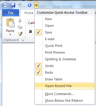
Clicking on the “Open Recent File Button” from the QAT will open the Backstage view directly to the Recent tab.

You could also choose to add a number of recently used documents directly to the navigation pane – the left hand side of the Backstage view. At the bottom of the Recent tab is a new feature that will allow you to choose the number of recent documents to show in the pane.
If you turn on this feature by clicking on the checkbox…
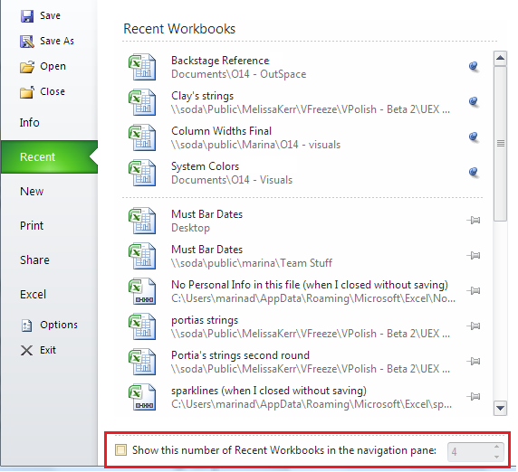
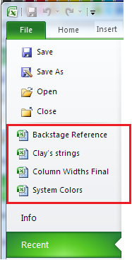
The number of documents you choose will be shown along with the other “Quick Commands” at the top of the Backstage navigation pane.
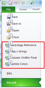
Turning this feature on also means that you’ll be able to use the keyboard sequence Alt+F+1 (or 2 or 3, etc) to open the most (or 2nd most, etc) recent document. And for those of you who use the pinning feature of the Recent Documents list (which keeps your favorite documents at the top of the list), you will be able to use the Alt+F+1 (or 2, or 3, etc) keyboard sequence to get to your favorite document, regardless of when it was last opened!
You can now use the keyboard to open your pinned and most recently viewed documents:
Thanks for all of the great feedback that you’ve been giving us so far and we hope that these changes help you become even more productive with the new Backstage view. Let us know what you think of these changes and we look forward to continue hearing your feedback on all of the work that we’ve put into Office 2010. We are listening closely and looking forward to the release of the beta version later this fall.
Marina, Program Manager on the Office User Experience team
Comments
Anonymous
January 01, 2003
On the Recent Documents, can it distinguish between a document in the local sharepoint drafts folder and one opened from a repository? I've had a really tough time with this in 2007. e.g.:\portalshared documentsmy document.xls
http://portal/shared documents/my document.xls
C:...Sharepoint Draftsmy document.xls which one should I open??? See the confusion?
Anonymous
January 01, 2003
Please refer to my post on Connect under userexperience.Anonymous
January 01, 2003
Well I for one absolutely love Backstage the way it is in the Tech Preview. It's made perfect sense to me from the start and is innovation that's increased my use of the product from the previous versions. Every single change you listed here is a disappointing regression in usefulness.Anonymous
January 01, 2003
those definitely look like improvements; and thanks for the tip about the Recent Documents icon on the QAT - but the icon for it looks so ugly and old-fashioned next to the others ;-(Anonymous
January 01, 2003
the UI is really good, may be people will take time to adopt the new pattern but i beleive this will working very fast. Good job guys.Anonymous
January 01, 2003
I don't like how the fitts law oriented design of office 2007 now got removed again, placing the system menu in most easy to reach place. the system menu is something really old, that windows tries to get rid from, but can't for backwards compatibility. please remove it from office, as it makes no sense up there. two proposals: the quick buttons to the left, so that fitts law lets you reach the most left button very easy (it would be 'save' for most people). or put the office logo (the one you had on the backspace menu button) up there, and let it still open file (similar to the way the office button in 2007 was visibly round, but clickable as a square). so expand the file menu upwards to be a square (or rectangle) with the office logo above. that would support fitts law, the new, more user understandable file menu, and the wish of windows, to get rid of the system menu completely. hope this gets heard, and considered.Anonymous
January 01, 2003
Great job! Thank you for these adjustments. Your work is appreciated. vanillaAnonymous
January 01, 2003
This new changes look great, and I suspect (but more importantly, your usability studies confirm) that it makes these features and the former "Office button" much more discoverable. The only bad thing is that now there are no fewer than three implementations of the ribbon UI in existence: the original Office 2007 style (oversized icon in upper left), the Windows 7 and former Office 2010 style (normal title bar, regular-sized icon-menu directly left of first ribbon tab), and now the Office 2010 style (similar but with "File" instead of icon). Too bad these studies weren't conducted sooner! Maybe it will be changed for Windows 8. :)Anonymous
January 01, 2003
I am sad to see the old look for Backstage gone as I really liked it, but I agree with all of the changes and have to admit that they look like they'll improve the experience. Is it possible to "close" the new Backstage by clicking again on the Tab? I guess that wouldn't make sense in a UI of tabs...Anonymous
January 01, 2003
Great changes! The Appearance now is more serious, but and other hand the beta office is more useful than technical preview. Best regards, Samuel Diogo Movport CEO 55 21 8321-1998Anonymous
January 01, 2003
The comment has been removedAnonymous
January 01, 2003
I like the elimination of the back button, but I will miss the program-oriented color scheme seen in the backstage view, i.e. the dark blue hue in Word. I hope that comes back, it was a nice color contrast to a mostly white UX that at times is plain and boring.Anonymous
January 01, 2003
Its the gr8 UI, it might take time to adopt the new UI but for sure it will help in working fast and would save timeAnonymous
January 01, 2003
Wow, exciting changes. I think these changes to backstage will make it much more usable for many people; I personally didn't like the back button on the new file menu. However, I still think the Office 2007 Orb was prettier!Anonymous
January 01, 2003
Good changes, but in my opinion you should leave Office icon instead of changing it to the "File"Anonymous
January 01, 2003
I think in the print view, the "print preview" should update when I select 2 or more pages per sheet. I Try it in Win7RTM + Office2kX TechPreview and didn't work. [I put this on the connection page.. .hope to resolve it]Anonymous
January 01, 2003
Eliminating the back button is a huge improvement over the techprev. However, I think you should reconsider not using an icon for the backstage/file tab. My preference would be to use the same icon that Windows 7 WordPad uses and the upcoming Windows Live Movie Maker release. With the option of displaying recent items in the navigation pane I think there should be an option exclude "pinned" items from the navigation pane. Using your screenshot as an example, the user will never see the last item(s) they worked on. Question: I assume in the technical preview, that the Backstage area had not been fully implemented. I'm seeing alot dialog boxes being launched (especially in Outlook). I take it the primary goal is to get rid of legacy dialog boxes and move the UI into the backstage sidescreen (for lack of a better term). Can you confirm that we'll be seeing more UI transfered to Backstage with the coming Beta?Anonymous
January 01, 2003
Yothe BackStage area has been a welcome change putting all the post-processing in one place like that and simplifying the interface. However, I must be on of the few that actually like it better in the Tech Preview Version rather than what is showing on the beta above. I like the extra splash of colour in the BackStage area, it helps seperate it from the main view. I also prefer the Office icon rather than File.Anonymous
January 01, 2003
The color of the selected panel looks like plastic, the previous style was better, and please bring back the application-specific background color, it looked very nice. The help button is inconsistent with Windows 7 help buttons.Anonymous
January 01, 2003
Thanks for the tip with the recent files :) I like to see the ability to see last x recent files directly in the backstage view. You made a good work introducing backstage view. What could be next improved is the options window. In the technical preview, options have a poor usability. Especially in Outlook I am wasting time searching options, like send/receive. When having an idea how to improve it, I'll tell you.Anonymous
January 01, 2003
This is great!!! These are all things that I've been hoping would change in the beta! Thank you so much for taking the feedback so seriously and for really improving the experience. This is what I love so much about the Office 2007 and 2010 products... genuine innovation!Anonymous
September 26, 2009
The comment has been removedAnonymous
September 26, 2009
Considering the arguments, I think there should be a customizable feature provided to either keep the Office Button at the Extreme Top Left or where-ever it is. Please give it a thought or two, as my 70 year old Dad and I feel the Office 2007 Orb Button is "more usable" than how it is now.Anonymous
September 28, 2009
Hi, I was just searching the web to see if people had similar thoughts. I request the UI Design Team to "PLEASE" read the article in the link below to see where you are heading. I STRONGLY feel, the UI team needs to give some strong thoughts as to what's being changed. I feel the Orb button is something that can be "refined" like, say, adding a small text that reads "Actions" or a tooltip that reads "File". http://blog.arkidect.com/2009/01/office-14-and-%E2%80%9Cscenic%E2%80%9D-one-small-change-can-destroy-the-ribbon.html For instance, in Windows 95 till XP we had the "Start" text in the Task Bar's Start Button. Now that it's become easier for people to recognize where the Start button is, you have removed the text and just put an Orb in the Task Bar of Windows Vista and Windows 7. That's acceptable and is welcome. But the Orb feature in Office 2007 was a real cool thing - that it's such a bad idea to remove that idea and go back to history! May be you want to try binging what feature went wrong in Office 2010 - and there you go: UI - The Orb and the Ribbon Everywhere!!! Team - Hope you hear us and do something! At least a customizable option can save the ideas!Anonymous
September 29, 2009
The comment has been removedAnonymous
October 04, 2009
In my honest opinion the Orb was never broken, it was the logical place to put the typical options such as Open, Print, Save... And for those who didn't find it the first time, they would have the second time. The Orb was distinct from the rest of the tab options, it made sense that if you want to open, save, or print a document you went to the Orb, anything else you wanted to do to a document you used the appropriate tab. How many users will now click the 'File' tab by mistake when they where really wanting to select 'Paste' on the 'Home' tab simply because of being used to selecting the 'Home' tab which used to be on the farthest left of the tabs selection area. You would have been able to solve the supposed delemmer for first time user blues simply by adding the word 'File' to the Orb, and providing an option for the user to remove the text once they knew where to go to Open, Print, Save... if they want. My honest suggestion and preference is to leave 'Back Stage' just where it should be - Back Stage - and bring back the Orb and its far better usability offerings. The old saying, 'if it ain't broke - don't fix it' surely applies here. Kind RegardsAnonymous
October 22, 2009
@ Michael (above): You lost all credibility when you spelt dilemma, "delemmer".Anonymous
October 23, 2009
The comment has been removedAnonymous
November 07, 2009
How can I get the evaluation of 2010Anonymous
November 13, 2009
Most of these changes are good and they were asked for on this blog quite often. Two things: I agree that the fitts corner should be used. As I remember the original office orb design history there were many variants possible. I would prefer having the office logo (or app logo) above the word File which would both be the complete backstage button. Please (pretty pleasy with sugar on top?) add a drag source onto the Info tab in Backstage (best drag & copy source) which would allow you to get the file to somewhere else (mail, folder, upload, whatever). Or even better: Make the File Button (/Ribbon Tab) a drag source. That is even the perfect metaphor. Thanks, MarcAnonymous
November 26, 2009
I would like to add my weight to the numerous comments supporting the Office 2007 'orb.' As a developer I was delighted to see the forward thinking design behind the Ribbon interface in Office 2007 and this included the Orb. The changes for Office 2010 are a step backwards particularly when most people have now accepted the 2007 style design. With plenty of other applications adopting this UI a change back to File will only serve to add more confusion.Anonymous
December 01, 2009
Thanks for all the good work.Anonymous
December 03, 2009
Problems with Office 2010 Well when I trying to use the right button of the mouse it is not possible, so I can't check the spelled or adjust a chart. Please send me a message jn_pape@hotmail.comAnonymous
December 17, 2009
These comments are completely perplexing to me. Some people seem to think that "old" user interfaces should be thrown out. What, is it getting moldy? It's like the AT&T commercial with the teenager who keeps wanting to throw out his rollover minutes, and his mom has to set him straight. Think about it - the UI is your set of tools for controlling the software and manipulating the content you create. Tools look the way they do because "form follows function." How often would you like the design of a pair of pliers to change? Look at the telephone handset. The standard handset has been 90% the same since what, the 1950s? It hasn't changed because it works correctly as is. Any major changes would detract from its function. Office 2007 and the ribbon interface represented destructive change. The software was no less complex than in 2003. But the interface was completely changed. In 2003 and earlier, there was a simple system that kept hundreds of commands organized. Menus. Yep, menus. They worked just like filing cabinets for paper, like directories for files, like addresses for houses. The menus were not perfect. Absolutely not. Many options were hidden (i.e., a checkbox inside a tab inside a dialog that can only be accessed by a button within a dialog that can only be accessed by a right-click.) But I think it was a mistake to blame the layers of organization for the entire problem. Think about it. At your desk, would you prefer to have one drawer with no partitions to keep all your important papers in? Or would you rather have a whole filing cabinet with a drawer for each area of your business, with hanging dividers for each function, with folders by date or client? Well, at first it might sound nice to have everything right at hand. But then you realize you need a certain document and have no idea where it is! The complexity of the filing system is necessary because of the complexity of your life. And it is the same way with software UIs. You can't simplify the UI significantly without simplifying the software first. The Ribbon was an attempt at simplifying things, but it was like an outside consultant coming into your office and dumping all your files on the ground so "workers can learn the business faster". And then not letting you clean them up! It is wasteful of space, not logically organized, aesthetically displeasing, and worst of all, fails in its stated purpose. The changes mentioned here for 2010 are not fueled by empty nostalgia for the trappings of the 1980s and 1990s. They are sensible changes dictated by Microsoft's slow, painful realization that Office 2007's Ribbon was an UN-improvement. Thank you, Microsoft team, for finally admitting you were wrong on at least a few points! May you one day muster up the courage to fix the rest of the things you have broken!Anonymous
December 21, 2009
Hi, I have some additional feedback on the backstage view:
- Use it more often. Why is it that we still have a lengthy options dialog pup up when I click on options?
- Use it more often. Why is it that we still see a seperate File Open dialog when I click Open?
- Use it more often. Why is there a save as dialog. Include all of these as panes in the backstage view. It would almost eliminate the need for the strange "Action Items" on the backstage "menu".
- Continue improving print dialog. Change your print preview when changing settings (print both sides, multiple page per side, staple indicators, etc.)
- Improve Information Page: All Properties should be visible and editable. This would remove the need for the strange properties area shown above the document.
- Improve New pane: Show your own templates! I guess approx. 99% of the people regularly use their own templates and only 1% use the microsoft templates, so why are the (quite nice sometime) MS templates so extremly exposed? Do away with the strange template selection dialog.
- Previews! Continue along that path, show previews when hovering above recently used documents (there is lots of space to the right), show previews in the new File Open pane (see 2) and the new template pane (see 6)
- Information / Share: Information has quite some "Actions" which do not fit to the metaphor of information. Most of them belong to sharing (or what is the english name of the german Freigeben Tab?)
- Allow Menu Style use of the backstage. Simple Click & Hold on File, then move to Save / Open / New should at least select the proper tab, ideally even allow me to select "New Empty Document" with less clicks.
- PDF Conversion: Should reside in the new Save As section (see 2).
- As stated before, make the title of the document (or the preview) shown on the information tab a drag source as well as a copy source (copy this document to clip as a file button would also be OK).
- Make the File Button Fits Law compatible again, please. Who needs the System Menu??? Please continue to improve the backstage view, maybe my little dozen helps. Regards, Marc
Anonymous
January 14, 2010
Why is the width of the "recent workbooks" column fixed? On my widescreen display, that column chops off the full path, yet at least 2/3 of the display width is unused. At lease I can hover over a link to see the full path, but it baffles me that the extra screen space is being wasted. I'd also like to see more info (such as file size and/or modification date) rather than simply a filename and a pushpin control.Anonymous
January 19, 2010
The comment has been removedAnonymous
January 19, 2010
i like itAnonymous
January 19, 2010
Show your own templates! I guess approx. 99% of the people regularly use their own templates and only 1% use the microsoft templates, so why are the (quite nice sometime) MS templates so extremly exposed? Do away with the strange template selection dialog. but i like itAnonymous
January 21, 2010
Hi, I know this isn't the appropriate thread, but I don't have the time to look or create one. The feedback that I want to provide is in regard to file properties and the metadate associated with doc (any many other file types). MS Office provides various data fields via the properties screen, but what can Windows do to make use of data entered in those fields? Exactly, absolutely nothing worthwhile. I hope I'm not being misunderstood, so please contact me for further detail on what I feel it's a VERY important aspect of operating system-file compatibility. marclove@gmail.comAnonymous
February 04, 2010
- In my opinion, the Quick Access Toolbar is very uncomfortable to use. In all my years of using Office, I have never used it once. It is just a pain to look at the tiny shortcuts, and look for the right tiny icon among them. It is just much more easier to click on the big "File" button and go to Backstage View, and then goto "Save" or "Recent Files". Yes, its more clicks, but its much easier and convenient.
- Additionally, the button order in the toolbar is not changeable. So if I use "Save" most often and want to have that as my right-most link, I cannot do that by simply dragging it.
- If I really use a function very often, and this applies to most people, I would rather use keyboard shortcuts rather than going to the mouse and looking for the miniscule icon at the top of the window. So, my suggestion - get rid of the quick access toolbar, infact have an option to get rid of the entire title bar and see how elegant and simple the UI becomes.
Anonymous
February 19, 2010
Big improvements over earlier versions; maintaining the ribbon bar for navigating back to the document really helps. One of my biggest problems with the 'file' menu at this version is how some of the commands make good use of the backstage view and others close this menu and bring up an old style dialog. 'Save' vs' 'Share' for example. To make matters worse there is very little visual difference between buttons with 2 very distinct actions. Some fill the column on mouse over, others don't. There isn't even a separator between buttons wich work very differently. Sure, the ones that bring up a dialog seem to have an icon but that seems to be more coincidental than a good design choice. What would be better would be to have ALL commands on this menu make use of the backstage. Get rid of the old style open dialogs etc and make use of the space you have just given yourselves. This would be more consistent and allow you to introduce some better ways to open docs etc. jon_boardman@hotmail.comAnonymous
March 03, 2010
Where can I provide feedback regarding 2010beta? Whenever I copy an email address from contacts and paste it into a new email I get an error. Then, if I paste it into notepad and then cut it and re-paste it into the email it works. Please pass this on to the 2010beta team thanks, markAnonymous
March 07, 2010
I have an idea! How about developing a pull down menu system, that uses minimal screen real estate. You could also add optional, completely customizable toolbars that are of minimal size. Wait, I could just stick with Office 2003 and get that! Users need some consistency in interface design. We don't want to have to relearn everything, just because some college kid punk programmers think they have developed something better (that isn't). You guys really thought a big round button, was better than a "File" menu? Give me a break. Does it really take years of testing in your useability labs to figure that out? Just a few years ago, users could quickly learn any Windows Program, because most mainstream software used a simple fairly consistent interface. Now, in the name of originality, consistency in UI is quickly disappearing. If the replacement was better and more efficient, it would be worth the change. It seldom is. I'm all for real innovation (example: iPhone OS), but not change for the sake of change (example: Office Ribbon).Anonymous
March 08, 2010
1.The file button is OK (maybe yo could add some flashier animation on mouse hover). 2.Updated visual are OK too, so backstage feels like a ribbon more (smother transition). transition. 3.Commands like“Save”, “Save As”, “Open”, and “Close” could easy be fit into a Save.. TAB. Without pop-out boxes or dialogs; following the WYSIWYG user interface. 4.What about Win7 integration ??? I didn't see anything about JUMP LIST; common task like save, print r open new doc could easily fit there.Anonymous
July 08, 2010
I've just got the final version of Office 2010 Professional Plus and I think it's great. This article is fantastic because it lets me see what features came in where. :)