CSS Style Bar Graphs using Data Views
 Hi everyone, Jon here again with a quick how-to on creating a simple bar graph of your data by using CSS and the Data View features of SharePoint Designer 2007. Among other things, this can give you a great KPI style view of your data without too much effort. For this example I created a basic list which had a column of number values formatted as percentages. First, I will go through the actual instructions and then I will describe what is happening.
Creating the bar graph:
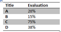
1. Insert a view of your list onto a page, making sure to include the columns you want (in my case “Title” and “Evaluation”).
![clip_image002[13]](https://msdntnarchive.blob.core.windows.net/media/TNBlogsFS/BlogFileStorage/blogs_msdn/sharepointdesigner/WindowsLiveWriter/CSSStyleBarGraphsusingDataViews_F8AD/clip_image002%5B13%5D.jpg)
2. Select an item in the column of numbers you want to graph (0.20), then click the “<”. In the Common xsl:value-of Tasks popup select Number formatting options… . Then, change the Format to “Percentage (%)”. Finally, click OK.
3. Place your IP after the number (20%), then click Insert -> HTML -> <span> .
4. With the span tag selected, open the Tag Properties task pane. For the “style” attribute type in “width: {format-number(@Evaluation, '##.#%')}; background-color: blue;”. (Note: change “@Evaluation” to match your field’s name).
5. You should now have something like this:
![clip_image004[6]](https://msdntnarchive.blob.core.windows.net/media/TNBlogsFS/BlogFileStorage/blogs_msdn/sharepointdesigner/WindowsLiveWriter/CSSStyleBarGraphsusingDataViews_F8AD/clip_image004%5B6%5D.jpg)
How it works
![clip_image006[6]](https://msdntnarchive.blob.core.windows.net/media/TNBlogsFS/BlogFileStorage/blogs_msdn/sharepointdesigner/WindowsLiveWriter/CSSStyleBarGraphsusingDataViews_F8AD/clip_image006%5B6%5D.jpg)
The graph works by taking the table cell and inserting a span tag within it. The table cell’s width becomes the “100%” width for the bar graph, and we adjust the size of the span tag to be the desired width given the percentage value. By coloring the background of the span tag, we get the familiar bar graph look. With a little creativity you can get very impressive looking graphs like those displayed on the CSS For Bar Graphs entry of the Apples to Oranges Blog. You can even combine this with the ability of the Data View to output JavaScript to create JavaScript based graphs. It’s a really great way to jazz up an otherwise boring view of a list.
Enjoy!
-Jon
Comments
Anonymous
June 28, 2008
Hi Jon, for my MS Press Book (in German) "SharePoint Designer 2007 - Das Handbuch" I recorded a screencast which shows this kind of customiziation see http://www.sharepointdesignerhandbuch.de/ under screencasts "NC02 Datenvisualisierung" and some other examplesAnonymous
June 29, 2008
PingBack from http://www.d2design.be/bookmarking/bookmarking-the-web-w262008/Anonymous
July 07, 2008
this really is a great workarround... u rockAnonymous
July 25, 2008
I just worked through this today and your tutorial plus a bit of extra CSS has produced excellent results. One issue I have is in exporting the Webpart from the Webpart Page that I created it from and importing onto my team site homepage - the page breaks. Even exporting and importing into the same page throws the error page. Any ideas why this may be?Anonymous
July 27, 2008
Hi again. I solved my problem re: exporting and importing the web part. I had based the data view on a list view in SPD originally. When I created a new DataFormWebPart from scratch then applied the tutorial to that it worked fine. My teamsite now has a funky Milestone Slip Chart based on a simple SharePoint list! Thanks for the post.Anonymous
December 09, 2008
On my blog, I show how to do something similar without the need for SharePoint Designer (sorry;-) ): http://pathtosharepoint.wordpress.com/2008/09/02/a-progress-bar-for-your-tasks-list/ http://pathtosharepoint.wordpress.com/2008/10/21/progress-bar-color-coding/ ChristopheAnonymous
December 23, 2008
The comment has been removed