The Path Layer in Azure Maps Power BI visual
The Path Layer feature in the Azure Maps Power BI Visual enables the visualization of connections between multiple geographic points.
The Path Layer feature can be used in multiple scenarios, such as:
- Route Visualization: Showing vehicle, ship, or flight paths between locations.
- Network Analysis: Examines connections between nodes in a network, like supply chain routes or communication networks.
- Movement Tracking: Monitoring assets or individuals over time and space.
This guide explains how to use this feature effectively.
Add a Path Layer
This section describes how to add data and configure the Path Layer. Before starting, you need to open your Azure Maps Visual in Power BI. For more information on adding an Azure Maps Visual to your Power BI report, see Use the Azure Maps Power BI visual.
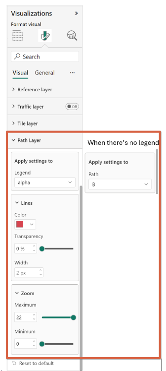
| Setting | Description |
|---|---|
| Apply Settings to | Path you want the settings to apply to |
| Color | The color of the line |
| Transparency | The transparency of the line |
| Width | The width of the line |
| Maximum Zoom | Maximum zoom level the layer is visible at |
| Minimum Zoom | Minimum zoom level the layer is visible at |
Add Data to the Path Layer
To draw paths, provide data for "Path ID" and "Point Order":
Add the column that best identifies each path to the Path ID field. The Path ID is used to identify which line each geospatial data point belongs to. If there are multiple paths, each path requires a unique Path ID.
Add the column that specifies the order of points along the path to the Point Order field. The Point Order dictates the sequence of points to form a path.

Configure a Path Layer
After adding your data, you can adjust the Path Layer's color, line width, and opacity. Apply settings by legend or path ID, coloring paths, and locations with the same legend identically.
After adding your data, you can configure the Path Layer according to your requirements. The style of the paths can be customized by adjusting the line color, width, and opacity. These settings can be applied based on legend or path ID. If a legend is provided, paths and locations associated with the same legend share the same color.

Interact with a Path Layer
The Path Layer feature offers several interactive options:
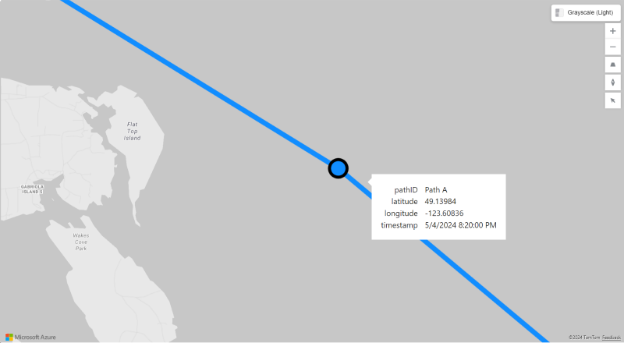
Hover and Select: Hover over a path to select points; clicking on a path selects the nearest point. The selected point will also select other reports by legend, path ID, location, and point order.
Tooltips: Tooltips show information for the nearest point when hovering over a line.

Explore and customize a Path Layer
Examine the connections and insights revealed by the Path Layer visualization. Further customize the settings to suit your specific requirements and derive more profound insights from your geospatial data.
Legends in a Path Layer
Adding a field to the legend field well creates a higher level of grouping. Consequently, paths and locations associated with the same legend are colored identically. Here's the process:
- Grouping by Legend: When a legend is provided, the paths and locations are grouped based on the legend. For instance, if visualizing flight paths with the airline as the legend, all paths and locations associated with the same airline share the same color. Moreover, if there are two rows, one with legend "Contoso" and path ID "A123", and another with legend "MSAirline" and path ID "A123", the Path Layer interprets these as two distinct paths: "Contoso-A123" and "MSAirline-A123".
- Styling by Legend: Configure the style (color, line width, opacity) using the legend to visually differentiate path groups.
- Interaction by Legend: When interacting with the Path Layer, selecting a path or point will also select other reports based on legend, path ID, location, and point order. This ensures all related data points are highlighted together.
Handle Origin-Destination Data
To use origin-destination data in the Path Layer, you must first transform it, as Azure Maps Visual doesn't directly support such data. Use the Unpivot function in Power Query to do this. Here’s how:
Import Data: Import your origin-destination data into Power BI.
Apply Unpivot Function: Use the following Power Query to transform the data:
let
    // Importing the source.
    Source = …
    // Create "path_id" to set in the "Path ID" field well later in the visual.
    // Since each row represents a line here, we can simply use the row index as path ID
    #"Added Index" = Table.AddIndexColumn(Source, "path_id", 0, 1, Int64.Type),
    // This is the key point of the transformation.
    // We transform the original rows into two: one for the origin and one for the destination.
    #"Unpivoted Other Columns" = Table.UnpivotOtherColumns(#"Added Index", {"path_id"}, "point_order", "city"),
    // We only support timestamp and number for the point order. So, convert the "origin" as 0 and "destination" as 1
    #"Replaced Values" = Table.ReplaceValue(Table.ReplaceValue(#"Unpivoted Other Columns", "origin", "0", Replacer.ReplaceText, {"point_order"}), "destination", "1", Replacer.ReplaceText, {"point_order"})
in
    #"Replaced Values"
Before Transformation
| origin | destination |
|---|---|
| New York | Los Angeles |
| Chicago | Houston |
| Miami | Atlanta |
| Seattle | Denver |
| Boston | San Francisco |
After Transformation
| path_id | point_order | city |
|---|---|---|
| 0 | 0 | New York |
| 0 | 1 | Los Angeles |
| 1 | 0 | Chicago |
| 1 | 1 | Houston |
| 2 | 0 | Miami |
| 2 | 1 | Atlanta |
| 3 | 0 | Seattle |
| 3 | 1 | Denver |
| 4 | 0 | Boston |
| 4 | 1 | San Francisco |
Current limitations
- The path layer is only compatible with specific map data layers, including the Bubble, Reference, Traffic, and Tile layers.
- The data-bound reference layer is not available when the path layer is enabled.
- Location hierarchy (drill down) is disabled when a Path ID is provided.
Conclusion
The Path Layer feature in Azure Maps Visual is a tool for visualizing and analyzing spatial connections. This new capability can be utilized to enhance reports.