Monitor queued ingestion with metrics
In the queued ingestion process, Azure Data Explorer optimizes data ingestion for high throughput by batching incoming small chunks of data into batches based on a configurable ingestion batching policy. The batching policy allows you to set the trigger conditions for sealing a batch (data size, number of blobs, or time passed). These batches are then optimally ingested for fast query results.
In this article, you will learn how to use metrics to monitor queued ingestion to Azure Data Explorer in Azure portal.
Batching stages
The stages described in this section apply to all batching ingestions. For Azure Event Grid, Azure Event Hubs, Azure IoT Hub and Cosmos DB ingestions, before the data is queued for ingestion a data connection gets the data from external sources and performs an initial data rearrangement.
Queued ingestion occurs in stages:
- The Batching Manager listens to the queue for ingestion messages and processes requests.
- The Batching Manager optimizes the ingestion throughput by taking the small ingress data chunks that it receives and batching the URLs based on the ingestion batching policy.
- The Ingestion Manager sends the ingestion commands to the Azure Data Explorer Storage Engine.
- The Azure Data Explorer Storage Engine stores the ingested data, making it available for query.
Azure Data Explorer provides a set of Azure Monitor ingestion metrics so that you can monitor your data ingestion across all the stages and components of the queued ingestion process.
The Azure Data Explorer ingestion metrics give you detailed information about:
- The result of the queued ingestion.
- The amount of ingested data.
- The latency of the queued ingestion and where it occurs.
- The batching process itself.
- For Event Hubs, Event Grid, and IoT Hub ingestions: The number of events received.
In this article, you'll learn how to use ingestion metrics in the Azure portal to monitor queued ingestion to Azure Data Explorer.
Prerequisites
- An Azure subscription. Create a free Azure account.
- An Azure Data Explorer cluster and database. Create a cluster and database.
- An active queued ingestion, such as Event Hubs, IoT Hub, or Event Grid.
Create metric charts with Azure Monitor metrics explorer
The following is a general explanation of how to use the Azure Monitor metrics that will then be implemented in subsequent sections. Use the following steps to create metric charts with the Azure Monitor metrics explorer in Azure portal:
Sign in to the Azure portal and navigate to the overview page for your Azure Data Explorer cluster.
Select Metrics from the left-hand navigation bar to open the metrics pane.
Open the time picker panel at the top right of the metrics pane and change the Time range to the time you want to analyze. In this article, we're analyzing data ingestion to Azure Data Explorer during the last 48 hours.
Select a Scope and a Metric Namespace:
- The Scope is the name of your Azure Data Explorer cluster. In the following example, we will use a cluster named demo11.
- The Metric Namespace should be set to Kusto Cluster standard metrics. This is the namespace that contains the Azure Data Explorer metrics.
Select the Metric name and the relevant Aggregation value.
For some examples in this article, we'll select Add Filter and Apply Splitting for metrics that have dimensions. We'll also use Add metric to plot other metrics in the same chart and + New chart to see multiple charts in one view.
Each time you add a new metric, you'll repeat steps four and five.
Note
To learn more about how to use metrics to monitor Azure Data Explorer in general and how to work with the metrics pane, see Monitor Azure Data Explorer performance, health, and usage with metrics.
In this article, you'll learn which metrics can be used to track queued ingestion, and how to use these metrics.
View the ingestion result
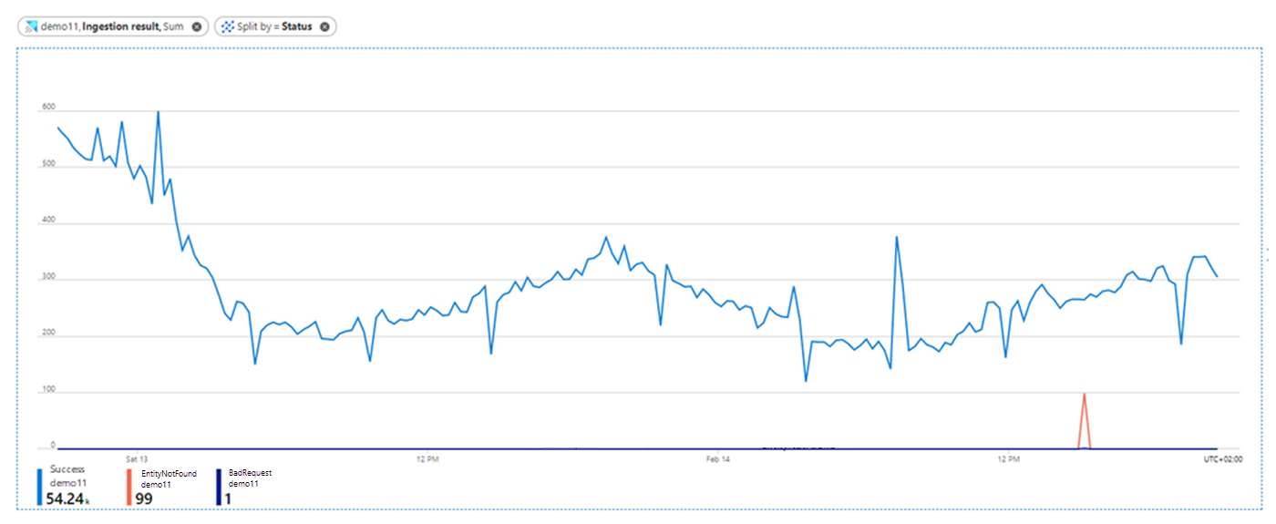
The Ingestion result metric provides information about the total number of sources that were successfully ingested and those that failed to be ingested.
In this example, we'll use this metric to view the result of our ingestion attempts and use the status information to help troubleshoot any failed attempts.
- In the Metrics pane in Azure Monitor, select Add Metric.
- Select Ingestion result as the Metric value and Sum as the Aggregation value. This selection shows you the ingestion results over time in one chart line.
- Select the Apply splitting button above the chart and choose Status to segment your chart by the status of the ingestion results. After selecting the splitting values, click away from the split selector to close it.
Now the metric information is split by status, and we can see information about the status of the ingestion results split into three lines:
- Blue for successful ingestion operations.
- Orange for ingestion operations that failed because of Entity not found.
- Purple for ingestion operations that failed because of Bad request.
Consider the following when looking at the chart of ingestion results:
- When using event hub or IoT hub ingestion, there is an event pre-aggregation in the Data connection component. During this stage of ingestion, events are treated as a single source to be ingested. Therefore, a few events appear as a single ingestion result after pre-aggregation.
- Transient failures are retried internally in a limited number of attempts. Each transient failure is reported as a transient ingestion result. That's why a single ingestion may lead to more than one ingestion result.
- Ingestion errors in the chart are listed by the category of the error code. To see the full list of ingestion error codes by categories and try to better understand the possible error reason, see Ingestion error codes in Azure Data Explorer.
- To get more details on an ingestion error, you can set failed ingestion diagnostic logs. However, it's important to consider that generating logs results in the creation of extra resources, and therefore an increase in the COGS (cost of goods sold).
View the amount of ingested data
The Blobs Processed, Blobs Received, and Blobs Dropped metrics provide information about the number of blobs that are processed, received, and dropped by the ingestion components during the stages of queued ingestion.
In this example, we'll use these metrics to see how much data passed through the ingestion pipeline, how much data was received by the ingestion components, and how much data was dropped.
Blobs Processed
- In the Metrics pane in Azure Monitor, select Add Metric.
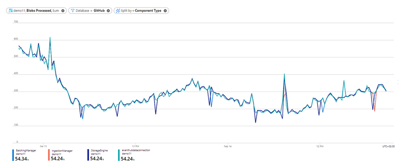
- Select Blobs Processed as the Metric value and Sum as the Aggregation value.
- Select the Apply splitting button and choose Component Type to segment the chart by the different ingestion components.
- To focus on a specific database in your cluster, select the Add filter button above the chart and then choose which database values to include when plotting the chart. In this example, we filter on the blobs sent to the GitHub database by selecting Database as the Property, = as the Operator, and GitHub in the Values drop-down. After selecting the filter values, click away from the filter selector to close it.
Now the chart shows how many blobs that were sent to the GitHub database were processed at each of the ingestion components over time.
- Notice that on February 13 there's a decrease in the number of blobs that were ingested to the GitHub database over time. Also, notice that the number of blobs that were processed at each of the components is similar, meaning that approximately all data processed in the Data Connection component was also processed successfully by the Batching Manager, Ingestion Manager, and Azure Data Explorer Storage Engine components. This data is ready for query.
Blobs Received
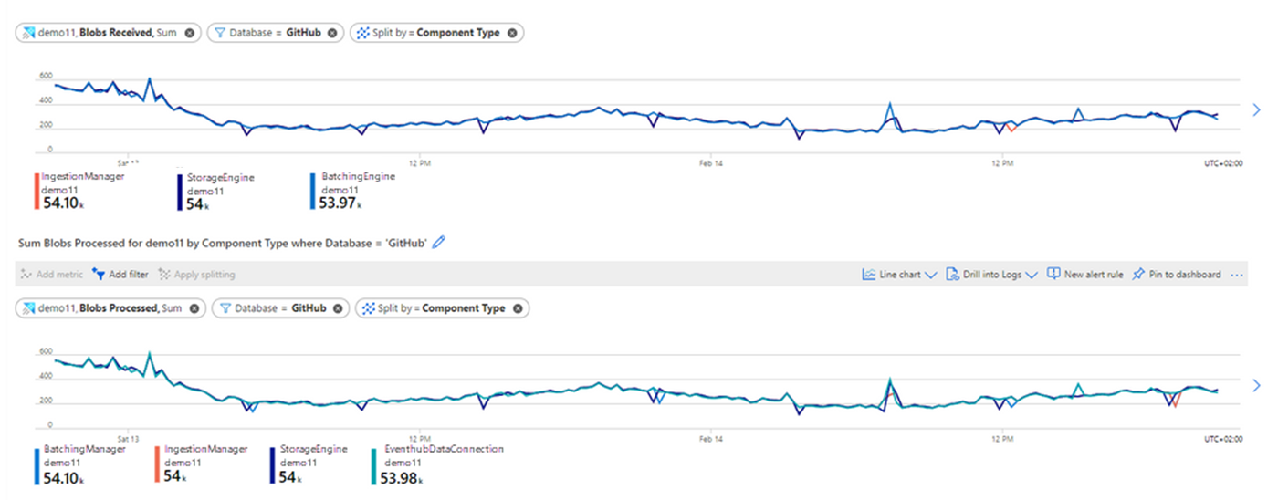
To better understand the relation between the number of blobs that were received at each component and the number of blobs that were processed successfully at each component, we'll add a new chart:
- Select + New chart.
- Choose the same values as above for Scope, Metric Namespace, and Aggregation, and select the Blobs Received metric.
- Select the Apply splitting button and choose Component Type to split the Blobs Received metric by component type.
- Select the Add filter button and set the same values as before to filter only the blobs sent to the GitHub database.
- Comparing the charts, notice that the number of blobs received by each component closely matches the number of blobs that were processed by each component. This comparison indicates that no blobs were dropped during ingestion.
Blobs Dropped
To determine whether there are blobs that were dropped during ingestion, you should analyze the Blobs Dropped metric. This metric shows how many blobs were dropped during ingestion and helps you detect whether there is a problem in processing at a specific ingestion component. For each dropped blob, you will also get an Ingestion Result metric with more information about the reason for failure.
View the ingestion latency
The metrics Stage Latency and Discovery Latency monitor latency in the ingestion process, and tell you if there are any long latencies occurring either in Azure Data Explorer, or before data arrives to Azure Data Explorer for ingestion.
- Stage Latency indicates the time span from when a message is discovered by Azure Data Explorer until its content is received by an ingestion component for processing.
- Discovery Latency is used for ingestion pipelines with data connections (such as event hub, IoT hub, and Event Grid). This metric gives information about the time span from data enqueue until discovery by Azure Data Explorer data connections. This time span is upstream to Azure Data Explorer, so it's not included in the Stage Latency metric that only measures the latency in Azure Data Explorer.
Note
According to the default batching policy, the default batching time is five minutes. Therefore, if the batch isn't sealed by other triggers, the batch will be sealed after five minutes.
When you see a long latency until data is ready for query, analyzing Stage Latency and Discovery Latency can help you understand whether the long latency is because of long latency in Azure Data Explorer, or is upstream to Azure Data Explorer. When the latency is in Azure Data Explorer itself, you can also detect the specific component responsible for the long latency.
Stage Latency (preview)
Let's first look at the stage latency of our queued ingestion. For an explanation of each stage, see Batching stages.
- In the Metrics pane in Azure Monitor, select Add Metric.
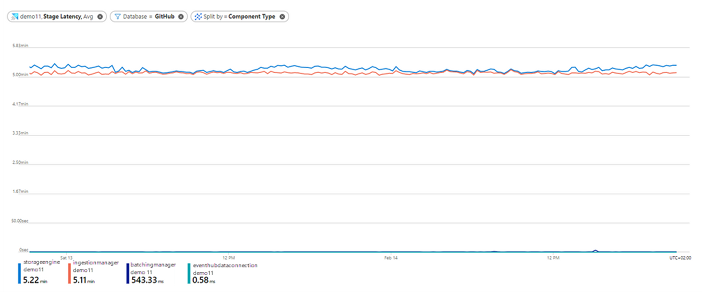
- Select Stage Latency as the Metric value and Avg as the Aggregation value.
- Select the Apply splitting button and choose Component Type to segment the chart by the different ingestion components.
- Select the Add filter button, and filter on the data sent to the GitHub database. After selecting the filter values, click away from the filter selector to close it. Now the chart shows the latency of ingestion operations that are sent to GitHub database at each of the components through ingestion over time:
We can tell the following information from this chart:
- The latency at the Event Hubs Data Connection component is approximately 0 seconds. This makes sense, because Stage Latency only measures latency from when a message is discovered by Azure Data Explorer.
- The longest time in the ingestion process (approximately 5 minutes) passes from when the Batching Manager component received data to when the Ingestion Manager component received data. In this example, we use the default batching policy for the GitHub database. As noted, the latency time limit for the default batching policy is 5 minutes, so this most likely indicates that nearly all the data was batched by time, and most of the latency time for the queued ingestion was due to the batching itself.
- The storage engine latency in the chart represents the latency until data is stored in the Azure Data Explorer Storage Engine and is ready for query. You can see that the average total latency from the time of data discovery by Azure Data Explorer until it's ready for query is 5.2 minutes.
Discovery Latency
If you use ingestion with data connections, you may want to estimate the latency upstream to Azure Data Explorer over time, as long latency may also occur before Azure Data Explorer gets the data for ingestion. For that purpose, you can use the Discovery Latency metric.
- Select + New chart.
- Select Discovery Latency as the Metric value and Avg as the Aggregation value.
- Select the Apply splitting button and choose Component Type to segment the chart by the different data connection component types. After selecting the splitting values, click away from the split selector to close it.
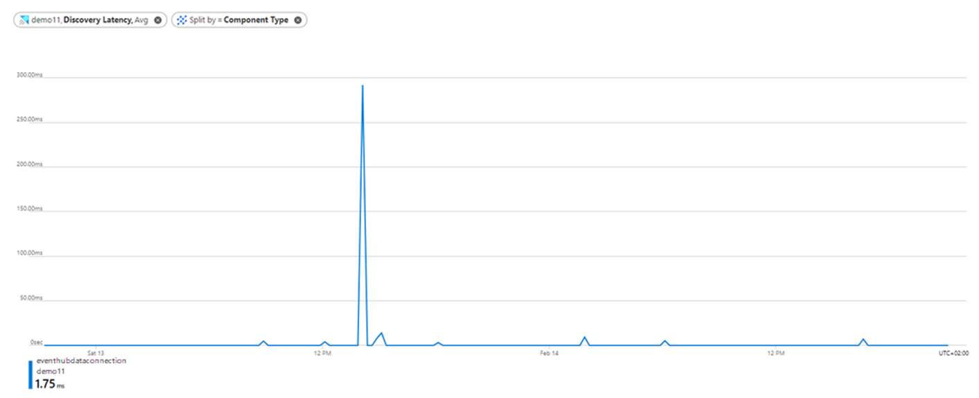
- You can see that for most of the duration the discovery latency is close to 0 seconds, indicating that Azure Data Explorer got data just after data enqueue. The highest peak of around 300 milliseconds is around February 13 at 14:00, indicating that at this time the Azure Data Explorer cluster received the data around 300 milliseconds after data enqueue.
Understand the batching process
In the second stage of the queued ingestion flow, the Batching Manager component optimizes the ingestion throughput by batching the data it receives based on the ingestion batching policy.
The following set of metrics helps you understand how your data is being batched during ingestion:
- Batches Processed: The number of batches completed for ingestion.
- Batch Size: The estimated size of uncompressed data in a batch aggregated for ingestion.
- Batch Duration: The duration of each individual batch from the moment the batch is opened until batch sealing.
- Batch Blob Count: The number of blobs in a completed batch for ingestion.
Batches processed
Let's start with an overall view of the batching process by looking at the Batches processed metric.
- In the Metrics pane in Azure Monitor, select Add Metric.
- Select Batches Processed as the Metric value and Sum as the Aggregation value.
- Select the Apply splitting button and choose Batching Type to segment the chart based on the reason the batch was sealed. For a complete list of batching types, see Batching types.
- Select the Add filter button and filter on the batches sent to the GitHub database. After selecting the filter values, click away from the filter selector to close it.
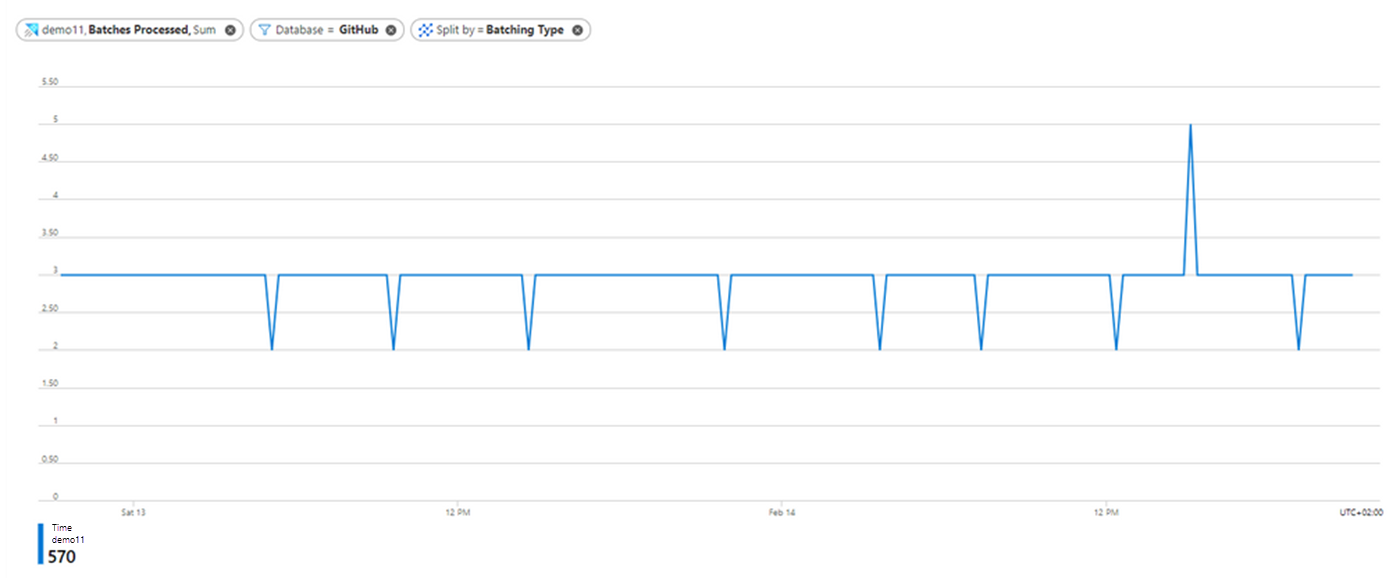
The chart shows the number of sealed batches with data sent to the GitHub database over time, split by the Batching Type.
- Notice that there are 2-4 batches per time unit over time, and all batches are sealed by time as estimated in the Stage Latency section where you can see that it takes around 5 minutes to batch data based on the default batching policy.
Batch duration, size, and blob count
Now let's further characterize the processed batches.
- Select the + Add Chart button for each chart to create more charts for the Metric values Batch Duration, Batch Size, and Batch Blob Count.
- Use Avg as the Aggregation value.
- As in the previous example, select the Add filter button, and filter on the data sent to the GitHub database.
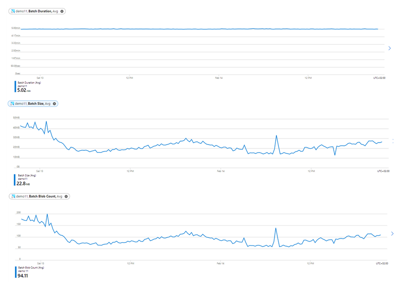
From the Batch Duration, Batch Size, and Batch Blob Count charts we can conclude some insights:
The average batch duration is five minutes (according to the default batching policy). You should take this into account when looking at the total ingestion latency.
In the Batch Size chart, you can see that the average size of batches is around 200-500 MB over time. The optimal size of data to be ingested is 1 GB of uncompressed data, and this size is also defined as a seal condition by the default batching policy. As there's not 1 GB of data to be batched over time, we don't see any batches sealed by size.
The average number of blobs in the batches is around 160 blobs over time, which then decreases to 60-120 blobs. Based on the default batching policy, a batch can seal when the blob count is 1000 blobs. As we don't arrive at this number, we don't see batches sealed by count.
Compare events received to events sent for ingestion
When applying event hub, IoT hub, or Event Grid ingestion, it can be useful to compare the number of events received by Azure Data Explorer to the number of events sent from the eventing source to Azure Data Explorer. The metrics Events Received, Events Processed, and Events Dropped allow you to make this comparison.
Events Received
- In the Metrics pane in Azure Monitor, select Add Metric.
- Select Events Received as the Metric value and Sum as the Aggregation value.
- Select the Add filter button above the chart and choose the Property value Component Name to filter the events received by a specific data connection defined on your cluster. In this example, we filter on the GitHubStreamingEvents data connection. After selecting the filter values, click away from the filter selector to close it.
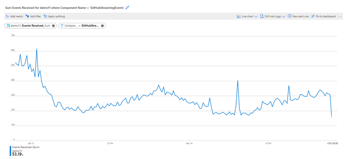
Now the chart shows the number of events received by the selected data connection over time:
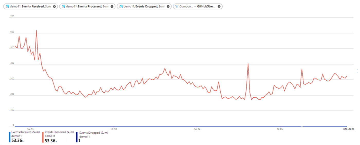
- In this chart, the GitHubStreamingEvents data connection receives around 200-500 events per time unit over time.
Events Processed and Events Dropped
To see if any events were dropped by Azure Data Explorer, use the Events Processed and Events Dropped metrics.
- On the chart you have already created, select Add metric.
- Select Events Processed as the Metric value and Sum as the Aggregation value.
- Select Add metric again and select Events Dropped as the Metric value and Sum as the Aggregation value.
The chart now shows the number of Events that were received, processed, and dropped by the GitHubStreamingEvents data connection over time.
- Almost all the received events were processed successfully by the data connection. There is one dropped event, which is compatible with the failed ingestion result due to bad request that we saw when viewing the ingestion result metric.
Compare events received in Azure Data Explorer to outgoing messages from event hub
You may also want to compare the number of events received to the number of events that were sent from event hub to Azure Data Explorer, by comparing the Events Received and Outgoing Messages metrics.
On the chart you have already created for Events Received, select Add metric.
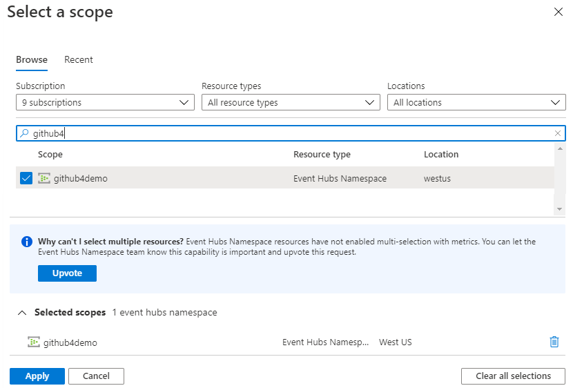
Select Scope and in the Select a scope dialog, browse for, and select the namespace of the event hub that sends data to your data connection.
Select Apply
Select Outgoing Messages as the Metric value and Sum as the Aggregation value.
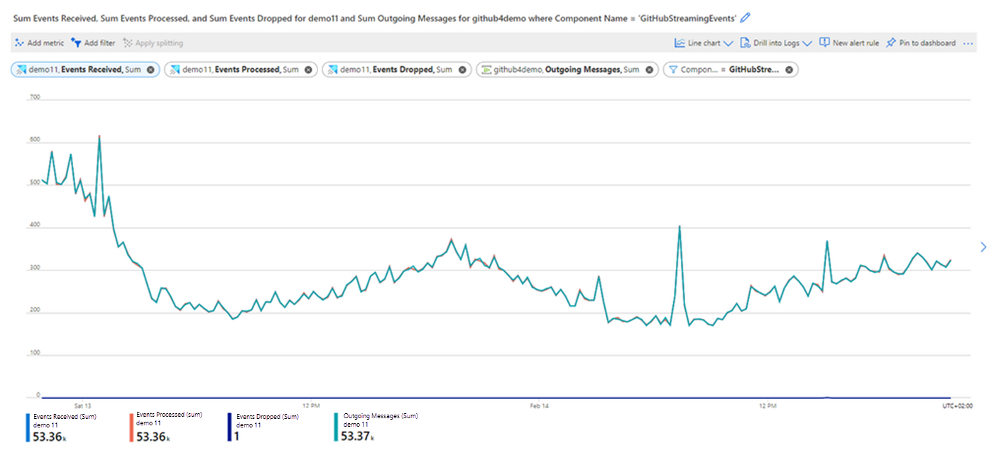
Click away from the settings to get the full chart that compares the number of events processed by the Azure Data Explorer data connection to the number of events sent from the event hub.
- Notice that all the events that were sent from event hub were processed successfully by the Azure Data Explorer data connection.
- If you have more than one event hub in the event hub namespace, you should filter the Outgoing Messages metric by the Entity Name dimension to get only data from the desired event hub in your event hub namespace.
Note
There's no option to monitor outgoing message per consumer group. The Outgoing Messages metric counts the total number of messages that were consumed by all consumer groups. So, if you have a few consumer groups in your event hub, you may get a larger number of Outgoing Messages than Events Received.

