How to: Customize the Application Button
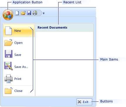
When you click the Application button, a menu of commands is displayed. Typically, the menu contains file-related commands such as Open, Save, Print, and Exit.

To customize the Application button, open it in the Properties window (in Resource View), modify its properties, and then preview the ribbon control.
To open the Application button in the Properties window
In Visual Studio, on the View menu, click Resource View.
In Resource View, double-click the ribbon resource to display it on the design surface.
On design surface, right-click the Application button menu and then click Properties.
Application Button Properties
The following table defines the properties of the Application button.
| Property | Definition |
|---|---|
| Buttons | Contains the collection of up to three buttons that appear in the bottom-right corner of the Application menu. |
| Caption | Specifies the text of the control. Unlike other ribbon elements, the Application button does not display caption text. Instead, the text is used for accessibility. |
| HDPI Image | Specifies the identifier of the high dots per inch (HDPI) Application button icon. When the application runs on a high DPI monitor, HDPI Image is used instead of Image. |
| HDPI Large Images | Specifies the identifier of the high DPI large images. When the application runs on a high DPI monitor, HDPI Large Images is used instead of Large Images. |
| HDPI Small Images | Specifies the identifier of the high DPI small images. When the application runs on a high DPI monitor, HDPI Small Images is used instead of Small Images. |
| ID | Specifies the identifier of the control. |
| Image | Specifies the identifier of the Application button icon. The icon is a 32-bit 26x26 bitmap that has alpha transparency. The transparent portions of the icon are highlighted when the Application button is clicked or hovered over. |
| Keys | Specifies the string that is displayed when key-tip navigation is enabled. Key-tip navigation is enabled when you press ALT. |
| Large Images | Specifies the identifier of the image that contains a series of 32x32 icons. The icons are used by the buttons in the Main Items collection. |
| Main Items | Contains a collection of menu items that appear on the Application menu. |
| MRU Caption | Specifies the text displayed on the Recent List panel. |
| Small Images | Specifies the identifier of the image that contains a series of 16x16 icons. The icons are used by the buttons in the Buttons collection. |
| Use | Enables or disables the Recent List panel. The Recent List panel appears on the Application menu. |
| Width | Specifies the width in pixels of the Recent List panel. |
The Application menu does not appear on the design surface. To view it, you must either preview the ribbon or run the application.
To preview the ribbon control
- On the Ribbon Editor Toolbar, click Test Ribbon.