Tutorial: Create a new WPF app with .NET
In this short tutorial, you'll learn how to create a new Windows Presentation Foundation (WPF) app with Visual Studio. Once the initial app has been generated, you'll learn how to add controls and how to handle events. By the end of this tutorial, you'll have a simple app that adds names to a list box.
In this tutorial, you learn how to:
- Create a new WPF app
- Add controls to a form
- Handle control events to provide app functionality
- Run the app
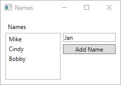
Here's a preview of the app you'll build while following this tutorial:
Prerequisites
Tip
Use Visual Studio 2022 version 17.4 or later and install both the .NET 7 and .NET 6 individual components. Support for .NET 7 was added in Visual Studio 2022 version 17.4.
Create a WPF app
The first step to creating a new app is opening Visual Studio and generating the app from a template.
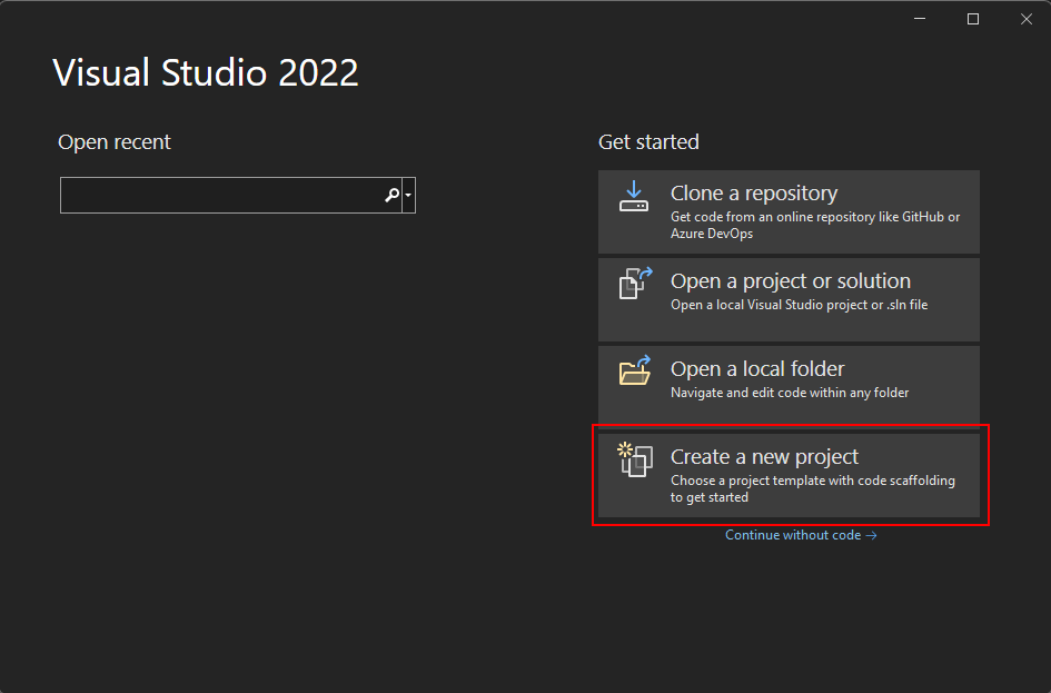
Open Visual Studio.
Select Create a new project.
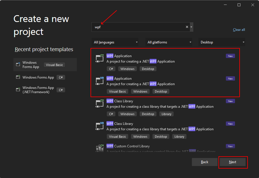
In the Search for templates box, type wpf, and then press Enter.
In the code language dropdown, choose C# or Visual Basic.
In the templates list, select WPF Application and then select Next.
Important
Don't select the WPF Application (.NET Framework) template.
The following image shows both C# and Visual Basic .NET project templates. If you applied the code language filter, you'll see the corresponding template.
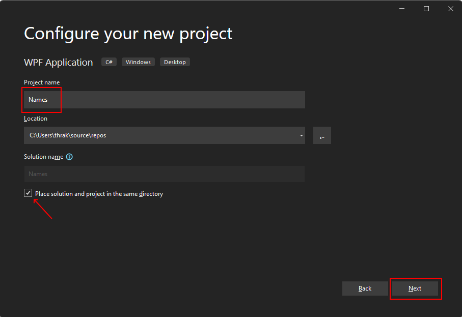
In the Configure your new project window, do the following:
- In the Project name box, enter Names.
- Select the Place solution and project in the same directory check box.
- Optionally, choose a different Location to save your code.
- Select the Next button.
In the Additional information window, select .NET 6.0 (Long-term support) for Target Framework. Select the Create button.
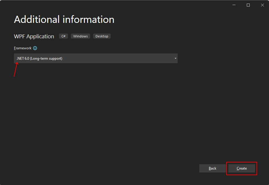
Open Visual Studio.
Select Create a new project.

In the Search for templates box, type wpf, and then press Enter.
In the code language dropdown, choose C# or Visual Basic.
In the templates list, select WPF Application and then select Next.
Important
Don't select the WPF Application (.NET Framework) template.
The following image shows both C# and Visual Basic .NET project templates. If you applied the code language filter, you'll see the corresponding template.

In the Configure your new project window, do the following:
- In the Project name box, enter Names.
- Select the Place solution and project in the same directory check box.
- Optionally, choose a different Location to save your code.
- Select the Next button.

In the Additional information window, select .NET 7.0 (Standard Term Support) for Target Framework. Select the Create button.
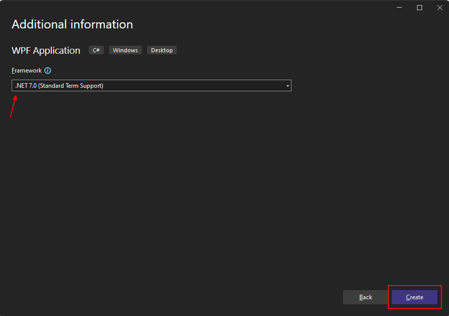
Once the app is generated, Visual Studio should open the XAML designer pane for the default window, MainWindow. If the designer isn't visible, double-click on the MainWindow.xaml file in the Solution Explorer pane to open the designer.
Important parts of Visual Studio
Support for WPF in Visual Studio has five important components that you'll interact with as you create an app:
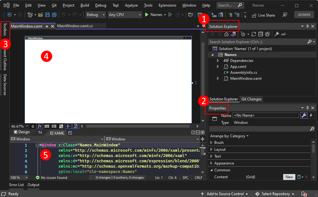
Solution Explorer
All of your project files, code, windows, resources, will appear in this pane.
Properties
This pane shows property settings you can configure based on the item selected. For example, if you select an item from Solution Explorer, you'll see property settings related to the file. If you select an object in the Designer, you'll see settings for that item.
Toolbox
The toolbox contains all of the controls you can add to a form. To add a control to the current form, double-click a control or drag-and-drop the control.
XAML designer
This is the designer for a XAML document. It's interactive and you can drag-and-drop objects from the Toolbox. By selecting and moving items in the designer, you can visually compose the user interface (UI) for your app.
When both the designer and editor are visible, changes to one is reflected in the other. When you select items in the designer, the Properties pane displays the properties and attributes about that object.
XAML code editor
This is the XAML code editor for a XAML document. The XAML code editor is a way to craft your UI by hand without a designer. The designer may infer the values of properties on a control when the control is added in the designer. The XAML code editor gives you a lot more control.
When both the designer and editor are visible, changes to one is reflected in the other. As you navigate the text caret in the code editor, the Properties pane displays the properties and attributes about that object.
Examine the XAML
After your project is created, the XAML code editor is visible with a minimal amount of XAML code to display the window. If the editor isn't open, double-click the MainWindow.xaml item in the Solution Explorer. You should see XAML similar to the following example:
<Window x:Class="Names.MainWindow"
        xmlns="http://schemas.microsoft.com/winfx/2006/xaml/presentation"
        xmlns:x="http://schemas.microsoft.com/winfx/2006/xaml"
        xmlns:d="http://schemas.microsoft.com/expression/blend/2008"
        xmlns:mc="http://schemas.openxmlformats.org/markup-compatibility/2006"
        xmlns:local="clr-namespace:Names"
        mc:Ignorable="d"
        Title="MainWindow" Height="450" Width="800">
    <Grid>

    </Grid>
</Window>
Let's break down this XAML code to understand it better. XAML is simply XML that can be processed by the compilers that WPF uses. It describes the WPF UI and interacts with .NET code. To understand XAML, you should, at a minimum, be familiar with the basics of XML.
The document root <Window> represents the type of object being described by the XAML file. There are eight attributes declared, and they generally belong to three categories:
Namespaces
An XML namespace provides structure to the XML, determining what XML content can be declared in the file.
The main
xmlnsattribute imports the XML namespace for the entire file, and in this case, maps to the types declared by WPF. The other XML namespaces declare a prefix and import other types and objects for the XAML file. For example, thexmlns:localnamespace declares thelocalprefix and maps to the objects declared by your project, the ones declared in theNamescode namespace.x:ClassattributeThis attribute maps the
<Window>to the type defined by your code: the MainWindow.xaml.cs or MainWindow.xaml.vb file, which is theNames.MainWindowclass.TitleattributeAny normal attribute declared on the XAML object sets a property of that object. In this case, the
Titleattribute sets theWindow.Titleproperty.
Change the window
First, run the project and see the default output. You'll see a window that pops up, without any controls, and a title of MainWindow:
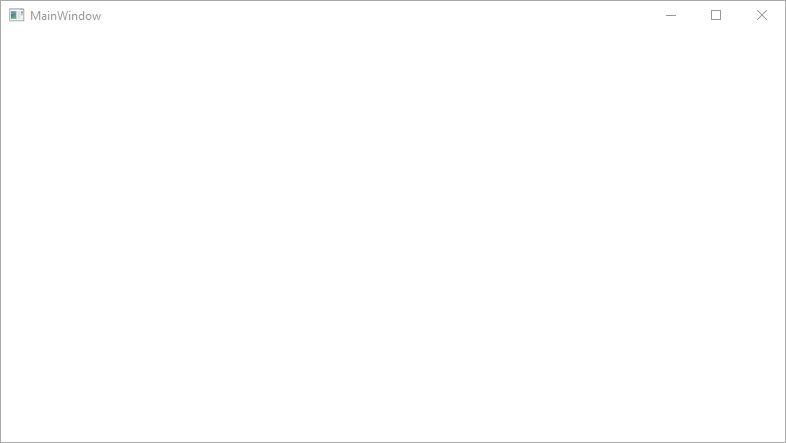
For our example app, this window is too large, and the title bar isn't descriptive. Change the title and size of the window by changing the appropriate attributes in the XAML to the following values:
<Window x:Class="Names.MainWindow"
        xmlns="http://schemas.microsoft.com/winfx/2006/xaml/presentation"
        xmlns:x="http://schemas.microsoft.com/winfx/2006/xaml"
        xmlns:d="http://schemas.microsoft.com/expression/blend/2008"
        xmlns:mc="http://schemas.openxmlformats.org/markup-compatibility/2006"
        xmlns:local="clr-namespace:Names"
        mc:Ignorable="d"
        Title="Names" Height="180" Width="260">
    <Grid>

    </Grid>
</Window>
Prepare the layout
WPF provides a powerful layout system with many different layout controls. Layout controls help place and size child controls, and can even do so automatically. The default layout control provided to you in this XAML is the <Grid> control.
The Grid control lets you define rows and columns, much like a table, and place controls within the bounds of a specific row and column combination. You can have any number of child controls or other layout controls added to the Grid. For example, you can place another Grid control in a specific row and column combination, and that new Grid can then define more rows and columns and have its own children.
The <Grid> control defines rows and columns in which your controls will be. A grid always has a single row and column declared, meaning, the grid by default is a single cell. That doesn't really give you much flexibility in placing controls.
Before we add the new rows and columns, add a new attribute to the <Grid> element: Margin="10". This insets the grid from the window and makes it look a little nicer.
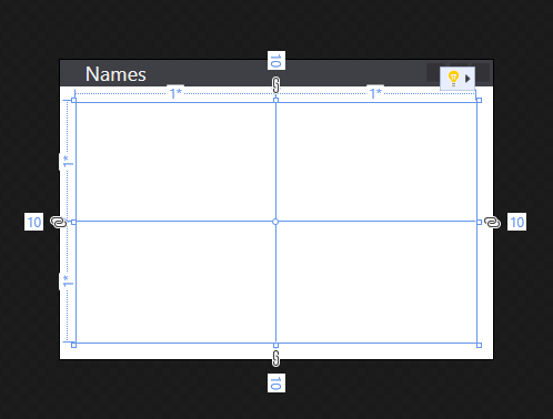
Next, define two rows and two columns, dividing the grid into four cells:
<Grid Margin="10">

    <Grid.RowDefinitions>
        <RowDefinition Height="*" />
        <RowDefinition Height="*" />
    </Grid.RowDefinitions>

    <Grid.ColumnDefinitions>
        <ColumnDefinition Width="*" />
        <ColumnDefinition Width="*" />
    </Grid.ColumnDefinitions>

</Grid>
Select the grid in either the XAML code editor or XAML designer, you'll see that the XAML designer shows each row and column:
Add the first control
Now that the grid has been created, we can start adding controls to it. First, start with the label control. Create a new <Label> element inside the <Grid> element, after the row and column definitions, and give it a string value of Names:
<Grid Margin="10">

    <Grid.RowDefinitions>
        <RowDefinition Height="*" />
        <RowDefinition Height="*" />
    </Grid.RowDefinitions>

    <Grid.ColumnDefinitions>
        <ColumnDefinition Width="*" />
        <ColumnDefinition Width="*" />
    </Grid.ColumnDefinitions>

    <Label>Names</Label>

</Grid>
The <Label>Names</Label> defines the content Names. Some controls understand how to handle content, others don't. The content of a control maps to the Content property. Setting the content through XAML attribute syntax, you would use this format: <Label Content="Names" />. Both ways accomplish the same thing, setting the content of the label to display the text Names.
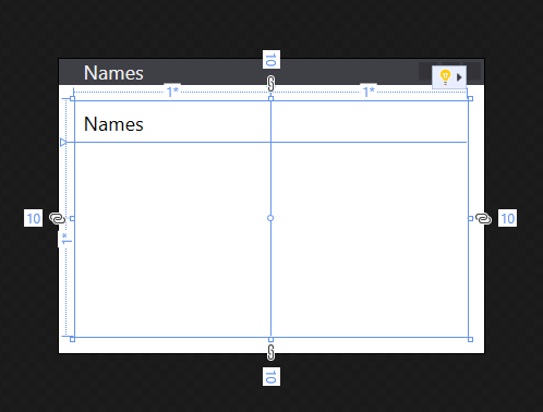
We have a problem though, the label takes up half the window as it was automatically assigned to the first row and column of the grid. For our first row, we don't need that much space because we're only going to use that row for the label. Change the Height attribute of the first <RowDefinition> from * to Auto. The Auto value automatically sizes the grid row to the size of its contents, in this case, the label control.
<Grid.RowDefinitions>
    <RowDefinition Height="Auto" />
    <RowDefinition Height="*" />
</Grid.RowDefinitions>
Notice that the designer now shows the label occupying a small amount of the available height. There's now more room for the next row to occupy. Most controls define some sort of height and width value that they should occupy that looks best for them. For example, the label control has a height value that ensures that you can read it.
Control placement
Let's talk about control placement. The label created in the section above was automatically placed in row 0 and column 0 of the grid. The numbering for rows and columns starts at 0 and increments by 1 for each new row or column. The control doesn't know anything about the grid, and the control doesn't define any properties to control its placement within the grid. The control could have even been placed within some other layout control that has its own set of rules defining how to place controls.
How do you tell a control to use a different row or column when the control has no knowledge of the grid? Attached properties! The grid takes advantage of the powerful property system provided by WPF. The grid defines new properties that the child controls can declare and use. The properties don't actually exist on the control itself, they're attached by the grid when the control is added to the grid.
The grid defines two properties to determine the row and column placement of a child control: Grid.Row and Grid.Column. If these properties are omitted from the control, it's implied that they have the default values of 0, so, the control is placed in row 0 and column 0 of the grid. Try changing the placement of the <Label> control by setting the Grid.Column attribute to 1:
<Label Grid.Column="1">Names</Label>
Notice how your label now moved to the second column. You can use the Grid.Row and Grid.Column attached properties to place the next controls we'll create. For now though, restore the label to column 0.
Create the name list box
Now that the grid is correctly sized and the label created, add a list box control on the row below the label. The list box will be in row 1 and column 0. We'll also give this control the name of lstNames. Once a control is named, it can be referenced in the code-behind. The name is assigned to the control with the x:Name attribute.
<Grid Margin="10">

    <Grid.RowDefinitions>
        <RowDefinition Height="Auto" />
        <RowDefinition Height="*" />
    </Grid.RowDefinitions>

    <Grid.ColumnDefinitions>
        <ColumnDefinition Width="*" />
        <ColumnDefinition Width="*" />
    </Grid.ColumnDefinitions>

    <Label>Names</Label>
    <ListBox Grid.Row="1" x:Name="lstNames" />

</Grid>
Add the remaining controls
The last two controls we'll add are a text box and a button, which the user will use to enter a name to add to the list box. However, instead of trying to create more rows and columns for the grid, we'll put these controls into the <StackPanel> layout control.
The stack panel differs from the grid in how the controls are placed. While you tell the grid where you want the controls to be with the Grid.Row and Grid.Column attached properties, the stack panel works automatically by placing the first control, then placing the next control after it, continuing until all controls have been placed. It "stacks" each control below the other.
Create the <StackPanel> control after the list box and put it in grid row 1 column 1. Add another attribute named Margin with a value of 5,0,0,0:
<Grid.RowDefinitions>
    <RowDefinition Height="Auto" />
    <RowDefinition Height="*" />
</Grid.RowDefinitions>

<Grid.ColumnDefinitions>
    <ColumnDefinition Width="*" />
    <ColumnDefinition Width="*" />
</Grid.ColumnDefinitions>

<Label>Names</Label>
<ListBox Grid.Row="1" x:Name="lstNames" />

<StackPanel Grid.Row="1" Grid.Column="1" Margin="5,0,0,0">

</StackPanel>
The Margin attribute was previously used on the grid, but we only put in a single value, 10. Now we've used a value of 5,0,0,0 on the stack panel. The margin is a Thickness type and can interpret both values. A thickness defines the space around each side of a rectangular frame, left, top, right, bottom, respectively. If the value for the margin is a single value, it uses that value for all four sides.
Next, create a <TextBox> and <Button> control in the <StackPanel>.
<StackPanel Grid.Row="1" Grid.Column="1" Margin="5,0,0,0">
    <TextBox x:Name="txtName" />
    <Button x:Name="btnAdd" Margin="0,5,0,0">Add Name</Button>
</StackPanel>
The layout for the window is complete. However, our app doesn't have any logic in it to actually be functional. Next, we need to hook up the control events to code and get the app to actually do something.
Add code for the Click event
The <Button> we created has a Click event that is raised when the user presses the button. You can subscribe to this event and add code to add a name to the list box. Just like you set a property on a control by adding a XAML attribute, you can use a XAML attribute to subscribe to an event. Set the Click attribute to ButtonAddName_Click
<StackPanel Grid.Row="1" Grid.Column="1" Margin="5,0,0,0">
    <TextBox x:Name="txtName" />
    <Button x:Name="btnAdd" Margin="0,5,0,0" Click="ButtonAddName_Click">Add Name</Button>
</StackPanel>
Now you need to generate the handler code. Right-click on ButtonAddName_Click and select Go To Definition. This action generates a method in the code-behind for you that matches the handler name you've entered.
private void ButtonAddName_Click(object sender, RoutedEventArgs e)
{

}
Private Sub ButtonAddName_Click(sender As Object, e As RoutedEventArgs)

End Sub
Next, add the following code to do these three steps:
- Make sure that the text box contains a name.
- Validate that the name entered in the text box doesn't already exist.
- Add the name to the list box.
private void ButtonAddName_Click(object sender, RoutedEventArgs e)
{
    if (!string.IsNullOrWhiteSpace(txtName.Text) && !lstNames.Items.Contains(txtName.Text))
    {
        lstNames.Items.Add(txtName.Text);
        txtName.Clear();
    }
}
Private Sub ButtonAddName_Click(sender As Object, e As RoutedEventArgs)
    If Not String.IsNullOrWhiteSpace(txtName.Text) And Not lstNames.Items.Contains(txtName.Text) Then
        lstNames.Items.Add(txtName.Text)
        txtName.Clear()
    End If
End Sub
Run the app
Now that the event has been coded, you can run the app by pressing the F5 key or by selecting Debug > Start Debugging from the menu. The window is displayed and you can enter a name in the textbox and then add it by clicking the button.

Next steps
.NET Desktop feedback
