Display menu items
The .NET Multi-platform App UI (.NET MAUI) MenuItem class can be used to define menu items for menus such as ListView item context menus and Shell app flyout menus.
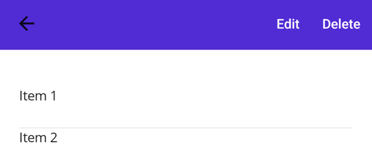
The following screenshots show MenuItem objects in a ListView context menu on Android:

The MenuItem class defines the following properties:
- Command, of type ICommand, allows binding user actions, such as finger taps or clicks, to commands defined on a viewmodel.
- CommandParameter, of type
object, specifies the parameter that should be passed to theCommand. - IconImageSource, of type ImageSource, defines the menu item icon.
- IsDestructive, of type
bool, indicates whether the MenuItem removes its associated UI element from the list. - IsEnabled, of type
bool, indicates whether the menu item responds to user input. - Text, of type
string, specifies the menu item text.
These properties are backed by BindableProperty objects, which means that they can be targets of data bindings.
Create a MenuItem
To create a menu item, for example as a context menu on a ListView object's items, create a MenuItem object within a ViewCell object that's used as the DataTemplate object for the ListViews ItemTemplate. When the ListView object is populated it will create each item using the DataTemplate, exposing the MenuItem choices when the context menu is activated for an item.
The following example shows how to create a MenuItem within the context of a ListView object:
<ListView>
    <ListView.ItemTemplate>
        <DataTemplate>
            <ViewCell>
                <ViewCell.ContextActions>
                    <MenuItem Text="Context menu option" />
                </ViewCell.ContextActions>
                <Label Text="{Binding .}" />
            </ViewCell>
        </DataTemplate>
    </ListView.ItemTemplate>
</ListView>
This example will result in a MenuItem object that has text. However, the appearance of a MenuItem varies across platforms.
A MenuItem can also be created in code:
// Return a ViewCell instance that is used as the template for each list item
DataTemplate dataTemplate = new DataTemplate(() =>
{
    // A Label displays the list item text
    Label label = new Label();
    label.SetBinding(Label.TextProperty, ".");

    // A ViewCell serves as the DataTemplate
    ViewCell viewCell = new ViewCell
    {
        View = label
    };

    // Add a MenuItem to the ContextActions
    MenuItem menuItem = new MenuItem
    {
        Text = "Context Menu Option"
    };
    viewCell.ContextActions.Add(menuItem);

    // Return the custom ViewCell to the DataTemplate constructor
    return viewCell;
});

ListView listView = new ListView
{
    ...
    ItemTemplate = dataTemplate
};
A context menu in a ListView is activated and displayed differently on each platform. On Android, the context menu is activated by long-press on a list item. The context menu replaces the title and navigation bar area and MenuItem options are displayed as horizontal buttons. On iOS, the context menu is activated by swiping on a list item. The context menu is displayed on the list item and MenuItems are displayed as horizontal buttons. On Windows, the context menu is activated by right-clicking on a list item. The context menu is displayed near the cursor as a vertical list.
Define MenuItem behavior
The MenuItem class defines a Clicked event. An event handler can be attached to this event to react to taps or clicks on MenuItem objects:
<MenuItem ...
          Clicked="OnItemClicked" />
An event handler can also be attached in code:
MenuItem item = new MenuItem { ... };
item.Clicked += OnItemClicked;
These examples reference an OnItemClicked event handler, which is shown in the following example:
void OnItemClicked(object sender, EventArgs e)
{
    MenuItem menuItem = sender as MenuItem;

    // Access the list item through the BindingContext
    var contextItem = menuItem.BindingContext;

    // Do something with the contextItem here
}
Define MenuItem appearance
Icons are specified using the IconImageSource property. If an icon is specified, the text specified by the Text property won't be displayed. The following screenshot shows a MenuItem with an icon on Android:
![]()
MenuItem objects only display icons on Android. On other platforms, only the text specified by the Text property will be displayed.
Note
Images can be stored in a single location in your app project. For more information, see Add images to a .NET MAUI project.
Enable or disable a MenuItem at runtime
To enable or disable a MenuItem at runtime, bind its Command property to an ICommand implementation, and ensure that a canExecute delegate enables and disables the ICommand as appropriate.
Important
Don't bind the IsEnabled property to another property when using the Command property to enable or disable the MenuItem.
