Data binding basics
.NET Multi-platform App UI (.NET MAUI) data bindings allow properties of two objects to be linked so that a change in one causes a change in the other. This is a very valuable tool, and while data bindings can be defined entirely in code, XAML provides shortcuts and convenience.
Data bindings
Data bindings connect properties of two objects, called the source and the target. In code, two steps are required:
- The
BindingContextproperty of the target object must be set to the source object, - The
SetBindingmethod (often used in conjunction with theBindingclass) must be called on the target object to bind a property of that object to a property of the source object.
The target property must be a bindable property, which means that the target object must derive from BindableObject. A property of Label, such as Text, is associated with the bindable property TextProperty.
In XAML, you must also perform the same two steps that are required in code, except that the Binding markup extension takes the place of the SetBinding call and the Binding class. However, when you define data bindings in XAML, there are multiple ways to set the BindingContext of the target object. Sometimes it’s set from the code-behind file, sometimes using a StaticResource or x:Static markup extension, and sometimes as the content of BindingContext property-element tags.
View-to-view bindings
You can define data bindings to link properties of two views on the same page. In this case, you set the BindingContext of the target object using the x:Reference markup extension.
The following example contains a Slider and two Label views, one of which is rotated by the Slider value and another which displays the Slider value:
<ContentPage xmlns="http://schemas.microsoft.com/dotnet/2021/maui"
             xmlns:x="http://schemas.microsoft.com/winfx/2009/xaml"
             x:Class="XamlSamples.SliderBindingsPage"
             Title="Slider Bindings Page">
    <StackLayout>
        <Label Text="ROTATION"
               BindingContext="{x:Reference slider}"
               Rotation="{Binding Path=Value}"
               FontAttributes="Bold"
               FontSize="18"
               HorizontalOptions="Center"
               VerticalOptions="Center" />
        <Slider x:Name="slider"
                Maximum="360"
                VerticalOptions="Center" />
        <Label BindingContext="{x:Reference slider}"
               Text="{Binding Value, StringFormat='The angle is {0:F0} degrees'}"
               FontAttributes="Bold"
               FontSize="18"
               HorizontalOptions="Center"
               VerticalOptions="Center" />
    </StackLayout>
</ContentPage>
The Slider contains an x:Name attribute that is referenced by the two Label views using the x:Reference markup extension. The x:Reference binding extension defines a property named Name to set to the name of the referenced element, in this case slider. However, the ReferenceExtension class that defines the x:Reference markup extension also defines a ContentProperty attribute for Name, which means that it isn’t explicitly required.
The Binding markup extension itself can have several properties, just like the BindingBase and Binding class. The ContentProperty for Binding is Path, but the “Path=” part of the markup extension can be omitted if the path is the first item in the Binding markup extension.
The second Binding markup extension sets the StringFormat property. In .NET MAUI, bindings do not perform any implicit type conversions, and if you need to display a non-string object as a string you must provide a type converter or use StringFormat.
Important
Formatting strings must be placed in single quotation marks.
Binding mode
A single view can have data bindings on several of its properties. However, each view can have only one BindingContext, so multiple data bindings on that view must all reference properties of the same object.
The solution to this and other problems involves the Mode property, which is set to a member of the BindingMode enumeration:
DefaultOneWay— values are transferred from the source to the targetOneWayToSource— values are transferred from the target to the sourceTwoWay— values are transferred both ways between source and targetOneTime— data goes from source to target, but only when theBindingContextchanges
The following example demonstrates one common use of the OneWayToSource and TwoWay binding modes:
<ContentPage xmlns="http://schemas.microsoft.com/dotnet/2021/maui"
             xmlns:x="http://schemas.microsoft.com/winfx/2009/xaml"
             x:Class="XamlSamples.SliderTransformsPage"
             Padding="5"
             Title="Slider Transforms Page">
    <Grid>
        <Grid.RowDefinitions>
            <RowDefinition Height="*" />
            <RowDefinition Height="Auto" />
            <RowDefinition Height="Auto" />
            <RowDefinition Height="Auto" />
            <RowDefinition Height="Auto" />
        </Grid.RowDefinitions>
        <Grid.ColumnDefinitions>
            <ColumnDefinition Width="*" />
            <ColumnDefinition Width="Auto" />
        </Grid.ColumnDefinitions>

        <!-- Scaled and rotated Label -->
        <Label x:Name="label"
               Text="TEXT"
               HorizontalOptions="Center"
               VerticalOptions="CenterAndExpand" />

        <!-- Slider and identifying Label for Scale -->
        <Slider x:Name="scaleSlider"
                BindingContext="{x:Reference label}"
                Grid.Row="1" Grid.Column="0"
                Maximum="10"
                Value="{Binding Scale, Mode=TwoWay}" />
        <Label BindingContext="{x:Reference scaleSlider}"
               Text="{Binding Value, StringFormat='Scale = {0:F1}'}"
               Grid.Row="1" Grid.Column="1"
               VerticalTextAlignment="Center" />

        <!-- Slider and identifying Label for Rotation -->
        <Slider x:Name="rotationSlider"
                BindingContext="{x:Reference label}"
                Grid.Row="2" Grid.Column="0"
                Maximum="360"
                Value="{Binding Rotation, Mode=OneWayToSource}" />
        <Label BindingContext="{x:Reference rotationSlider}"
               Text="{Binding Value, StringFormat='Rotation = {0:F0}'}"
               Grid.Row="2" Grid.Column="1"
               VerticalTextAlignment="Center" />

        <!-- Slider and identifying Label for RotationX -->
        <Slider x:Name="rotationXSlider"
                BindingContext="{x:Reference label}"
                Grid.Row="3" Grid.Column="0"
                Maximum="360"
                Value="{Binding RotationX, Mode=OneWayToSource}" />
        <Label BindingContext="{x:Reference rotationXSlider}"
               Text="{Binding Value, StringFormat='RotationX = {0:F0}'}"
               Grid.Row="3" Grid.Column="1"
               VerticalTextAlignment="Center" />

        <!-- Slider and identifying Label for RotationY -->
        <Slider x:Name="rotationYSlider"
                BindingContext="{x:Reference label}"
                Grid.Row="4" Grid.Column="0"
                Maximum="360"
                Value="{Binding RotationY, Mode=OneWayToSource}" />
        <Label BindingContext="{x:Reference rotationYSlider}"
               Text="{Binding Value, StringFormat='RotationY = {0:F0}'}"
               Grid.Row="4" Grid.Column="1"
               VerticalTextAlignment="Center" />
    </Grid>
</ContentPage>
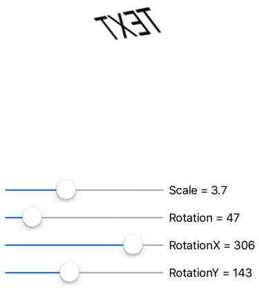
In this example, four Slider views are intended to control the Scale, Rotate, RotateX, and RotateY properties of a Label. At first, it seems as if these four properties of the Label should be data-binding targets because each is being set by a Slider. However, the BindingContext of Label can be only one object, and there are four different sliders. For that reason, the BindingContext of each of the four sliders is set to the Label, and the bindings are set on the Value properties of the sliders. By using the OneWayToSource and TwoWay modes, these Value properties can set the source properties, which are the Scale, Rotate, RotateX, and RotateY properties of the Label.
The bindings on three of the Slider views are OneWayToSource, meaning that the Slider value causes a change in the property of its BindingContext, which is the Label named label. These three Slider views cause changes to the Rotate, RotateX, and RotateY properties of the Label:

However, the binding for the Scale property is TwoWay. This is because the Scale property has a default value of 1, and using a TwoWay binding causes the Slider initial value to be set at 1 rather than 0. If that binding were OneWayToSource, the Scale property would initially be set to 0 from the Slider default value. The Label would not be visible.
Note
The VisualElement class also has ScaleX and ScaleY properties, which scale the VisualElement on the x-axis and y-axis respectively.
Bindings and collections
ListView defines an ItemsSource property of type IEnumerable, and it displays the items in that collection. These items can be objects of any type. By default, ListView uses the ToString method of each item to display that item. Sometimes this is just what you want, but in many cases, ToString returns only the fully-qualified class name of the object.
However, the items in the ListView collection can be displayed any way you want through the use of a template, which involves a class that derives from Cell. The template is cloned for every item in the ListView, and data bindings that have been set on the template are transferred to the individual clones. Custom cells can be created for items using the ViewCell class.
ListView can display a list of every named color that's available in .NET MAUI, with the help of the NamedColor class:
using System.Reflection;
using System.Text;

namespace XamlSamples
{
    public class NamedColor
    {
        public string Name { get; private set; }
        public string FriendlyName { get; private set; }
        public Color Color { get; private set; }

        // Expose the Color fields as properties
        public float Red => Color.Red;
        public float Green => Color.Green;
        public float Blue => Color.Blue;

        public static IEnumerable<NamedColor> All { get; private set; }

        static NamedColor()
        {
            List<NamedColor> all = new List<NamedColor>();
            StringBuilder stringBuilder = new StringBuilder();

            // Loop through the public static fields of the Color structure.
            foreach (FieldInfo fieldInfo in typeof(Colors).GetRuntimeFields())
            {
                if (fieldInfo.IsPublic &&
                    fieldInfo.IsStatic &&
                    fieldInfo.FieldType == typeof(Color))
                {
                    // Convert the name to a friendly name.
                    string name = fieldInfo.Name;
                    stringBuilder.Clear();
                    int index = 0;

                    foreach (char ch in name)
                    {
                        if (index != 0 && Char.IsUpper(ch))
                        {
                            stringBuilder.Append(' ');
                        }
                        stringBuilder.Append(ch);
                        index++;
                    }

                    // Instantiate a NamedColor object.
                    NamedColor namedColor = new NamedColor
                    {
                        Name = name,
                        FriendlyName = stringBuilder.ToString(),
                        Color = (Color)fieldInfo.GetValue(null)
                    };

                    // Add it to the collection.
                    all.Add(namedColor);
                }
            }
            all.TrimExcess();
            All = all;
        }
    }
}
Each NamedColor object has Name and FriendlyName properties of type string, a Color property of type Color, and Red, Green, and Blue properties. In addition, the NamedColor static constructor creates an IEnumerable<NamedColor> collection that contains NamedColor objects corresponding to the fields of type Color in the Colors class, and assigns it to its public static All property.
Setting the static NamedColor.All property to the ItemsSource of a ListView can be achieved using the x:Static markup extension:
<ContentPage xmlns="http://schemas.microsoft.com/dotnet/2021/maui"
             xmlns:x="http://schemas.microsoft.com/winfx/2009/xaml"
             xmlns:local="clr-namespace:XamlSamples;assembly=XamlSamples"
             x:Class="XamlSamples.ListViewDemoPage"
             Title="ListView Demo Page">
    <ListView ItemsSource="{x:Static local:NamedColor.All}" />
</ContentPage>
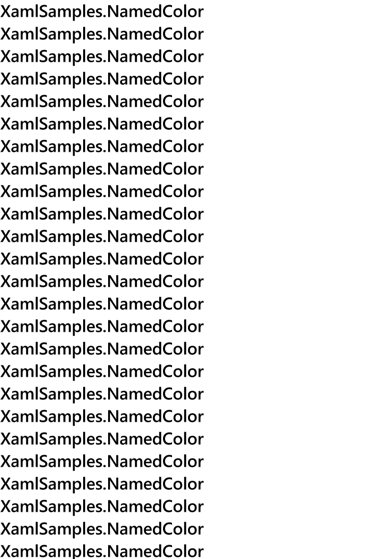
The result establishes that the items are of type XamlSamples.NamedColor:

To define a template for the items, the ItemTemplate should be set to a DataTemplate that references a ViewCell. The ViewCell should define a layout of one or more views to display each item:
<ListView ItemsSource="{x:Static local:NamedColor.All}">
    <ListView.ItemTemplate>
        <DataTemplate>
            <ViewCell>
                <Label Text="{Binding FriendlyName}" />
            </ViewCell>
        </DataTemplate>
    </ListView.ItemTemplate>
</ListView>
Note
The binding source for cells, and children of cells, is the ListView.ItemsSource collection.
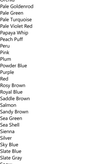
In this example, the Label element is set to the View property of the ViewCell. The ViewCell.View tags are not needed because the View property is the content property of ViewCell. This XAML displays the FriendlyName property of each NamedColor object:

The item template can be expanded to display more information and the actual color:
<ContentPage xmlns="http://schemas.microsoft.com/dotnet/2021/maui"
             xmlns:x="http://schemas.microsoft.com/winfx/2009/xaml"
             xmlns:local="clr-namespace:XamlSamples"
             x:Class="XamlSamples.ListViewDemoPage"
             Title="ListView Demo Page">
    <ContentPage.Resources>
        <x:Double x:Key="boxSize">50</x:Double>
        <x:Int32 x:Key="rowHeight">60</x:Int32>
        <local:FloatToIntConverter x:Key="intConverter" />
    </ContentPage.Resources>

    <ListView ItemsSource="{x:Static local:NamedColor.All}"
              RowHeight="{StaticResource rowHeight}">
        <ListView.ItemTemplate>
            <DataTemplate>
                <ViewCell>
                    <StackLayout Padding="5, 5, 0, 5"
                                 Orientation="Horizontal"
                                 Spacing="15">
                        <BoxView WidthRequest="{StaticResource boxSize}"
                                 HeightRequest="{StaticResource boxSize}"
                                 Color="{Binding Color}" />
                        <StackLayout Padding="5, 0, 0, 0"
                                     VerticalOptions="Center">
                            <Label Text="{Binding FriendlyName}"
                                   FontAttributes="Bold"
                                   FontSize="14" />
                            <StackLayout Orientation="Horizontal"
                                         Spacing="0">
                                <Label Text="{Binding Red,
                                                      Converter={StaticResource intConverter},
                                                      ConverterParameter=255,
                                                      StringFormat='R={0:X2}'}" />
                                <Label Text="{Binding Green,
                                                      Converter={StaticResource intConverter},
                                                      ConverterParameter=255,
                                                      StringFormat=', G={0:X2}'}" />
                                <Label Text="{Binding Blue,
                                                      Converter={StaticResource intConverter},
                                                      ConverterParameter=255,
                                                      StringFormat=', B={0:X2}'}" />
                            </StackLayout>
                        </StackLayout>
                    </StackLayout>
                </ViewCell>
            </DataTemplate>
        </ListView.ItemTemplate>
    </ListView>
</ContentPage>
Binding value converters
The previous XAML example displays the individual Red, Green, and Blue properties of each NamedColor. These properties are of type float and range from 0 to 1. If you want to display the hexadecimal values, you can’t simply use StringFormat with an “X2” formatting specification. That only works for integers and besides, the float values need to be multiplied by 255.
This issue can be solved with a value converter, also called a binding converter. This is a class that implements the IValueConverter interface, which means it has two methods named Convert and ConvertBack. The Convert method is called when a value is transferred from source to target. The ConvertBack method is called for transfers from target to source in OneWayToSource or TwoWay bindings:
using System.Globalization;

namespace XamlSamples
{
    public class FloatToIntConverter : IValueConverter
    {
        public object Convert(object value, Type targetType, object parameter, CultureInfo culture)
        {
            float multiplier;

            if (!float.TryParse(parameter as string, out multiplier))
                multiplier = 1;

            return (int)Math.Round(multiplier * (float)value);
        }

        public object ConvertBack(object value, Type targetType, object parameter, CultureInfo culture)
        {
            float divider;

            if (!float.TryParse(parameter as string, out divider))
                divider = 1;

            return ((float)(int)value) / divider;
        }
    }
}
Note
The ConvertBack method does not play a role in this example because the bindings are only one way from source to target.
A binding references a binding converter with the Converter property. A binding converter can also accept a parameter specified with the ConverterParameter property. For some versatility, this is how the multiplier is specified. The binding converter checks the converter parameter for a valid float value.
The converter is instantiated in the page's resource dictionary so it can be shared among multiple bindings:
<local:FloatToIntConverter x:Key="intConverter" />
Three data bindings reference this single instance:
<Label Text="{Binding Red,
                      Converter={StaticResource intConverter},
                      ConverterParameter=255,
                      StringFormat='R={0:X2}'}" />
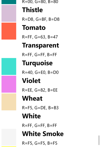
The item template dsplays the color, its friendly name, and its RGB values:

The ListView can handle changes that dynamically occur in the underlying data, but only if you take certain steps. If the collection of items assigned to the ItemsSource property of the ListView changes during runtime, use an ObservableCollection<T> class for these items. ObservableCollection<T> implements the INotifyCollectionChanged interface, and ListView will install a handler for the CollectionChanged event.
If properties of the items themselves change during runtime, then the items in the collection should implement the INotifyPropertyChanged interface and signal changes to property values using the PropertyChanged event.
Next steps
Data bindings provide a powerful mechanism for linking properties between two objects within a page, or between visual objects and underlying data. But when the application begins working with data sources, a popular app architectural pattern begins to emerge as a useful paradigm.
 Browse the sample