Custom Bottom Navigation View
Important
This article describes functionality and guidance that is in public preview and may be substantially modified before it's generally available. Microsoft makes no warranties, express or implied, with respect to the information provided here.
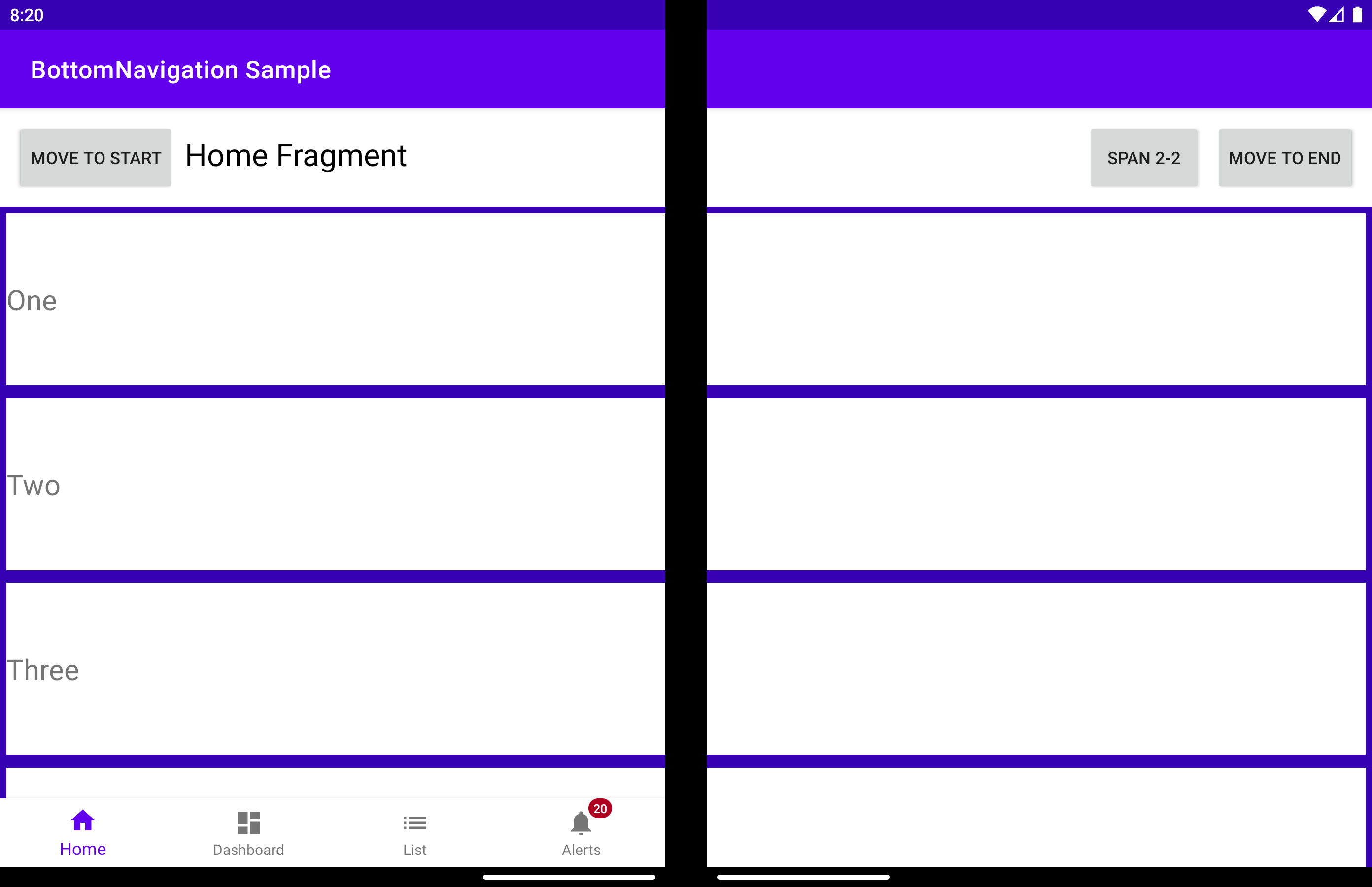
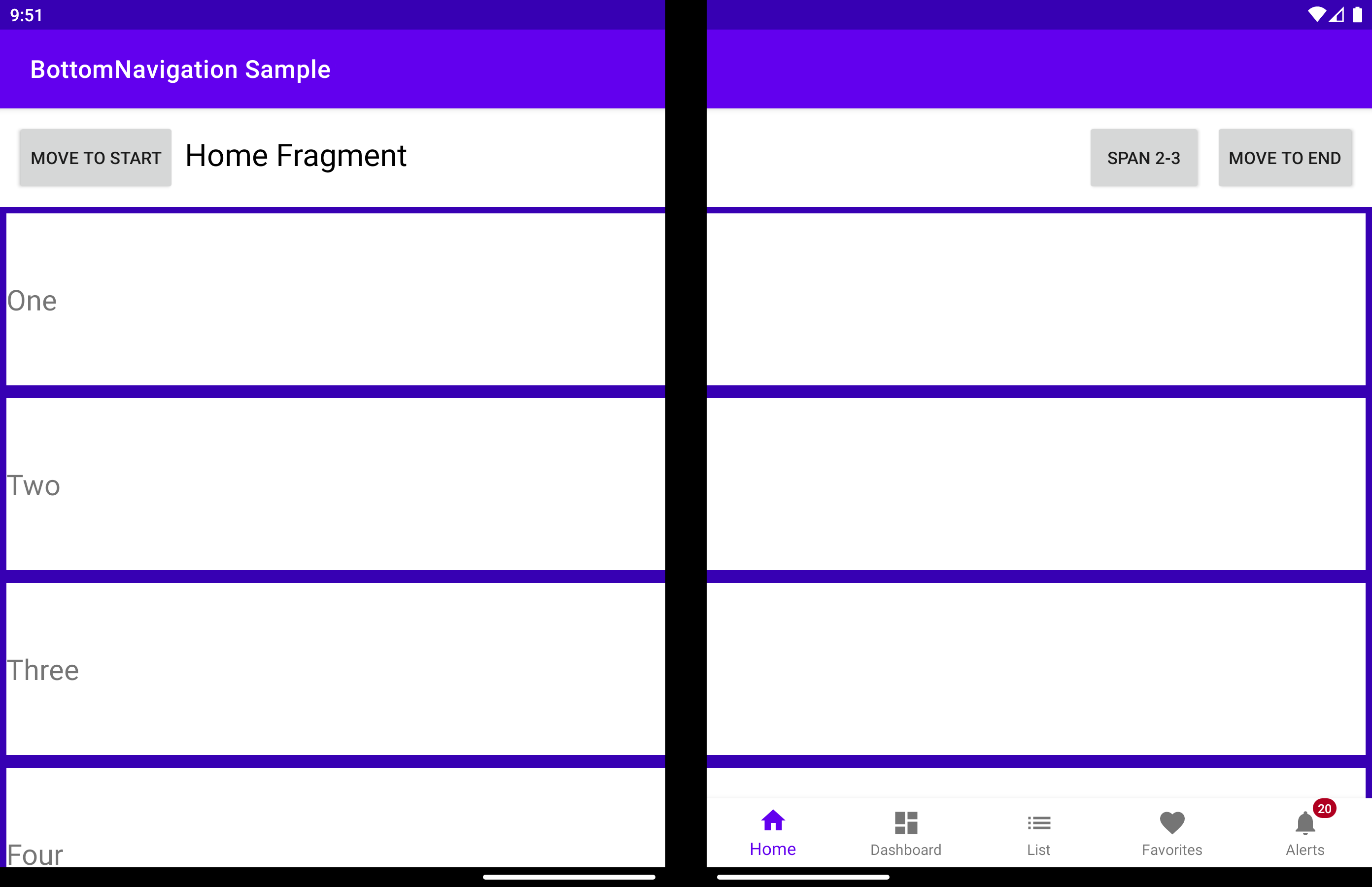
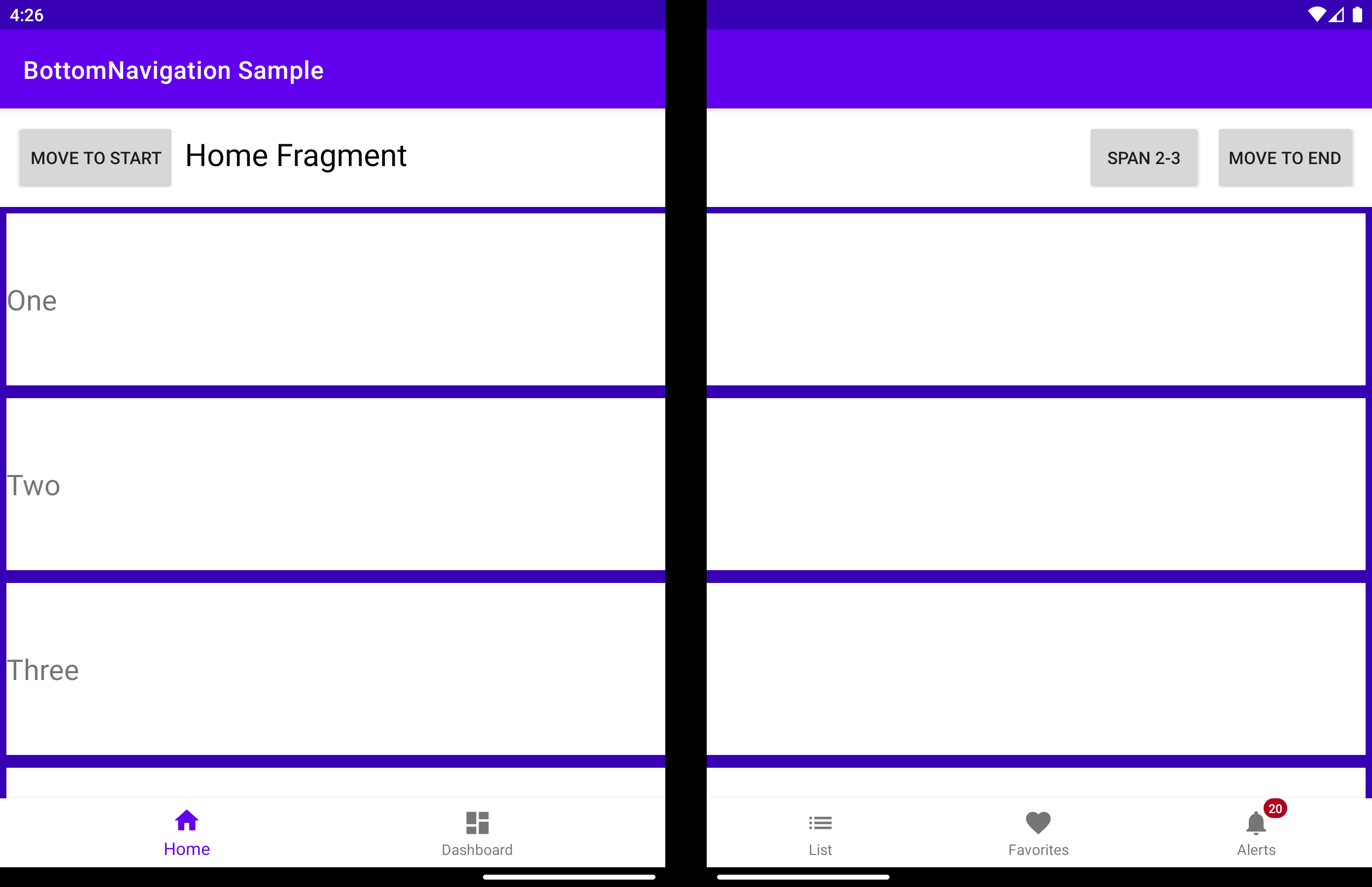
The BottomNavigationView is a BottomNavigationView that can detect a folding feature and positions its child views on the left or on the right of it.
displayPosition - Determines on which screen the view will render. Can be one of the three values:
DisplayPosition.START- grouped on the left of the folding feature.
DisplayPosition.END- grouped on the right of the folding feature.
DisplayPosition.DUAL- spanned across the entire screen (might appear under hinge).
The same can be obtained using the app:display_position attribute:
<com.microsoft.device.dualscreen.bottomnavigation.BottomNavigationView
    android:id="@+id/nav_view"
    android:layout_width="match_parent"
    android:layout_height="wrap_content"
    app:menu="@menu/bottom_nav_menu"
    tool:tools_application_mode="dual_screen"
    .....
    app:display_position="start"
     />
arrangeButtons - When the application is spanned over the folding feature and the component has an odd number of buttons, the middle one will be covered by the hinge (if the device has a physical hinge). One way to avoid this is to arrange the buttons differently on each screen:
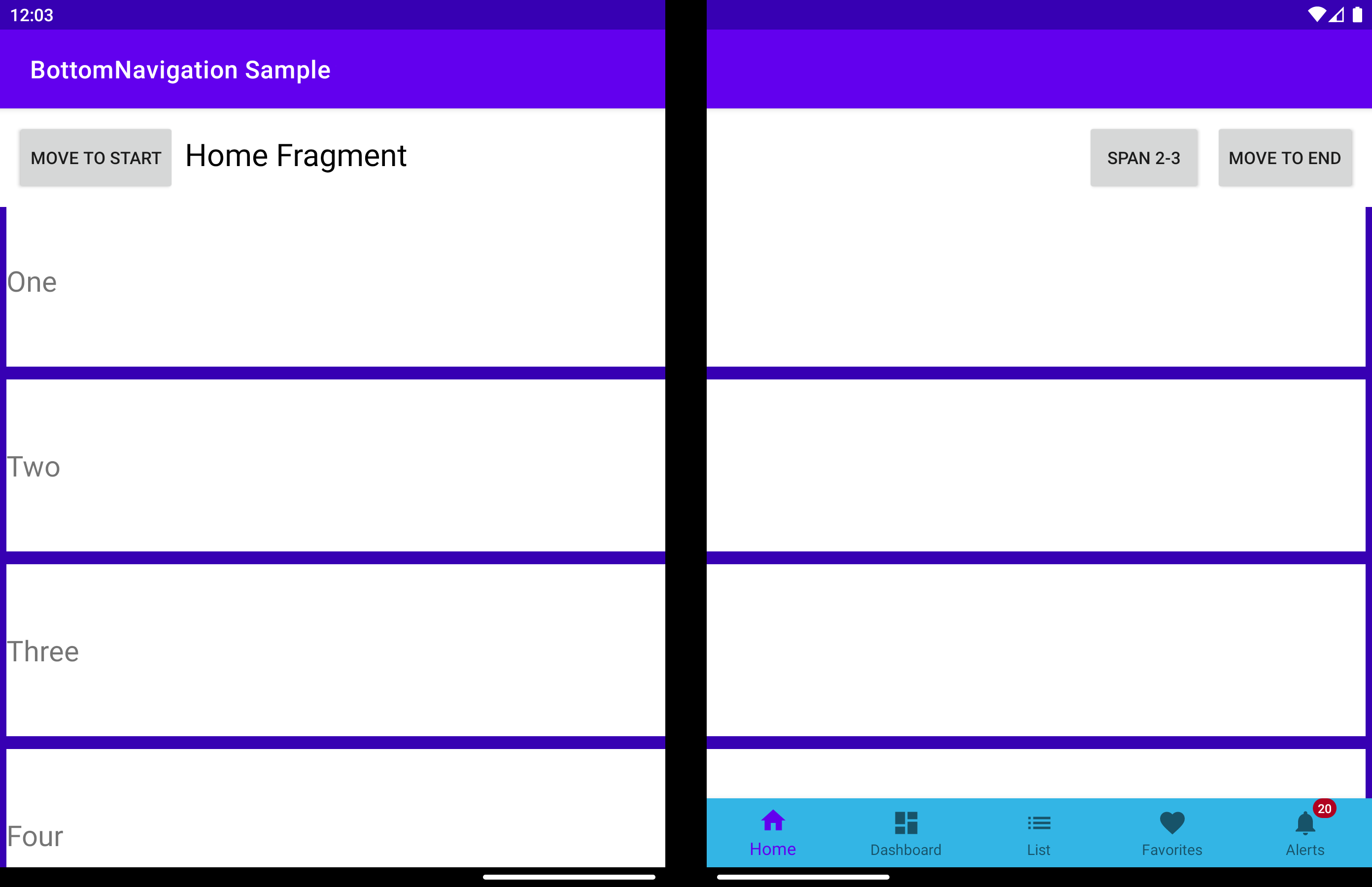
useTransparentBackground - When the application is spanned across the entire width of the screen and part of the component does not contain any buttons, the background on that part of the screen can be made transparent:
useAnimation - Determines if an animation is used when the arrangement of buttons is changed. By default, the AccelerateDecelerateInterpolator will be used. With the help of animationInterpolator property this can be changed to any other interpolator.
bottomNavigationView.useAnimation = true
bottomNavigationView.animationInterpolator = OvershootInterpolator()
allowFlingGesture - If set to true, the displayPosition can be set to DisplayPosition.START or DisplayPosition.END with a fling gesture on the component.

