General user experience adjustments
Important
This content is archived and is not being updated. For the latest documentation, see Microsoft Dynamics 365 product documentation. For the latest release plans, see Dynamics 365 and Microsoft Power Platform release plans.
| Enabled for | Public preview | General availability |
|---|---|---|
| End users, automatically |  Aug 1, 2019 Aug 1, 2019 |
 Oct 1, 2019 Oct 1, 2019 |
Business value
Business users often work across productivity and business apps to complete their tasks. As they transition back and forth, differences in user experiences cause friction and lost productivity.
Feature details
Continuing our familiar look and feel across Dynamics 365 and Office 365, this update includes the addition of more fluent design elements and subtle stylistic changes to buttons, list headers, and captions on parts.
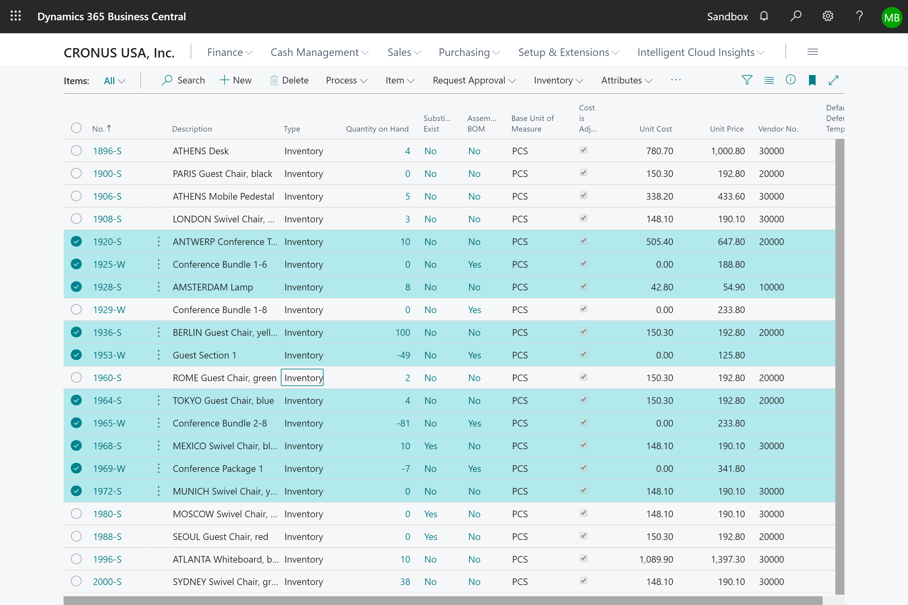
Rows have minor stylistic improvements and a new indicator when selecting multiple records.
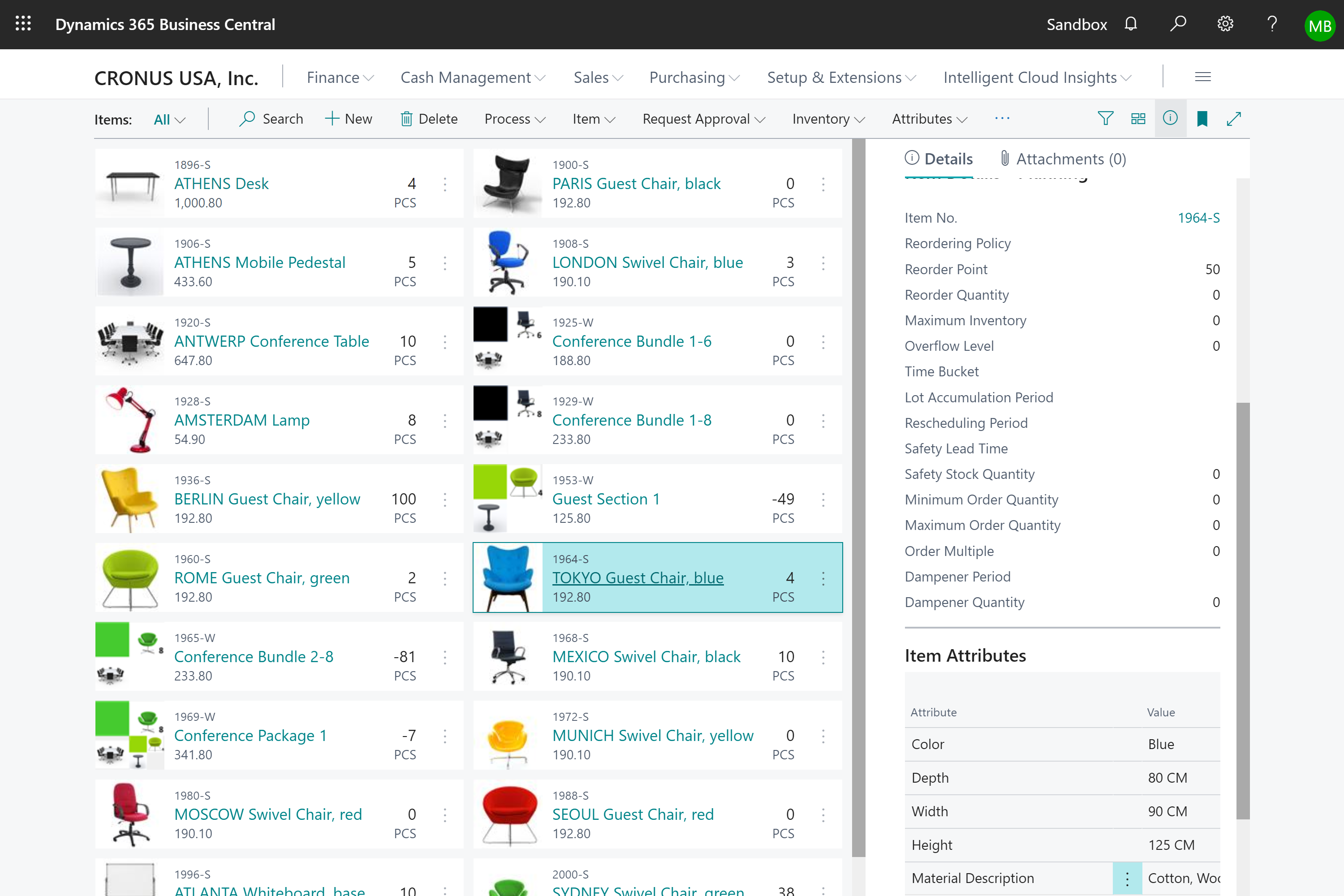
A number of aesthetic and usability issues were also addressed for records shown as bricks:
- Bricks adapt to fill the available horizontal space.
- In past releases, clicking anywhere on a brick would drill down to the details of the record. This had various shortcomings such as requiring precision-clicking to set focus to the brick so that related FactBoxes can be displayed. New click targets now provide more clear differentiation between clicking to select and clicking to drill down.
- The Ctrl+C keyboard shortcut to copy a single brick has also been enabled.
Role Centers no longer automatically separate root-level actions from action groups. The sequence in which they were defined in code is respected and reflected in the client for each action area. For example, on a Role Center, actions can now be displayed in the sequence of action, then action group, then action.


Tell us what you think
Help us improve Dynamics 365 Business Central by discussing ideas, providing suggestions, and giving feedback. Use the forum at https://aka.ms/bcideas.