Updates to page styling
Important
This content is archived and is not being updated. For the latest documentation, see Microsoft Dynamics 365 product documentation. For the latest release plans, see Dynamics 365 and Microsoft Power Platform release plans.
| Enabled for | Public preview | General availability |
|---|---|---|
| Users, automatically |  Jul 28, 2020
 |
 Oct 1, 2020
 |
Feature details
We're styling things slightly differently for the browser experience to align with other Dynamics 365 apps, to allow for more flexibility when designing pages, and to solve some of the feedback you have provided over the past few months.
Changes to task dialogs
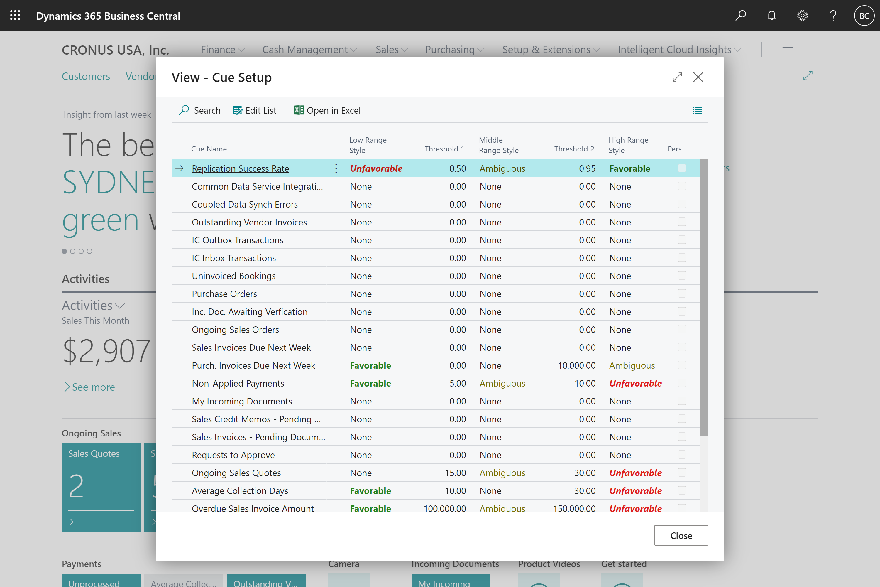
Dialogs create focus on completing the current task by displaying modally and having clear and specific commands to exit the dialog. The following changes were applied to all task dialogs:
- Task dialogs are now displayed in the middle of the screen.
- Actions are presented below the page caption in task dialogs.
- Consistent ways to close a dialog or abandon a lookup.
- Consistent experience for showing the FactBox pane on task dialogs.
- Consistent experience for maximizing any task dialog, both vertically and horizontally.

Examples of task dialogs include advanced lookups, pages run modally, pages of type StandardDialog, ConfirmationDialog and NavigatePage, and any report or XmlPort request page.
Improved use of space for embedded lists
We've completed more fine-tuning of how list parts are displayed in pages with complex layouts:
- List parts placed inside a group now stretch to fill the available space.
- List parts and list repeaters placed inside pages of type NavigatePage and StandardDialog now fill the dialog.
- Pages with multiple list parts split by nested groups no longer waste space.
- Card pages having a group followed by a list part now stretch to fill the available space.
Other stylistic changes
- Adjustments to fonts and font sizing, including removing the use of the Bahnschrift font.
- Minor adjustments to message dialogs, such as choice or error dialogs.
Some adjustments might be needed to your control add-ins if you have implemented add-ins that seamlessly integrate into the Business Central client and imitate Business Central's styling.
Try it now
To experience an example of the change, sign in to Business Central and navigate to the Time Zones lookup from the My Settings window.
Tell us what you think
Help us improve Dynamics 365 Business Central by discussing ideas, providing suggestions, and giving feedback. Use the forum at https://aka.ms/bcIdeas.