Real-Time Intelligence tutorial part 5: Create a Power BI report
Note
This tutorial is part of a series. For the previous section, see: Tutorial part 4: Create a Real-Time dashboard.
A Power BI report is a multi-perspective view into a semantic model, with visuals that represent findings and insights from that semantic model. In this section, you use a KQL query output to create a new Power BI report.
Build a Power BI report
From the navigation bar, select the KQL queryset you created in a previous step, named TutorialQueryset.
Copy and paste the following query into the query editor. The output of this query is used as the semantic model for building the Power BI report.
TutorialTable
| summarize arg_max(Timestamp, No_Bikes,  No_Empty_Docks, Neighbourhood, Lat=todouble(Latitude), Lon=todouble(Longitude)) by BikepointID
Select Power BI. The Power BI report editor opens with the query result available as a data source named Kusto Query Result.
Add visualizations to the report
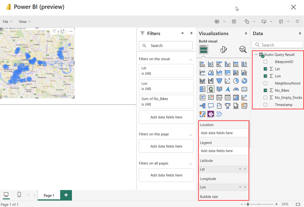
In the report editor, select Visualizations > Map icon.

Drag the following fields from Data > Kusto Query Result to the Visualizations pane.
- Lat > Latitude
- Lon > Longitude
- No_Bikes > Bubble size
- Neighbourhood > Add drill-through fields here
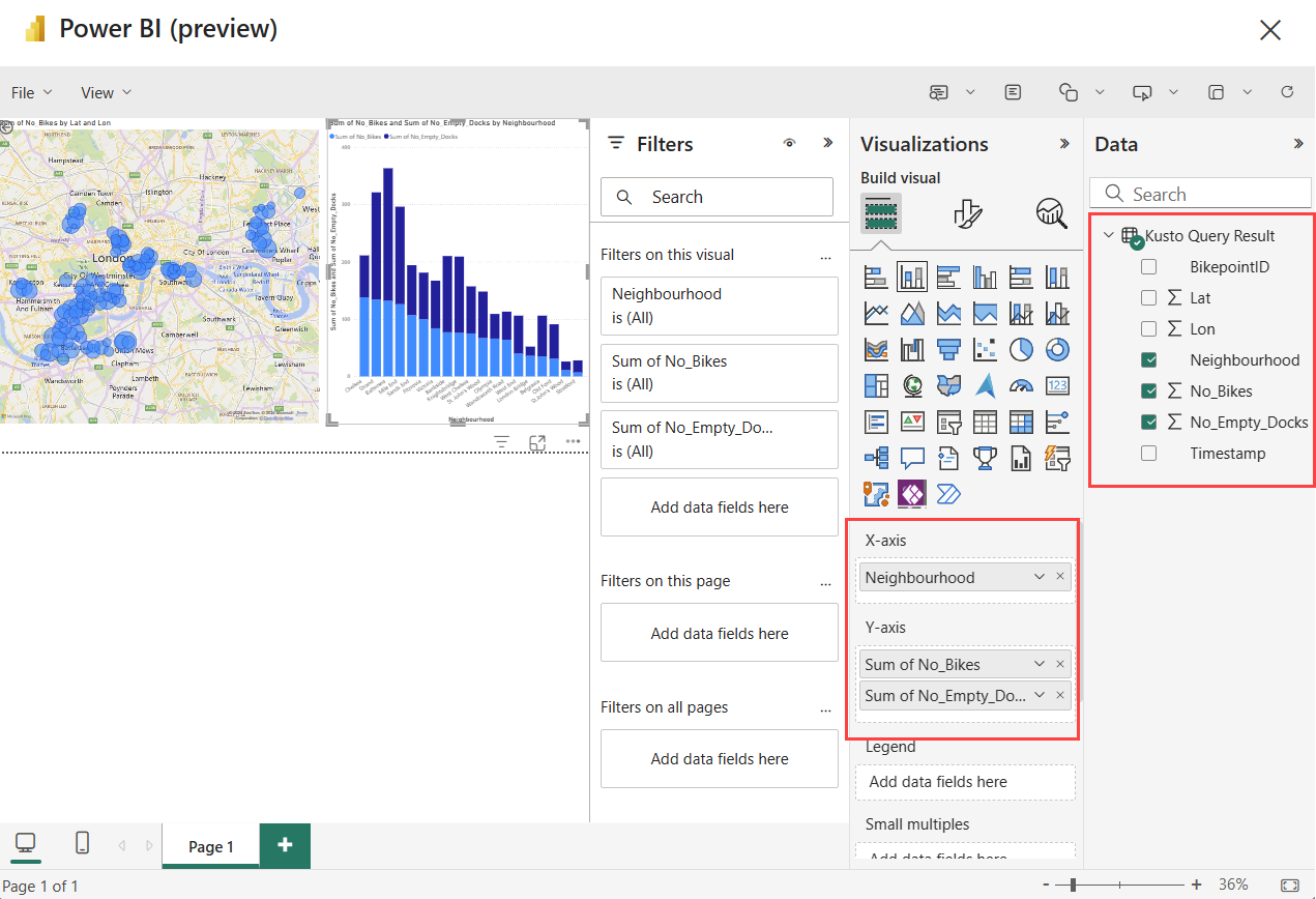
In the report editor, select Visualizations > Stacked column chart icon.

Drag the following fields from Data > Kusto Query Result to the Visualizations pane.
- Neighbourhood > X-axis
- No_Bikes > Y-axis
- No_Empty_Docks > Y-axis
Save the report
- In the top left corner of the ribbon, select File > Save.
- Enter the name TutuorialReport. Choose your workspace, and set sensitivity as Public.
- Select Continue.
- Select Open the file in Power BI to view, edit, and get a shareable link.
Interact with the report
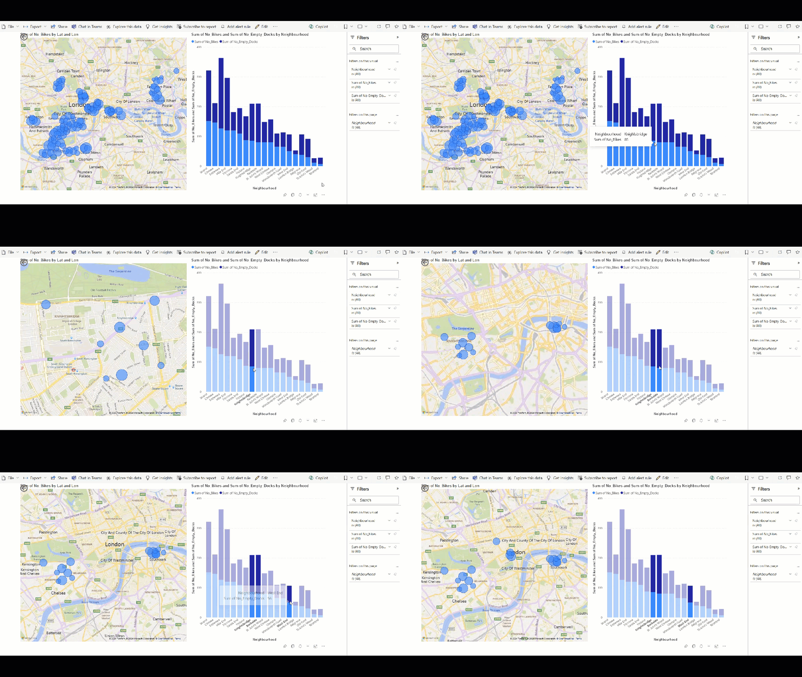
When you open the Power BI report, you can add or edit visualizations. You can also interact with the visualizations. For example, selecting one of the Neighbourhood columns on one visualization highlights the values of that neighborhood in the other visualizations.
Related content
For more information about tasks performed in this tutorial, see:


