High-density sampling in Power BI scatter charts
The Power BI sampling algorithm improves how scatter charts represent high-density data.
For example, you might create a scatter chart from your organization's sales activity, with each store having tens of thousands of data points each year. A scatter chart of such information would sample data from a meaningful representation of that data to illustrate how sales occurred over time. The details of high-density data sampling are described in this article.
Note
The High-density sampling algorithm described in this article is available in the scatter charts for both Power BI Desktop and the Power BI service.
How high-density scatter charts work
Previously, Power BI selected a collection of sample data points in the full range of underlying data in a deterministic fashion to create a scatter chart. Specifically, Power BI would select the first and last rows of data in the scatter chart series, then divide the remaining rows evenly so that 3,500 data points total were plotted on the scatter chart. For example, if the sample had 35,000 rows, the first and last rows would be selected for plotting, then every tenth row would also be plotted (35,000 / 10 = every tenth row = 3,500 data points). Also previously, null values or points that couldn't be plotted, such as text values, in data series weren't shown, and thus, weren't considered when generating the visual. With such sampling, the perceived density of the scatter chart was also based on the representative data points, so the implied visual density was a circumstance of the sampled points, not the full collection of the underlying data.
When you enable High-density sampling, Power BI implements an algorithm that eliminates overlapping points and ensures that the points on the visual can be reached when interacting with the visual. The algorithm also ensures that all points in the data set are represented in the visual, providing context to the meaning of selected points, rather than just plotting a representative sample.
By definition, high-density data is sampled to create visualizations that are responsive to interactivity. Too many data points on a visual can slow it down and detract from the visibility of trends. The way data is sampled drives the creation of the sampling algorithm to provide the best visualization experience and ensure that all data is represented. In Power BI, the algorithm is improved to provide the best combination of responsiveness, representation, and clear preservation of important points in the overall data set.
Note
Scatter charts using the High-density sampling algorithm are best plotted on square visuals, as with all scatter charts.
How the scatter chart sampling algorithm works
The algorithm for High-density sampling for scatter charts employs methods that capture and represent the underlying data more effectively and eliminates overlapping points. The algorithm starts with a small radius for each data point, which is the visual circle size for a given point on the visualization. It then increases the radius of all data points. When two or more data points overlap, a single circle of the increased radius size represents those overlapped data points. The algorithm continues to increase the radius of data points until that radius value results in a reasonable number of data points (3,500) being displayed in the scatter chart.
The methods in this algorithm ensure that outliers are represented in the resulting visual. The algorithm respects scale when determining overlap, too, such that exponential scales are visualized with fidelity to the underlying visualized points.
The algorithm also preserves the overall shape of the scatter chart.
Note
When using the High-density sampling algorithm for scatter charts, accurate distribution of the data is the goal, not implied visual density. For example, you might see a scatter chart with lots of circles that overlap (density) in a certain area and imagine many data points must be clustered there. Since the High-density sampling algorithm can use one circle to represent many data points, such implied visual density or "clustering" won't show up. To get more detail in a given area, you can use slicers to zoom in.
In addition, data points that can't be plotted, such as nulls or text values, are ignored, so another value that can be plotted is selected. This further ensures the true shape of the scatter chart is maintained.
When the standard algorithm for scatter charts is used
There are circumstances under which High-density sampling can't be applied to a scatter chart and the original algorithm is used. Those circumstances are:
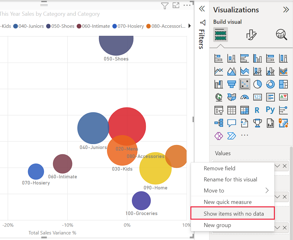
If you right-click a value under Values and set it to Show items with no data from the menu, the scatter chart will revert to the original algorithm.

Any values in the Play Axis field will result in the scatter chart reverting to the original algorithm.
If both X and Y axes are missing on a scatter chart, the chart reverts to the original algorithm.
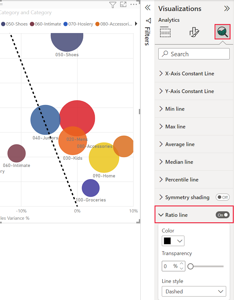
Using a Ratio line in the Analytics pane results in the chart reverting to the original algorithm.

How to turn on high-density sampling for a scatter chart
To switch High-density sampling to On, select a scatter chart, go to the Format visual pane, expand the General card, and near the bottom of that card, slide the High-density sampling toggle slider to On.

Note
After the switch is turned on, Power BI will attempt to use the High-density sampling algorithm whenever possible. When the algorithm can't be used, such as when you place a value in the Play axis, the switch stays On even though the chart has reverted to the standard algorithm. If you then remove a value from the Play axis, or if conditions change to enable use of the high-density sampling algorithm, the chart will automatically use high-density sampling for that chart because the feature is active.
Note
Data points are grouped or selected by the index. Having a legend doesn't affect sampling for the algorithm. It only affects the ordering of the visual.
Considerations and limitations
The high-density sampling algorithm is an important improvement to Power BI. However, the High-density sampling algorithm only works with live connections to Power BI service-based models, imported models, or DirectQuery.
