Style components to match your branding
Microsoft Graph Toolkit components are flexible for customization. If you want to change the way components look and feel, you can easily do that by using a set of custom CSS properties.
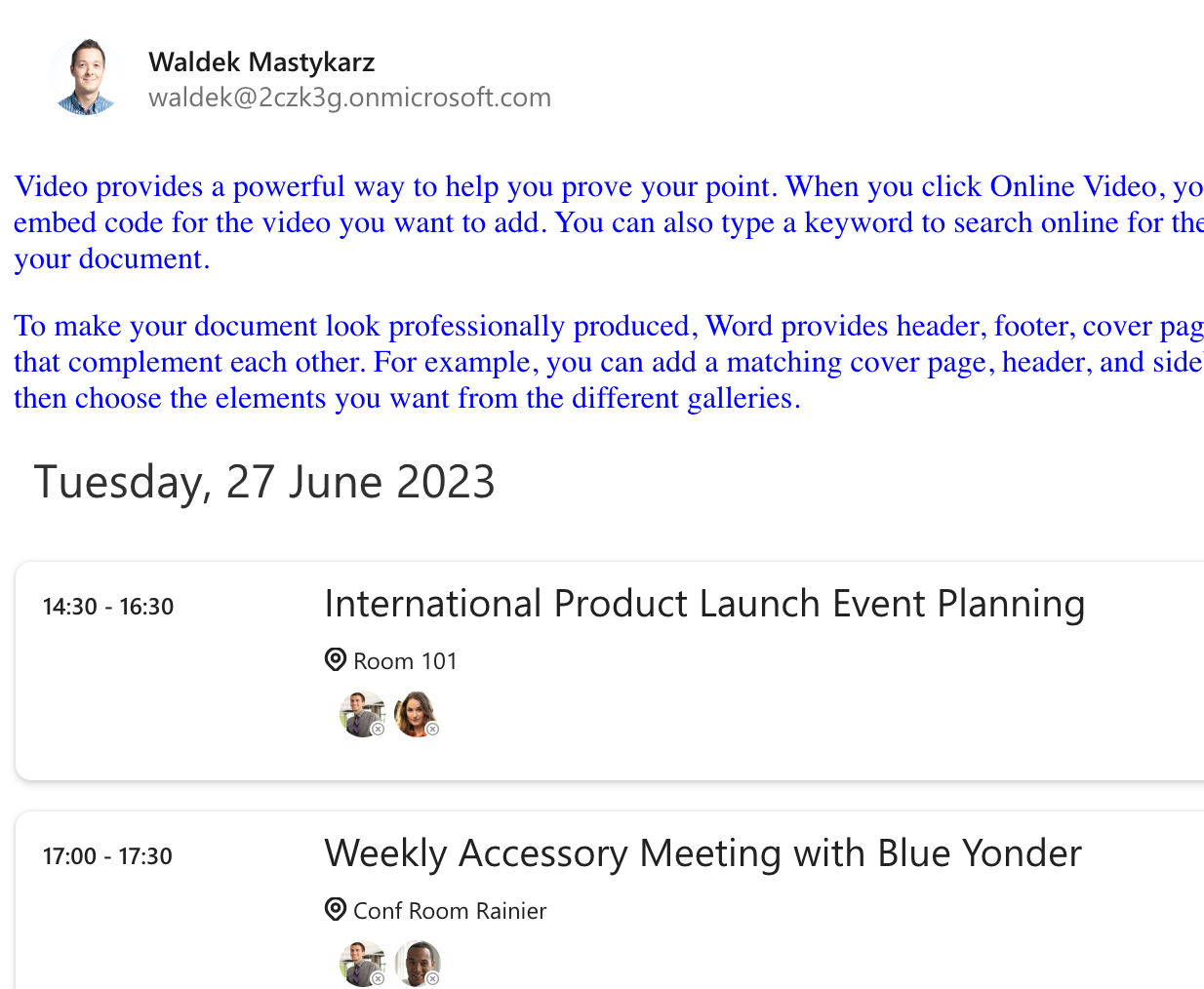
Microsoft Graph Toolkit components use the shadow DOM. It means that they're isolated from the rest of your web app. For example, if you changed the global font color of your web app to blue, Microsoft Graph Toolkit components would still use their default color.

This isolation is intentional so that Microsoft Graph Toolkit components always render as intended and aren't affected by the specific styling of your web app.
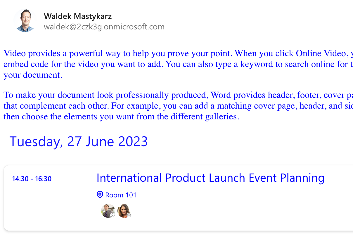
To style the contents of Microsoft Graph Toolkit, use custom CSS properties exposed by the component. For example, to change the font color used to display events in the agenda component:
<style>
  mgt-agenda {
    --agenda-header-color: blue;
    --agenda-event-time-color: blue;
    --agenda-event-subject-color: blue;
    --agenda-event-location-color: blue;
  }
</style>

You can find more information about the available custom CSS properties exposed by each component in their documentation.
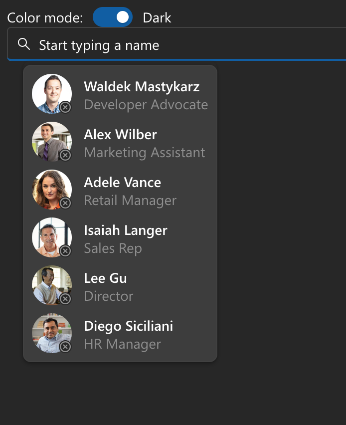
Microsoft Graph Toolkit also provides light and dark themes.
The easiest way to add support for switching themes, is to use the mgt-theme-toggle component and set body background and font-color to variables to follow the theme.
<head>
  <!-- trimmed for brevity -->
  <style>
    body {
      background-color: var(--fill-color);
      color: var(--neutral-foreground-rest);
    }
  </style>
</head>
<body>
    <!-- trimmed for brevity -->
    <mgt-theme-toggle></mgt-theme-toggle>
    <mgt-people-picker></mgt-people-picker>
</body>

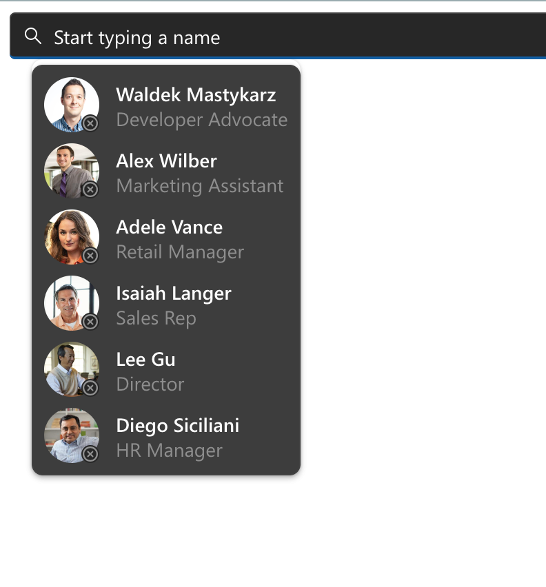
If you use custom logic to switch theme for your app, you can have Microsoft Graph Toolkit components follow the theme by applying it programmatically.
<div id="graph">
    <mgt-people-picker></mgt-people-picker>
</div>
<script>
    let region = document.getElementById('graph');
    mgt.applyTheme('dark', region);
</script>
