Button Group — MRTK3

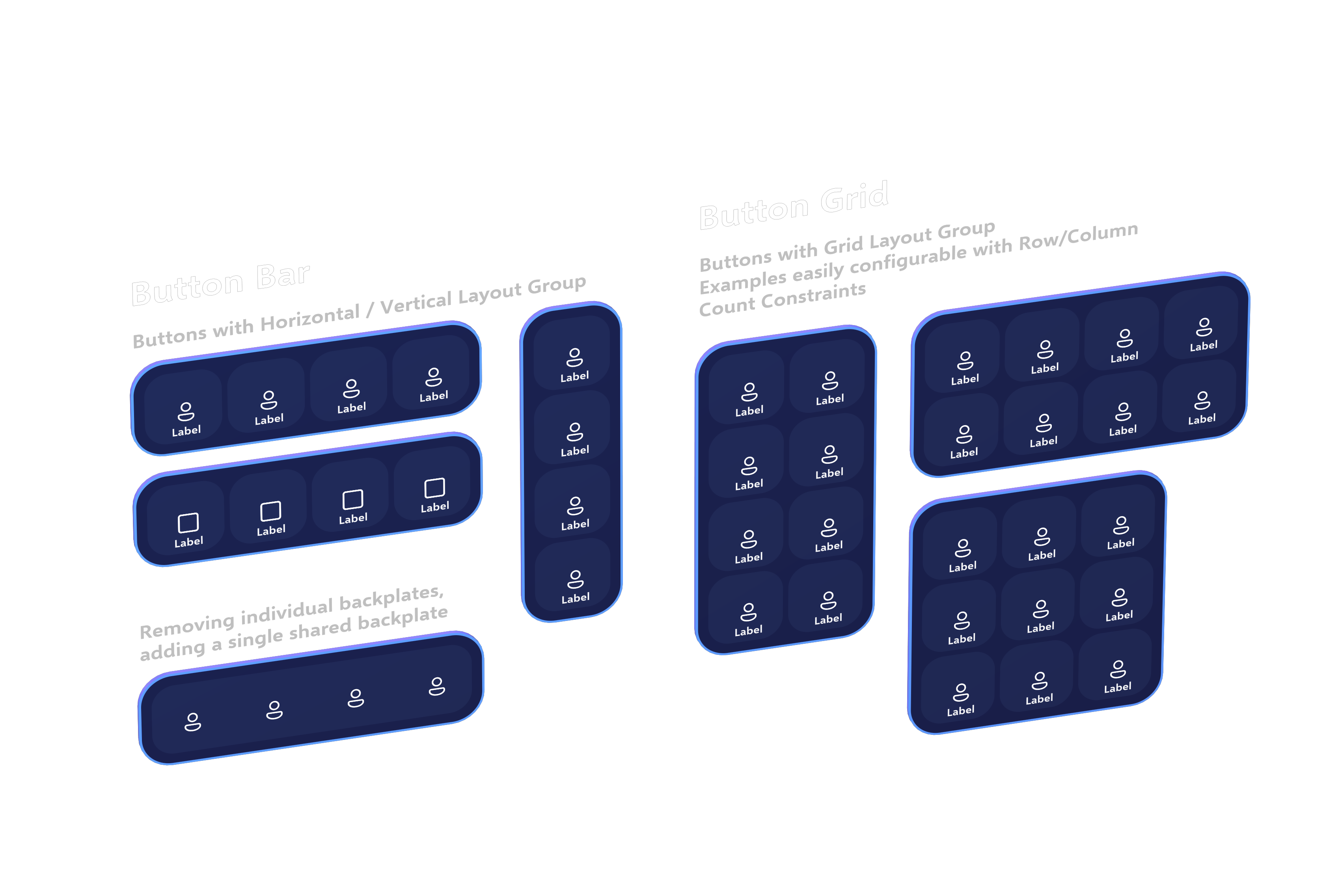
Flexible and responsive button groups are easy to build using the new Canvas-based layout system. Previously, users had to use the ObjectBar script to lay out a collection of children along a single axis, and each child had to be manually added to the ObjectBar's list of managed children.
With Canvas-based UX, you can take advantage of the built-in RectTransform-based layout system to easily build and manage rows, columns, and grids of UI components. Button bars and grids can be built using the HorizontalLayoutGroup, VerticalLayoutGroup, and GridLayoutGroup UnityUI components. The children will be automatically laid out according the constraints, padding, and options configured in the layout group.
Button Bar
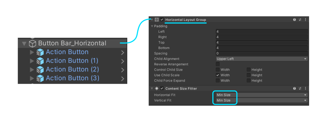
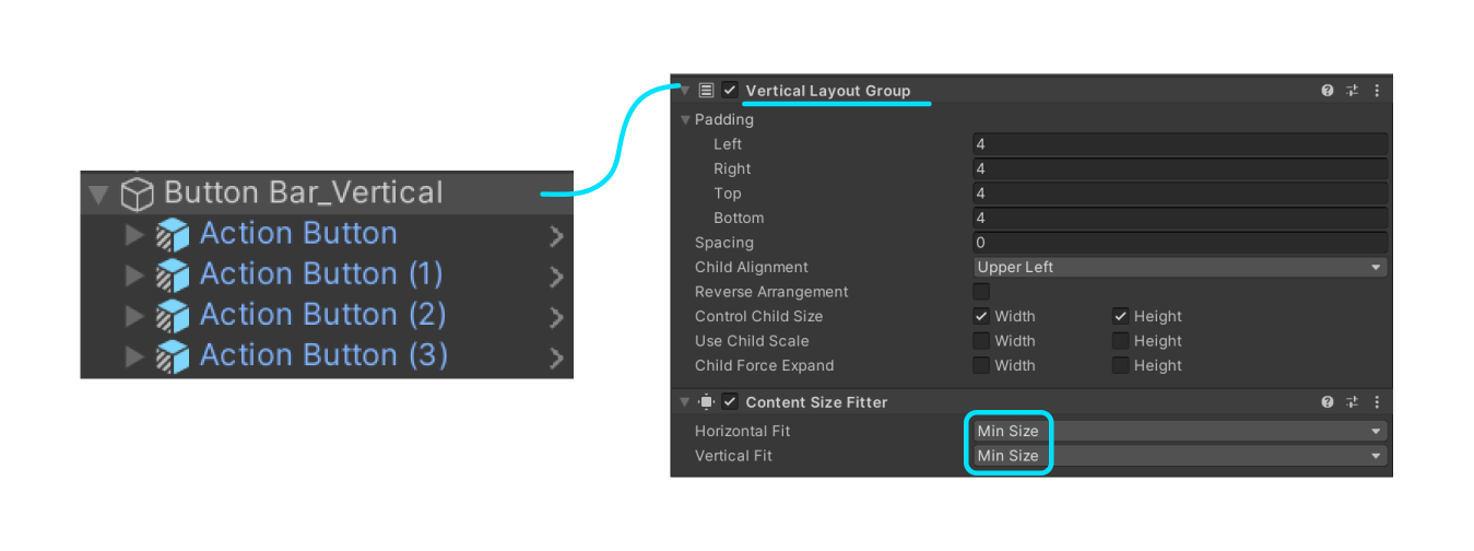
To build a horizontal or vertical "bar" of buttons (or other UI controls!) you can build a simple layout using either HorizontalLayoutGroup, VerticalLayoutGroup, or ContentSizeFitter.


Note that children of these auto-layout components should have a LayoutElement component to inform the layout engine of the minimum and preferred sizes for each child. Our Button prefabs come pre-installed with these components, but you may need to add them to your own custom controls or customize the minimum and preferred sizing to fit your needs.
Button Grid
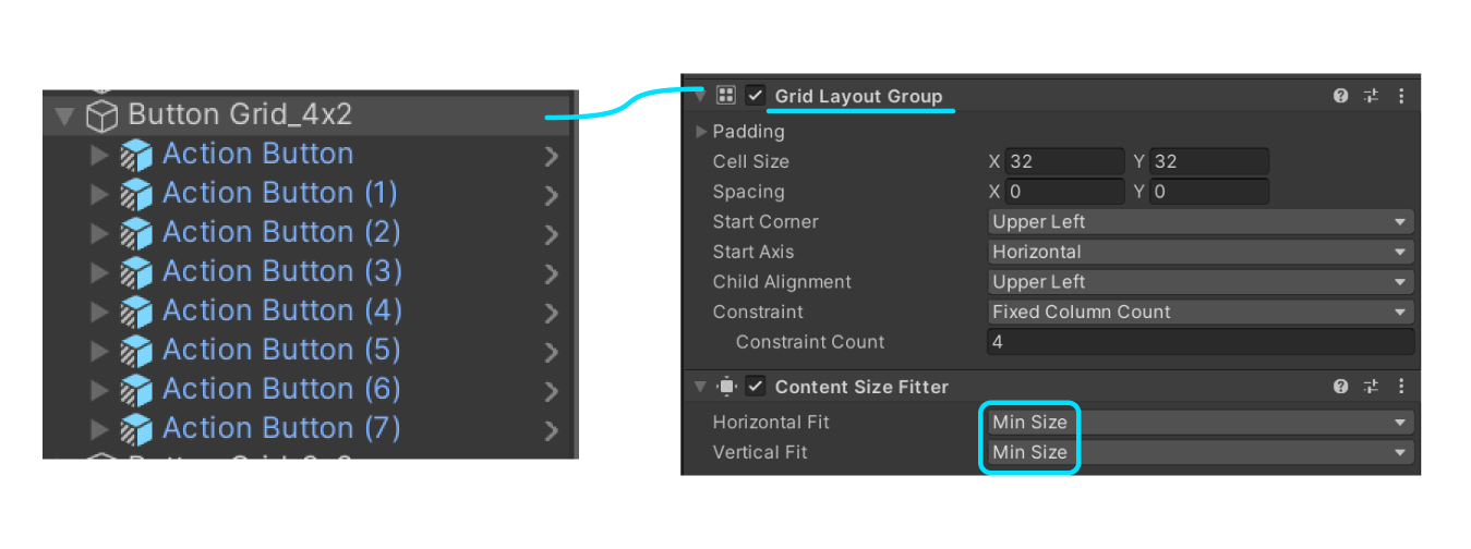
To build a flexible grid of buttons, the same layout and design from the button bar applies, but a GridLayoutGroup is used instead.

To adjust the number of rows or columns, select which constraint type you'd like.
- Fixed Column Count specifies the number of columns. The number of rows will reflow depending on the number of items in the collection.
- Fixed Row Count specifies the number of columns. The number of rows will reflow depending on the number of items in the collection.
- Flexible results in a flexible number of rows or columns, depending on the fit types selected in the
ContentSizeFitter. SelectingPreferred sizefor both fit types in theContentSizeFitter, along with aFlexiblegrid constraint, will result in a grid layout that attempts to be mostly square/even, but will add rows or columns accordingly when necessary.
For more information on using the UnityUI layout system, you can view the documentation here.