Examples of Light-Aware User Interfaces
Now that you understand some basic principles for optimizing your UI for different lighting conditions, you can look at some examples of how this optimization makes a difference when viewing content outdoors. The following images are side-by-side comparisons of laptops in direct sunlight.
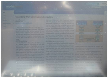
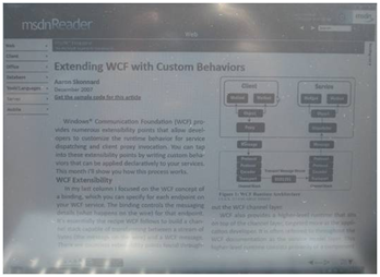
The following images compare light-aware UI to normal UI on a laptop in direct sunlight. The first photograph shows what content typically looks like outdoors when a laptop is using its battery usage display settings. The second photograph shows the combination of Adaptive Brightness and light-aware UI, and how these features can work together to increase screen readability.


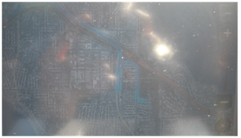
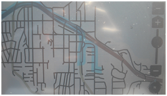
The following photographs show a navigation program as seen outdoors with light-awareness turned off and turned on. The indoor content is not usable outdoors, whereas the outdoor content is easily legible. Also note how the reflections are minimized when a black-on-white color scheme is used, as shown in the second photograph.

