Fundamentals of Light-Aware User Interfaces
The term light-aware UI refers to a program that uses light sensor data to optimize its content, controls, and other graphics for an optimum user experience in many lighting conditions, ranging from darkness to direct sunlight. Perhaps the most important optimizations are legibility, readability, and interactions in direct sunlight, because screens do not typically perform well in these conditions. In this section, we focus on three UI properties: scale, contrast, and color. These properties can be changed to optimize the visual user experience.
Scale and Brightness
In general, larger objects are easier to see. When the computer is in adverse lighting conditions (such as in direct sunlight) making content larger can help to improve the legibility and interactiveness of that content.
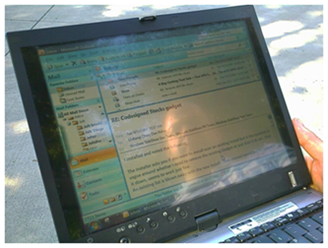
The following photographs compare a laptop in direct sunlight with typical screen brightness and zoom levels to a laptop in the same lighting conditions with light-aware UI. The first photograph shows the display set to 40% brightness with normal zoom levels. The second photograph shows the display set to 100% brightness with increased zoom levels.


Varying Font Size
If you increase the size of the font that is used to display text, the text is more legible in adverse lighting conditions. Font style, font face, and other characteristics can also be varied to optimize legibility and readability. For example, sans serif fonts are typically easier to read than serif fonts.

Zooming Content
If your program implements zooming, it can be used to scale the content. Zooming in enhances legibility while zooming out enables the program to display more content.
Altering Vector Graphic Rendering Properties
If your program renders vector graphic primitives (such as lines, circles, and so on), the characteristics of the rendering can be altered to optimize legibility. For example, if your program renders rectangles, the width of the lines that are used to render the rectangles could be scaled (wider for outdoors and narrower for indoors) to optimize the appearance and legibility of the vector graphic content.
Contrast
When LCD screens are used in bright lighting conditions, the overall contrast of the screen is reduced. When the screen is flooded with light (from the sun, for example), the user's perception of dark areas on the screen is reduced. In general, this makes it important to increase the contrast of content and UI when the ambient light is bright. It may be desirable to use a monochrome color scheme to maximize contrast in these lighting conditions. Another way to increase contrast is to replace low-contrast content (such as an aerial photo mode in a mapping program) with high-contrast elements (such as black-on-white street vector graphics mode).
Color
The colors that a program uses to display its content can have a drastic effect on the overall user experience and legibility of rendered content. By changing color contrast based on ambient light, you can make content more readable in adverse lighting conditions, such as bright outdoor light or dark interior light.
One way to increase color contrast is through color saturation. Another way is by using complementary colors instead of adjacent colors for better readability. Complementary colors are pairs of colors that are of opposite hue, such as blue and yellow. The following side-by-side example shows how using complementary colors can help improve color contrast.
