Context Popup
A Context Popup is the principal control in the ContextPopup View of the Windows Ribbon framework. It is a rich context menu system that is only exposed by the framework as an extension to a Ribbon implementation—the framework does not expose the Context Popup as an independent control.
Components of the Context Popup
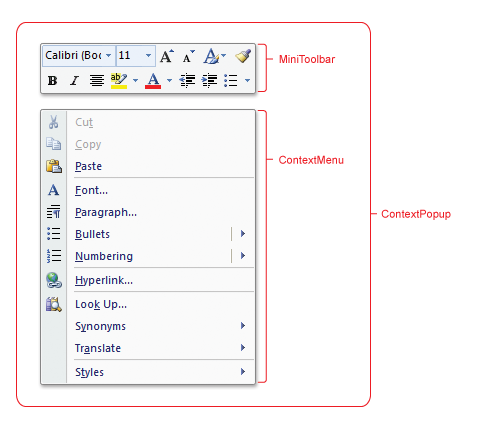
The Context Popup is a logical container for the Context Menu and Mini-Toolbar sub-controls that are exposed through the ContextMenu and MiniToolbar markup elements, respectively:
- The ContextMenu exposes a menu of Commands and galleries.
- The MiniToolbar exposes a floating toolbar of various Commands, galleries, and complex controls such as the Font Control and the Combo Box.
Each sub-control can appear at most once in a Context Popup.
The following screen shot illustrates the Context Popup and its constituent sub-controls.

The Context Popup is purely conceptual and does not expose any UI functionality itself, such as positioning or sizing.
Note
The Context Popup is typically displayed by right-clicking the mouse (or through the keyboard shortcut SHIFT+F10) on an object of interest. However, the steps required to display the Context Popup are defined by the application.
Implement the Context Popup
In similar fashion to other Windows Ribbon framework controls, the Context Popup is implemented through a markup component that specifies its presentation details and a code component that governs its functionality.
The following table lists the controls that are supported by each Context Popup sub-control.
| Control | Mini-Toolbar | Context Menu |
|---|---|---|
| Button | x | x |
| Check Box | x | x |
| Combo Box | x | |
| Drop-Down Button | x | x |
| Drop-Down Color Picker | x | x |
| Drop-Down Gallery | x | x |
| Font Control | x | |
| Help Button | ||
| In-Ribbon Gallery | ||
| Spinner | ||
| Split Button | x | x |
| Split Button Gallery | x | x |
| Toggle Button | x | x |
Markup
Each Context Popup sub-control must be declared individually in markup.
Mini-Toolbar
When adding controls to a Context Popup Mini-Toolbar, the following two recommendations should be considered:
- Controls should be highly recognizable and provide obvious functionality. Familiarity is key, as labels and tooltips are not exposed for Mini-Toolbar controls.
- Each Command exposed by a control should be presented elsewhere in the ribbon UI. The Mini-Toolbar does not support keyboard navigation.
The following example demonstrates the basic markup for a MiniToolbar element that contains three Button controls.
Note
One MenuGroup element is specified for each row of controls in the Mini-Toolbar.
<MiniToolbar Name="MiniToolbar">
  <MenuGroup>
    <Button CommandName="cmdButton1" />
    <Button CommandName="cmdButton2" />
    <Button CommandName="cmdButton3" />
  </MenuGroup>
</MiniToolbar>
Context Menu
The following example demonstrates the basic markup for a ContextMenu element that contains three Button controls.
Note
Each set of controls in the MenuGroup element is separated by a horizontal bar in the Context Menu.
<ContextMenu Name="ContextMenu">
  <MenuGroup>
    <Button CommandName="cmdCut" />
    <Button CommandName="cmdCopy" />
    <Button CommandName="cmdPaste" />
  </MenuGroup>
</ContextMenu>
Although a Context Popup can contain at most one of each sub-control, multiple ContextMenu and MiniToolbar element declarations in the Ribbon markup are valid. This allows an application to support various combinations of Context Menu and Mini-Toolbar controls, based on criteria defined by the application, such as workspace context.
For more information, see the ContextMap element.
The following example demonstrates the basic markup for the ContextPopup element.
<ContextPopup>
  <ContextPopup.MiniToolbars>
    <MiniToolbar Name="MiniToolbar">
      <MenuGroup>
        <Button CommandName="cmdButton1" />
        <Button CommandName="cmdButton2" />
        <Button CommandName="cmdButton3" />
      </MenuGroup>
    </MiniToolbar>
  </ContextPopup.MiniToolbars>
  <ContextPopup.ContextMenus>
    <ContextMenu Name="ContextMenu">
      <MenuGroup>
        <Button CommandName="cmdCut" />
        <Button CommandName="cmdCopy" />
        <Button CommandName="cmdPaste" />
      </MenuGroup>
    </ContextMenu>
  </ContextPopup.ContextMenus>
  <ContextPopup.ContextMaps>
    <ContextMap CommandName="cmdContextMap" ContextMenu="ContextMenu" MiniToolbar="MiniToolbar"/>
  </ContextPopup.ContextMaps>
</ContextPopup>
Code
To invoke a Context Popup, the IUIContextualUI::ShowAtLocation method is called when the top-level window of the Ribbon application receives a WM_CONTEXTMENU notification.
This example demonstrates how to handle the WM_CONTEXTMENU notification in the WndProc() method of the Ribbon application.
case WM_CONTEXTMENU:
  POINT pt;
  POINTSTOPOINT(pt, lParam);

  // ShowContextualUI method defined by the application.
  ShowContextualUI (pt, hWnd);
  break;
The following example demonstrates how a Ribbon application can show the Context Popup at a specific screen location using the IUIContextualUI::ShowAtLocation method.
GetCurrentContext() has a value of cmdContextMap as defined in the preceding markup example.
g_pApplication is a reference to the IUIFramework interface.
HRESULT ShowContextualUI(POINT& ptLocation, HWND hWnd)
{
  GetDisplayLocation(ptLocation, hWnd);

  HRESULT hr = E_FAIL;

  IUIContextualUI* pContextualUI = NULL;

  if (SUCCEEDED(g_pFramework->GetView(
                                g_pApplication->GetCurrentContext(),
                                IID_PPV_ARGS(&pContextualUI))))
  {
    hr = pContextualUI->ShowAtLocation(ptLocation.x, ptLocation.y);
    pContextualUI->Release();
  }

  return hr;
}
The reference to IUIContextualUI can be released before the Context Popup is dismissed, as shown in the preceding example. However, the reference must be released at some point to avoid memory leaks.
Caution
The Mini-Toolbar has a built-in fade effect that is based on the proximity of the mouse pointer. For this reason, it is recommended that the Mini-Toolbar be displayed as close to the mouse pointer as possible. Otherwise, due to the conflicting display mechanisms, the Mini-Toolbar may not render as expected.
Context Popup Properties
There are no property keys associated with the Context Popup control.
Related topics