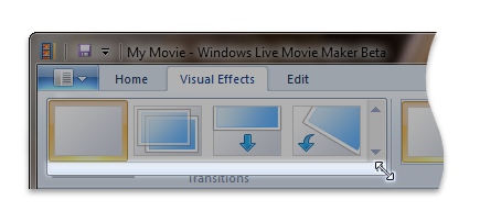
VerticalMenuLayout element
Represents a vertical layout for items in a gallery.
Usage
<VerticalMenuLayout
  Rows = "xs:integer"
  IsMultipleHighlightingEnabled = "xs:boolean"
  Gripper = "xs:string"/>
Attributes
| Attribute | Type | Required | Description |
|---|---|---|---|
| Gripper |
xs:string |
No |
A resizing handle attached to the gallery drop down.  Restricted to one of the following values: |
| IsMultipleHighlightingEnabled |
xs:boolean |
No |
Windows 8 and newer Highlights all items in the list up to, and including, the current mouseover item (instead of the mouseover item only). Typically used for multiple Undo and Redo functionality. |
| Rows |
xs:integer |
No |
Specifies the number of item rows to be visible without scrolling. The default is -1 which specifies to display as many item rows as possible. |
Child elements
There are no child elements.
Parent elements
| Element |
|---|
| DropDownGallery.MenuLayout |
| InRibbonGallery.MenuLayout |
| SplitButtonGallery.MenuLayout |
Remarks
Required.
Either the VerticalMenuLayout or the FlowMenuLayout element must occur one time for each DropDownGallery.MenuLayout, InRibbonGallery.MenuLayout, or SplitButtonGallery.MenuLayout element.
Examples
The following example demonstrates the basic markup for an VerticalMenuLayout element.
This section of code shows the InRibbonGallery control declarations.
<!-- InRibbonGallery -->
<Group CommandName="cmdInRibbonGalleryGroup" SizeDefinition="OneInRibbonGallery">
  <InRibbonGallery CommandName="cmdInRibbonGallery"
                   MaxColumns="10"
                   MaxColumnsMedium="5"
                   MinColumnsLarge="5"
                   MinColumnsMedium="3"
                   Type="Items">
    <InRibbonGallery.MenuLayout>
      <VerticalMenuLayout Rows="2"
                          Gripper="Vertical"/>
    </InRibbonGallery.MenuLayout>
    <InRibbonGallery.MenuGroups>
      <MenuGroup>
        <Button CommandName="cmdButton1"></Button>
        <Button CommandName="cmdButton2"></Button>
      </MenuGroup>
      <MenuGroup>
        <Button CommandName="cmdButton3"></Button>
      </MenuGroup>
    </InRibbonGallery.MenuGroups>
  </InRibbonGallery>
</Group>
Element information
- Minimum supported system: Windows 7
- Can be empty: Yes