Tutorial: Create geospatial visualizations
Applies to: ✅ Microsoft Fabric ✅ Azure Data Explorer ✅ Azure Monitor ✅ Microsoft Sentinel
This tutorial is for those who want to use Kusto Query Language (KQL) for geospatial visualization. Geospatial clustering is a way to organize and analyze data based on geographical location. KQL offers multiple methods for performing geospatial clustering and tools for geospatial visualizations.
In this tutorial, you'll learn how to:
Prerequisites
To run the following queries, you need a query environment with access to the sample data. You can use one of the following:
- A Microsoft account or Microsoft Entra user identity to sign in to the help cluster
- A Microsoft account or Microsoft Entra user identity
- A Fabric workspace with a Microsoft Fabric-enabled capacity
Plot points on a map
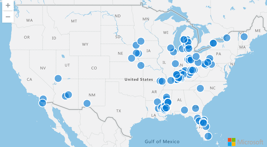
To visualize points on a map, use project to select the column containing the longitude and then the column containing the latitude. Then, use render to see your results in a scatter chart with kind set to map.
StormEvents
| take 100
| project BeginLon, BeginLat
| render scatterchart with (kind = map)
Plot multiple series of points
To visualize multiple series of points, use project to select the longitude and latitude along with a third column, which defines the series.
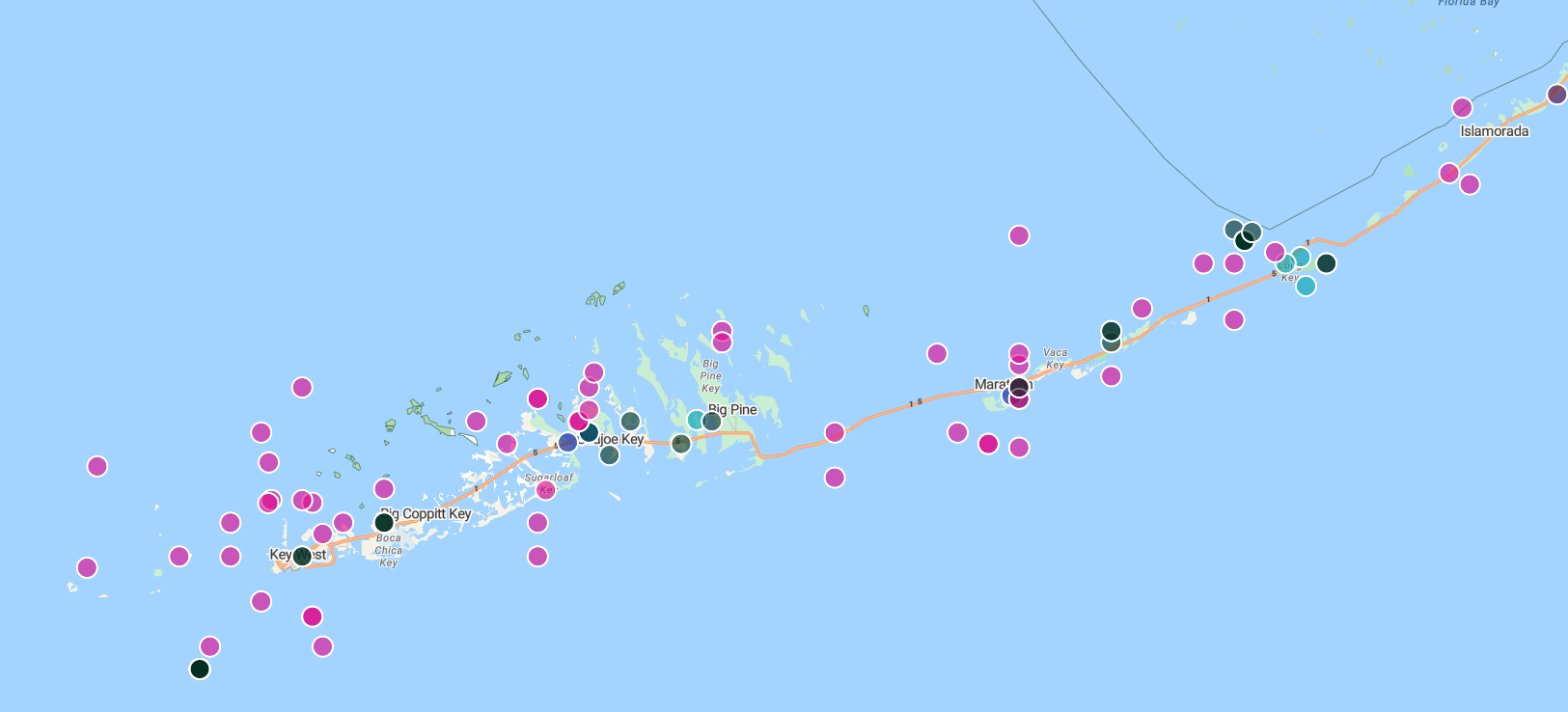
In the following query, the series is EventType. The points are colored differently according to their EventType, and when selected display the content of the EventType column.
StormEvents
| take 100
| project BeginLon, BeginLat, EventType
| render scatterchart with (kind = map)

You may also explicitly specify the xcolumn (Longitude), ycolumn (Latitude), and series when performing the render. This specification is necessary when there are more columns in the result than just the longitude, latitude, and series columns.
StormEvents
| take 100
| render scatterchart with (kind = map, xcolumn = BeginLon, ycolumns = BeginLat, series = EventType)
Use GeoJSON values to plot points on a map
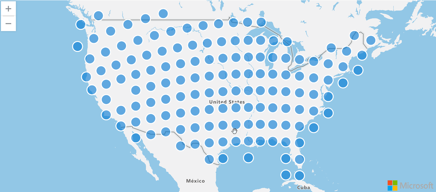
A dynamic GeoJSON value can change or be updated and are often used for real-time mapping applications. Mapping points using dynamic GeoJSON values allows for more flexibility and control over the representation of the data on the map that may not be possible with plain latitude and longitude values.
The following query uses the geo_point_to_s2cell and geo_s2cell_to_central_point to map storm events in a scatter chart.
StormEvents
| project BeginLon, BeginLat
| summarize by hash=geo_point_to_s2cell(BeginLon, BeginLat, 5)
| project point = geo_s2cell_to_central_point(hash)
| project lng = toreal(point.coordinates[0]), lat = toreal(point.coordinates[1])
| render scatterchart with (kind = map)
Represent data points with variable-sized bubbles
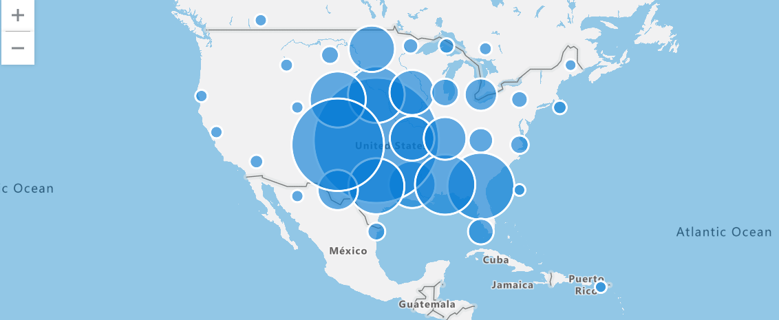
Visualize the distribution of data points by performing an aggregation in each cluster and then plotting the central point of the cluster.
For example, the following query filters for all storm events of the "Tornado" event type. It then groups the events into clusters based on their longitude and latitude, counts the number of events in each cluster, and projects the central point of the cluster, and renders a map to visualize the result. The regions with the most tornados become clearly detected based on their large bubble size.
StormEvents
| where EventType == "Tornado"
| project BeginLon, BeginLat
| where isnotnull(BeginLat) and isnotnull(BeginLon)
| summarize count_summary=count() by hash = geo_point_to_s2cell(BeginLon, BeginLat, 4)
| project geo_s2cell_to_central_point(hash), count_summary
| extend Events = "count"
| render piechart with (kind = map)
Display points within a specific area
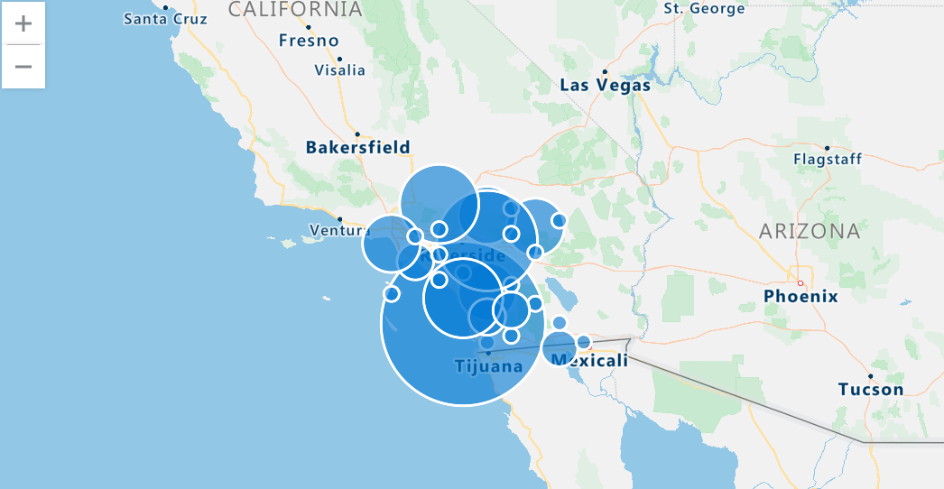
Use a polygon to define the region and the geo_point_in_polygon function to filter for events that occur within that region.
The following query defines a polygon representing the southern California region and filters for storm events within this region. It then groups the events into clusters, counts the number of events in each cluster, projects the central point of the cluster, and renders a map to visualize the clusters.
let southern_california = dynamic({
    "type": "Polygon",
    "coordinates": [[[-119.5, 34.5], [-115.5, 34.5], [-115.5, 32.5], [-119.5, 32.5], [-119.5, 34.5]]
    ]});
StormEvents
| where geo_point_in_polygon(BeginLon, BeginLat, southern_california)
| project BeginLon, BeginLat
| summarize count_summary = count() by hash = geo_point_to_s2cell(BeginLon, BeginLat, 8)
| project geo_s2cell_to_central_point(hash), count_summary
| extend Events = "count"
| render piechart with (kind = map)
Show nearby points on a LineString
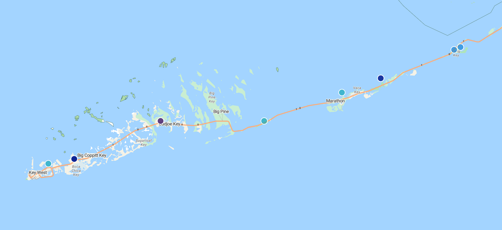
The following query finds nearby storm events that occur along a specified LineString, which represents a defined path. In this case, the LineString is a road to Key West. The geo_distance_point_to_line() function is used to filter the storm events based on their proximity to the defined LineString. If an event is within 500 meters from LineString, the event is rendered on a map.
let roadToKeyWest = dynamic({
"type":"linestring",
"coordinates":[
          [
            -81.79595947265625,
            24.56461038017685
          ],
          [
            -81.595458984375,
            24.627044746156027
          ],
          [
            -81.52130126953125,
            24.666986385216273
          ],
          [
            -81.35650634765625,
            24.66449040712424
          ],
          [
            -81.32354736328125,
            24.647017162630366
          ],
          [
            -80.8099365234375,
            24.821639356846607
          ],
          [
            -80.62042236328125,
            24.93127614538456
          ],
          [
            -80.37872314453125,
            25.175116531621764
          ],
          [
            -80.42266845703124,
            25.19251511519153
          ],
          [
            -80.4803466796875,
            25.46063471847754
          ]
        ]});
StormEvents
| where isnotempty(BeginLat) and isnotempty(BeginLon)
| project BeginLon, BeginLat, EventType
| where geo_distance_point_to_line(BeginLon, BeginLat, roadToKeyWest) < 500
| render scatterchart with (kind=map)
Show nearby points in a polygon
The following query finds nearby storm events that occur within a specified polygon. In this case, the polygon is a road to Key West. The geo_distance_point_to_polygon() function is used to filter the storm events based on their proximity to the defined polygon. If an event is within 500 meters of the polygon, the event is rendered on a map.
let roadToKeyWest = dynamic({
"type":"polygon",
"coordinates":[
          [
            [
              -80.08209228515625,
              25.39117928167583
            ],
            [
              -80.4913330078125,
              25.517657429994035
            ],
            [
              -80.57922363281249,
              25.477992320574817
            ],
            [
              -82.188720703125,
              24.632038149596895
            ],
            [
              -82.1942138671875,
              24.53712939907993
            ],
            [
              -82.13104248046875,
              24.412140070651528
            ],
            [
              -81.81243896484375,
              24.43714786161562
            ],
            [
              -80.58746337890625,
              24.794214972389486
            ],
            [
              -80.08209228515625,
              25.39117928167583
            ]
          ]
        ]});
StormEvents
| where isnotempty(BeginLat) and isnotempty(BeginLon)
| project BeginLon, BeginLat, EventType
| where geo_distance_point_to_polygon(BeginLon, BeginLat, roadToKeyWest) < 500
| render scatterchart with (kind=map)
Find anomalies based on geospatial data
The following query performs an analysis of storm events occurring within a particular state. The query uses S2 cells and temporal aggregation to investigate patterns of damage. The result is a visual anomaly chart that portrays any irregularities or deviations in storm-induced destruction over time, offering a detailed perspective on the effect of storms within the specified state boundaries.
let stateOfInterest = "Texas";
let statePolygon = materialize(
    US_States
    | extend name = tostring(features.properties.NAME)
    | where name == stateOfInterest
    | project geometry=features.geometry);
let stateCoveringS2cells = statePolygon
    | project s2Cells = geo_polygon_to_s2cells(geometry, 9);
StormEvents
| extend s2Cell = geo_point_to_s2cell(BeginLon, BeginLat, 9)
| where s2Cell in (stateCoveringS2cells)
| where geo_point_in_polygon(BeginLon, BeginLat, toscalar(statePolygon))
| make-series damage = avg(DamageProperty + DamageCrops) default = double(0.0) on StartTime step 7d
| extend anomalies=series_decompose_anomalies(damage)
| render anomalychart with (anomalycolumns=anomalies)
Related content
- See a use case for geospatial clustering: Data analytics for automotive test fleets
- Learn about Azure architecture for geospatial data processing and analytics
- Get a comprehensive understanding of Azure Data Explorer by reading the white paper
