Bar chart
Applies to: ✅ Microsoft Fabric ✅ Azure Data Explorer ✅ Azure Monitor ✅ Microsoft Sentinel
The bar chart visual needs a minimum of two columns in the query result. By default, the first column is used as the y-axis. This column can contain text, datetime, or numeric data types. The other columns are used as the x-axis and contain numeric data types to be displayed as horizontal lines. Bar charts are used mainly for comparing numeric and nominal discrete values, where the length of each line represents its value.
Note
This visualization can only be used in the context of the render operator.
Syntax
T | render barchart [with (propertyName = propertyValue [, ...])]
Learn more about syntax conventions.
Parameters
| Name | Type | Required | Description |
|---|---|---|---|
| T | string |
✔️ | Input table name. |
| propertyName, propertyValue | string |
A comma-separated list of key-value property pairs. See supported properties. |
Supported properties
All properties are optional.
| PropertyName | PropertyValue |
|---|---|
accumulate |
Whether the value of each measure gets added to all its predecessors (true or false). |
kind |
Further elaboration of the visualization kind. For more information, see kind property. |
legend |
Whether to display a legend or not (visible or hidden). |
series |
Comma-delimited list of columns whose combined per-record values define the series that record belongs to. |
ymin |
The minimum value to be displayed on Y-axis. |
ymax |
The maximum value to be displayed on Y-axis. |
title |
The title of the visualization (of type string). |
xaxis |
How to scale the x-axis (linear or log). |
xcolumn |
Which column in the result is used for the x-axis. |
xtitle |
The title of the x-axis (of type string). |
yaxis |
How to scale the y-axis (linear or log). |
ycolumns |
Comma-delimited list of columns that consist of the values provided per value of the x column. |
ytitle |
The title of the y-axis (of type string). |
ysplit |
How to split the visualization into multiple y-axis values. For more information, see ysplit property. |
ysplit property
This visualization supports splitting into multiple y-axis values:
ysplit |
Description |
|---|---|
none |
A single y-axis is displayed for all series data. This is the default. |
axes |
A single chart is displayed with multiple y-axes (one per series). |
panels |
One chart is rendered for each ycolumn value. |
Supported properties
All properties are optional.
| PropertyName | PropertyValue |
|---|---|
kind |
Further elaboration of the visualization kind. For more information, see kind property. |
series |
Comma-delimited list of columns whose combined per-record values define the series that record belongs to. |
title |
The title of the visualization (of type string). |
kind property
This visualization can be further elaborated by providing the kind property.
The supported values of this property are:
kind value |
Description |
|---|---|
default |
Each "bar" stands on its own. |
unstacked |
Same as default. |
stacked |
Stack "bars". |
stacked100 |
Stack "bars" and stretch each one to the same width as the others. |
Examples
Render a bar chart
The following query creates a bar chart displaying the number of storm events for each state, filtering only those states with more than 10 events. The chart provides a visual representation of the event distribution across different states.
StormEvents
| summarize event_count=count() by State
| project State, event_count
| render barchart
    with (
    title="Storm count by state",
    ytitle="Storm count",
    xtitle="State",
    legend=hidden
    )
Render a stacked bar chart
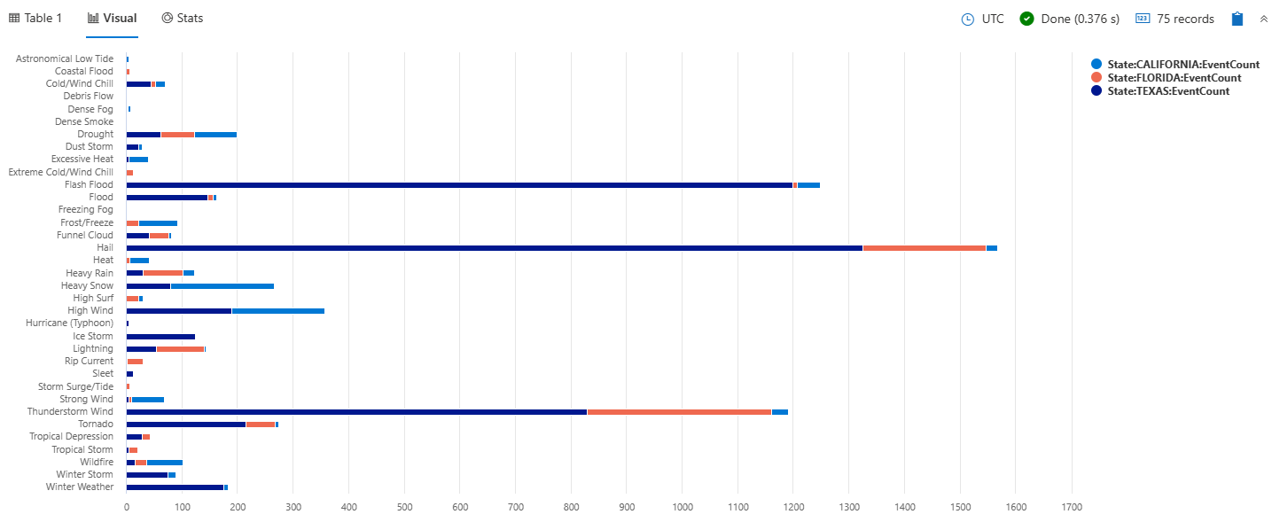
The following query creates a stacked bar chart that shows the total count of storm events by their type for selected states of Texas, California, and Florida. Each bar represents a storm event type, and the stacked bars show the breakdown of storm events by state within each type.
StormEvents
| where State in ("TEXAS", "CALIFORNIA", "FLORIDA")
| summarize EventCount = count() by EventType, State
| order by EventType asc, State desc
| render barchart with (kind=stacked)
Render a stacked100 bar chart
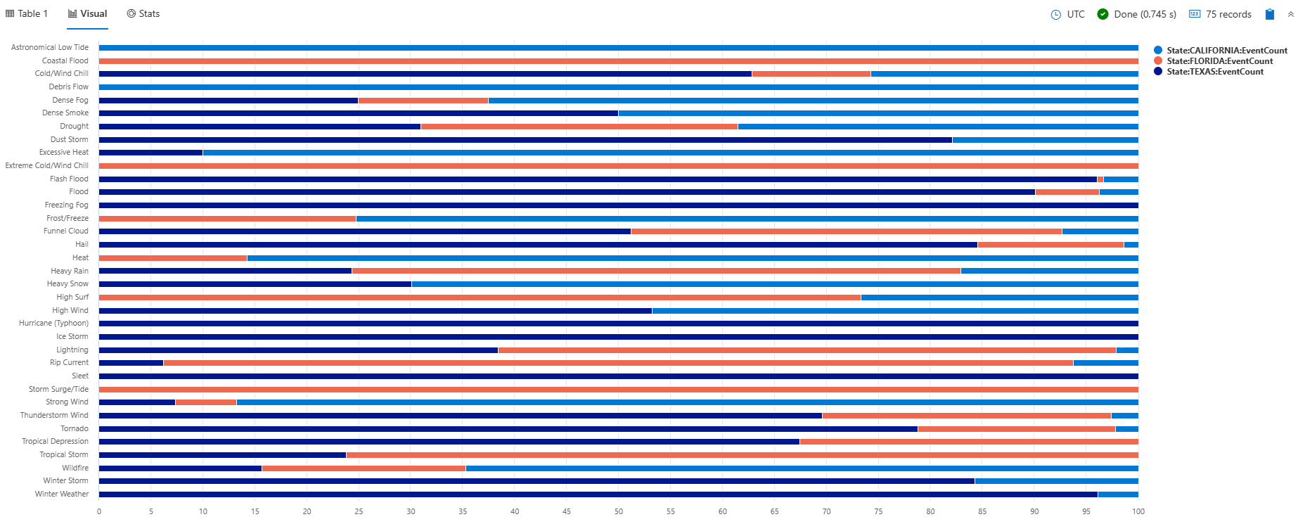
The following query creates a stacked100 bar chart that shows the total count of storm events by their type for selected states of Texas, California, and Florida. The chart shows the distribution of storm events across states within each type. Although the stacks visually sum up to 100, the values actually represent the number of events, not percentages. This visualization is helpful for understanding both the percentages and the actual event counts.
StormEvents
| where State in ("TEXAS", "CALIFORNIA", "FLORIDA")
| summarize EventCount = count() by EventType, State
| order by EventType asc, State desc
| render barchart with (kind=stacked100)
Use the ysplit property
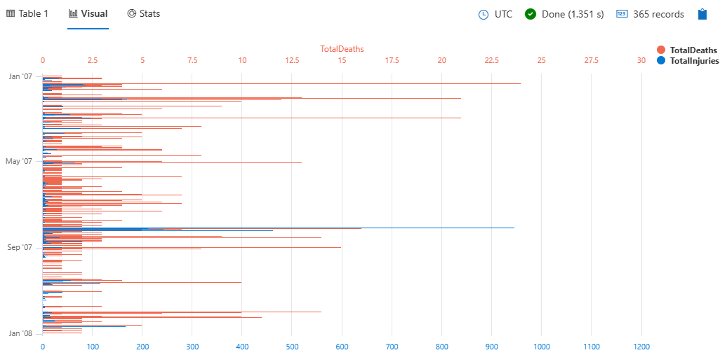
StormEvents
| summarize
    TotalInjuries = sum(InjuriesDirect) + sum(InjuriesIndirect),
    TotalDeaths = sum(DeathsDirect) + sum(DeathsIndirect)
    by bin(StartTime, 1d)
| project StartTime, TotalInjuries, TotalDeaths
| render barchart with (ysplit=axes)
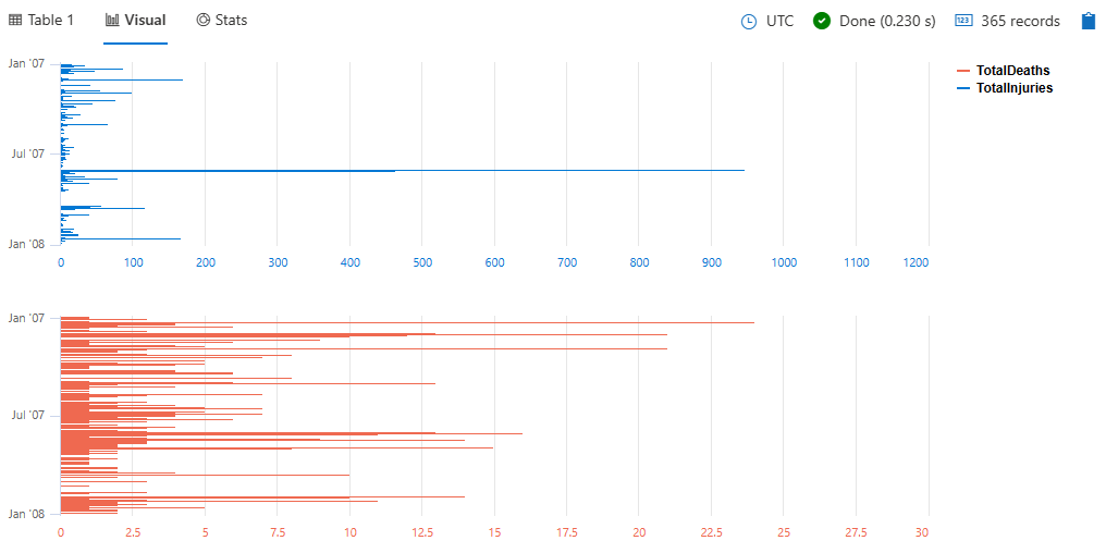
To split the view into separate panels, specify panels instead of axes:
StormEvents
| summarize
    TotalInjuries = sum(InjuriesDirect) + sum(InjuriesIndirect),
    TotalDeaths = sum(DeathsDirect) + sum(DeathsIndirect)
    by bin(StartTime, 1d)
| project StartTime, TotalInjuries, TotalDeaths
| render barchart with (ysplit=panels)


