Line chart
Applies to: ✅ Microsoft Fabric ✅ Azure Data Explorer ✅ Azure Monitor ✅ Microsoft Sentinel
The line chart visual is the most basic type of chart. The first column of the query should be numeric and is used as the x-axis. Other numeric columns are the y-axes. Line charts track changes over short and long periods of time. When smaller changes exist, line graphs are more useful than bar graphs.
Note
This visualization can only be used in the context of the render operator.
Syntax
T | render linechart [with ( propertyName = propertyValue [, ...] )]
Learn more about syntax conventions.
Parameters
| Name | Type | Required | Description |
|---|---|---|---|
| T | string |
✔️ | Input table name. |
| propertyName, propertyValue | string |
A comma-separated list of key-value property pairs. See supported properties. |
Supported properties
All properties are optional.
| PropertyName | PropertyValue |
|---|---|
accumulate |
Whether the value of each measure gets added to all its predecessors (true or false). |
legend |
Whether to display a legend or not (visible or hidden). |
series |
Comma-delimited list of columns whose combined per-record values define the series that record belongs to. |
ymin |
The minimum value to be displayed on Y-axis. |
ymax |
The maximum value to be displayed on Y-axis. |
title |
The title of the visualization (of type string). |
xaxis |
How to scale the x-axis (linear or log). |
xcolumn |
Which column in the result is used for the x-axis. |
xtitle |
The title of the x-axis (of type string). |
yaxis |
How to scale the y-axis (linear or log). |
ycolumns |
Comma-delimited list of columns that consist of the values provided per value of the x column. |
ysplit |
How to split multiple the visualization. For more information, see ysplit property. |
ytitle |
The title of the y-axis (of type string). |
ysplit property
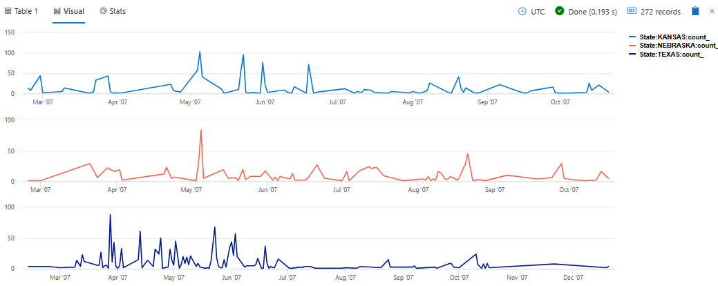
This visualization supports splitting into multiple y-axis values:
ysplit |
Description |
|---|---|
none |
A single y-axis is displayed for all series data. (Default) |
axes |
A single chart is displayed with multiple y-axes (one per series). |
panels |
One chart is rendered for each ycolumn value (up to some limit). |
Examples
Render a line chart
StormEvents
| where State=="VIRGINIA"
| project StartTime, DamageProperty
| render linechart
Label a line chart
StormEvents
| where State=="VIRGINIA"
| project StartTime, DamageProperty
| render linechart
    with (
    title="Property damage from storms in Virginia",
    xtitle="Start time of storm",
    ytitle="Property damage"
    )
Limit values displayed on the y-axis
StormEvents
| where State=="VIRGINIA"
| project StartTime, DamageProperty
| render linechart with (ymin=7000, ymax=300000)
View multiple y-axes
StormEvents
| where State in ("TEXAS", "NEBRASKA", "KANSAS") and EventType == "Hail"
| summarize count() by State, bin(StartTime, 1d)
| render linechart with (ysplit=panels)


