Building Win-Loss Sparklines in SQL Server Reporting Services 2008 R2
With the November CTP of SQL Server Reporting Services 2008 R2, we are introducing a new visualization in SSRS, sparklines. Sparklines were developed by Edward Tufte and are described as “small, intense, simple data words”. In this post we’ll look at how you can add a “win-loss” sparkline to your reports.
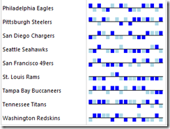
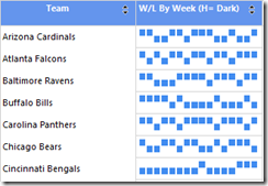
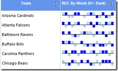
For this example, we’ll take a look at the 2008 NFL season schedule by team and draw a sparkline to depict each team’s performance over the year. When we’re done, it will look like the image below. This image shows each team’s result by week where the up ticks are wins and the down ticks are losses. The dark blue ticks are home games and the light blue ticks are away games.
Step 1: The Dataset
The dataset that we need contains the scores of all the games from the 2008 NFL season. I’ve placed a backup of the database for this exercise up at SSRS 2008 R2 Samples.
SELECT Home as Team, HomeScore as Score, [Week], 'H' as Home, Away as Opponent, AwayScore as OpponentScore, (SELECT Team from TeamOffense where teamoffense.TeamAbb=scores.Home) as TeamName
FROM dbo.scores
UNION ALL
SELECT Away as Team, AwayScore as Score, [Week], 'A' as Home, Home as Opponent, HomeScore as OpponentScore,(SELECT Team from TeamOffense where teamoffense.TeamAbb=scores.Away) as TeamName
FROM dbo.scores
Step 2: Add Matrix
Inside the report body, add a matrix to your report and place the TeamName field on row groups. This should give you the look below.
Step 3: Add Sparkline
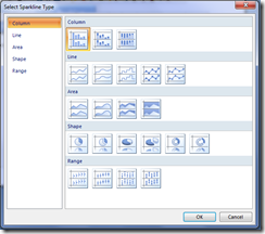
To add a sparkline to your report, you can right click on a non-detail cell of a tablix or use the ribbon entry point.
We have added several sparkline types to Report Builder 3.0, but the concept for all of them is the same. They are effectively small charts that are stripped down to just the visual for the series. There are no legends, no axis titles, no data point labels, etc. It’s just the line, bar, or column. Of course, if you want to add any of these features that are turned off because you are targeting a small multiple scenario (subject of a future blog post :) ), you can simply select the sparkline and choose the option to convert it to full chart. Sparklines are persisted in our RDL format as full charts.
For this example, we are going to use the column chart. Select that first option. Your report should now look like the image below.
Step 4: Specify the Series Value and Category Grouping
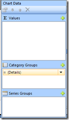
In our scenario, we want to use the sparkline to chart each team’s result over the 17 weeks of the NFL season. To start with, let’s just give the series a value which we will go in and edit. Select the bar series and you should see our new data visualization panel. This is new in the November CTP as well.
Click on the “+” symbol and add the [Score] field to the Values area.
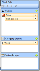
Next, we need to define the Category Group for the sparkline. In our case, each bar represents a week so, we’ll pick the [Week] field. This will remove the details group. Your data visualization panel should now look like the image below.
Now things are going to get a little bit more advanced. The purpose of our sparkline is to show whether or not each team won or lost for each week of the season. We need to modify our Series value expression in order to achieve this goal.
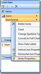
With the data visualization panel still open, select the series and bring up it’s properties.
Change the Value to the following expression:
=IIF(IsNothing(SUM(Fields!Score.Value)), 0, IIF(SUM(Fields!Score.Value) >SUM(Fields!OpponentScore.Value), 1,-1))
There is a lot going on in this expression, and we’ll get to all of it before this post is over, but for the time being, what we should take away from this expression is that it’s simply doing a check of the current team’s score and comparing it to the opponent’s score, and assigning a 1 for a win and a –1 for a loss. These are the values that are going to be charted on the sparkline.
Let’s go ahead and run the report to see how things are looking to this point.
Step 4: Axis Synchronization
If you count all of the little up and down ticks on our sparkline, the avid NFL fan will notice something wrong with this picture. Namely, each team has 16 “sparks”, but the NFL season is actually comprised of 17 weeks in which every team gets one week off. As a result, if we were trying to ask ourselves, which teams won on Week 6, the sparkline above would not be helpful, because some of the teams would have had their bye week already. What we want to see is a gap in the axis to reflect the bye weeks.
For those of you who are not NFL fans, here’s another scenario that is similar. Suppose you have 10 sales people, and only a few of them worked for the entire year, but you have a few that worked during the holiday season. When you display the sparklines to show their monthly sales, you want all of the monthly sales bars to be the same size in width and be aligned to the appropriate month.
How do we solve this problem? One way would be to use an OUTER JOIN query, but we realized we shouldn’t necessarily require report authors to do such work in order to get the visual they need. So, along with the addition of sparklines, we added another feature in SSRS 2008 called Group Domain Scope that surfaces itself in sparklines as Axis alignment. The domain scope feature is actually very useful in non-sparkline scenarios as well. I will cover this particular feature in a future blog post, but for folks who want to start using it now, you can think of it as a feature that fills in the missing values for each instance in a group based on the total unique instances in the group.
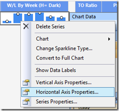
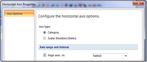
Back to the problem at hand. To insert all of our bye weeks on the sparkline, we will use the axis synchronization feature. You can do this by selecting the sparkline and bringing up the Horizontal Axis properties.
Check the check box for “Align Axes in:” and set it to the tablix.
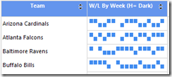
Run the report. Now you should see the following:
Notice now that each team has a gap in their sparkline that corresponds to their bye week. If you look back at the value expression for the series, this is where the IsNothing() check on the team’s score comes into play. If the team doesn’t have an entry for the week, and they don’t have an entry in our database when they are on their bye week, we can check for that using IsNothing() in conjuction with the Axis Synchronization feature and the result is we chart a value of 0 for those instances.
Step 5: Conditional Formatting the Sparkline
If you look back at our final sparkline at the top of the post, you will notice that some bars are light blue and some bars are darker blue. Why and how do we do this? The why is simple: I’d like to be able to show a distinction between home and away games.
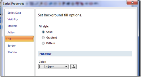
The “how” part is actually relatively straightforward. Open up the Series property page and go to the fill tab.
Open up the Color expression editor and insert the following expression:
=IIF(Fields!Home.Value= "H", "Blue","LightBlue")
Run the report. Now we have the effect we are looking for.
Step 6: Let’s Add Some Tooltips
One last requirement before we are done. I’d like to see the opponent for each week in my sparkline. For this case, we can add a tooltip to our sparkline, so that user’s can hover over each point and see who the opponent was.
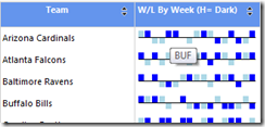
Select the series and open up it’s Series Data property page. There you will find a tooltip property. Set it to the [Opponent] Field. Now, run the report.
It’s hard to see where the mouse is pointed in this capture, but it’s on Week 5 of the Arizona Cardinals schedule. Looks like they beat the Buffalo Bills that week.
Step 7: Add the Axis Line
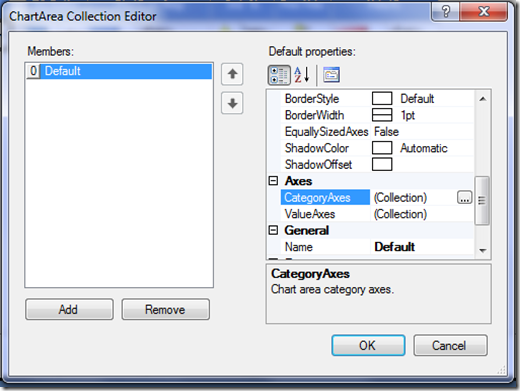
This last one is a bit hidden, but to add the horizontal axis line we will need to go to the property grid. Select the Sparkline and in the property grid, and open up the Chart Areas section.
Select the Category Axes in the above editor and then in the window that opens up, choose the option to mark the axis visible.
That’s it. Your report should be all done now.
Download the Solution
I’ve placed the supporting database backup and the reports up on my SkyDrive account. You can download them here.
