Shapes
A .NET Multi-platform App UI (.NET MAUI) Shape is a type of View that enables you to draw a shape to the screen. Shape objects can be used inside layout classes and most controls, because the Shape class derives from the View class. .NET MAUI Shapes is available in the Microsoft.Maui.Controls.Shapes namespace.
Shape defines the following properties:
- Aspect, of type Stretch, describes how the shape fills its allocated space. The default value of this property is
Stretch.None. - Fill, of type Brush, indicates the brush used to paint the shape's interior.
- Stroke, of type Brush, indicates the brush used to paint the shape's outline.
- StrokeDashArray, of type
DoubleCollection, which represents a collection ofdoublevalues that indicate the pattern of dashes and gaps that are used to outline a shape. - StrokeDashOffset, of type
double, specifies the distance within the dash pattern where a dash begins. The default value of this property is 0.0. - StrokeDashPattern, of type
float[], indicates the pattern of dashes and gaps that are used when drawing the stroke for a shape. - StrokeLineCap, of type PenLineCap, describes the shape at the start and end of a line or segment. The default value of this property is
PenLineCap.Flat. - StrokeLineJoin, of type PenLineJoin, specifies the type of join that is used at the vertices of a shape. The default value of this property is
PenLineJoin.Miter. - StrokeMiterLimit, of type
double, specifies the limit on the ratio of the miter length to half the StrokeThickness of a shape. The default value of this property is 10.0. - StrokeThickness, of type
double, indicates the width of the shape outline. The default value of this property is 1.0.
These properties are backed by BindableProperty objects, which means that they can be targets of data bindings, and styled.
.NET MAUI defines a number of objects that derive from the Shape class. These are Ellipse, Line, Path, Polygon, Polyline, Rectangle, and RoundRectangle.
Paint shapes
Brush objects are used to paint a shapes's Stroke and Fill:
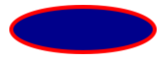
<Ellipse Fill="DarkBlue"
         Stroke="Red"
         StrokeThickness="4"
         WidthRequest="150"
         HeightRequest="50"
         HorizontalOptions="Start" />
In this example, the stroke and fill of an Ellipse are specified:

Important
Brush objects use a type converter that enables Color values to specified for the Stroke property.
If you don't specify a Brush object for Stroke, or if you set StrokeThickness to 0, then the border around the shape is not drawn.
For more information about Brush objects, see Brushes. For more information about valid Color values, see Colors.
Stretch shapes
Shape objects have an Aspect property, of type Stretch. This property determines how a Shape object's contents is stretched to fill the Shape object's layout space. A Shape object's layout space is the amount of space the Shape is allocated by the .NET MAUI layout system, because of either an explicit WidthRequest and HeightRequest setting or because of its HorizontalOptions and VerticalOptions settings.
The Stretch enumeration defines the following members:
None, which indicates that the content preserves its original size. This is the default value of theShape.Aspectproperty.- Fill, which indicates that the content is resized to fill the destination dimensions. The aspect ratio is not preserved.
Uniform, which indicates that the content is resized to fit the destination dimensions, while preserving the aspect ratio.UniformToFill, indicates that the content is resized to fill the destination dimensions, while preserving the aspect ratio. If the aspect ratio of the destination rectangle differs from the source, the source content is clipped to fit in the destination dimensions.
The following XAML shows how to set the Aspect property:
<Path Aspect="Uniform"
      Stroke="Yellow"
      Fill="Red"
      BackgroundColor="LightGray"
      HorizontalOptions="Start"
      HeightRequest="100"
      WidthRequest="100">
    <Path.Data>
        <!-- Path data goes here -->
    </Path.Data>
</Path>
In this example, a Path object draws a heart. The Path object's WidthRequest and HeightRequest properties are set to 100 device-independent units, and its Aspect property is set to Uniform. As a result, the object's contents are resized to fit the destination dimensions, while preserving the aspect ratio:

Draw dashed shapes
Shape objects have a StrokeDashArray property, of type DoubleCollection. This property represents a collection of double values that indicate the pattern of dashes and gaps that are used to outline a shape. A DoubleCollection is an ObservableCollection of double values. Each double in the collection specifies the length of a dash or gap. The first item in the collection, which is located at index 0, specifies the length of a dash. The second item in the collection, which is located at index 1, specifies the length of a gap. Therefore, objects with an even index value specify dashes, while objects with an odd index value specify gaps.
Shape objects also have a StrokeDashOffset property, of type double, which specifies the distance within the dash pattern where a dash begins. Failure to set this property will result in the Shape having a solid outline.
Dashed shapes can be drawn by setting both the StrokeDashArray and StrokeDashOffset properties. The StrokeDashArray property should be set to one or more double values, with each pair delimited by a single comma and/or one or more spaces. For example, "0.5 1.0" and "0.5,1.0" are both valid.
The following XAML example shows how to draw a dashed rectangle:
<Rectangle Fill="DarkBlue"
           Stroke="Red"
           StrokeThickness="4"
           StrokeDashArray="1,1"
           StrokeDashOffset="6"
           WidthRequest="150"
           HeightRequest="50"
           HorizontalOptions="Start" />
In this example, a filled rectangle with a dashed stroke is drawn:

Control line ends
A line has three parts: start cap, line body, and end cap. The start and end caps describe the shape at the start and end of a line, or segment.
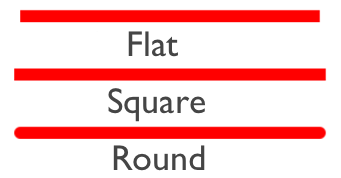
Shape objects have a StrokeLineCap property, of type PenLineCap, that describes the shape at the start and end of a line, or segment. The PenLineCap enumeration defines the following members:
Flat, which represents a cap that doesn't extend past the last point of the line. This is comparable to no line cap, and is the default value of the StrokeLineCap property.Square, which represents a rectangle that has a height equal to the line thickness and a length equal to half the line thickness.Round, which represents a semicircle that has a diameter equal to the line thickness.
Important
The StrokeLineCap property has no effect if you set it on a shape that has no start or end points. For example, this property has no effect if you set it on an Ellipse, or Rectangle.
The following XAML shows how to set the StrokeLineCap property:
<Line X1="0"
      Y1="20"
      X2="300"
      Y2="20"
      StrokeLineCap="Round"
      Stroke="Red"
      StrokeThickness="12" />
In this example, the red line is rounded at the start and end of the line:

Control line joins
Shape objects have a StrokeLineJoin property, of type PenLineJoin, that specifies the type of join that is used at the vertices of the shape. The PenLineJoin enumeration defines the following members:
Miter, which represents regular angular vertices. This is the default value of the StrokeLineJoin property.Bevel, which represents beveled vertices.Round, which represents rounded vertices.
Note
When the StrokeLineJoin property is set to Miter, the StrokeMiterLimit property can be set to a double to limit the miter length of line joins in the shape.
The following XAML shows how to set the StrokeLineJoin property:
<Polyline Points="20 20,250 50,20 120"
          Stroke="DarkBlue"
          StrokeThickness="20"
          StrokeLineJoin="Round" />
In this example, the dark blue polyline has rounded joins at its vertices:

.NET MAUI
 Browse the sample