Visualizing Team Foundation Server Work Items with Live Labs Pivot
Live Labs Pivot is a great way to visualize sets of data, and glean insights/understand patterns that may not be as visible otherwise. In this post, we’ll walk through how easy it is to visualize Team Foundation Server work items using Live Labs Pivot.
Prerequisites
For the purposes of this walkthrough, you’ll need the following:
- Live Labs Pivot
- Microsoft Office Excel (2007 or 2010)
- Pivot Collection Tool for Microsoft Excel - The sets of data that Pivot can visualize are called “Collections”. There are various ways you can create collections, but the easiest for the purposes of this walkthrough is to just use Excel. The Pivot Collection Tool for Microsoft Excel is an add-in that makes it easy to create collections from data in Excel.
- Access to a Team Foundation Server (you can use TFS’s Excel add-in to easily pull in work items into Excel).
Creating the collection
Open Excel, and on the Pivot Collections tab in the ribbon, create a New Collection.
In the resulting workbook that’s created, you’ll see a blank table with some column headings.
Of particular importance are “Name” and “Description”. These appear at the top of the Info Panel when you’ve zoomed in to an item in the collection:
As you can see, these map well to the Title and Description fields in a work item (or if you’re looking at bug work items, the Repro Steps field).
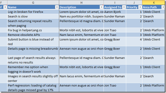
Next, copy and paste work items into the blank table (you can run query in Visual Studio and copy the results you want into Excel, or in a new sheet, import work items using the TFS Excel add-in and copy those results over). Be sure to choose columns that you want to see/analyze in Pivot. For example, if I’m analyzing the active bugs in the current iteration, I might want to see who they are assigned to, the priorities, and the area path:
Notice that I’ve renamed Title to Name and Repro Steps to Description above so that Pivot recognizes these columns.
Previewing the collection
On the Pivot Collections tab in the ribbon, click the Quick Preview button (note, you must select a cell in the table for this option to be enabled):
This should fire up Pivot and display the work items with some filter options on the left:
Start exploring and analyzing your work items!
Adding images
For each data point, Pivot assumes that there is some sort of image that can represent it. For the purposes of this walkthrough, I’m most interested in the priority of the bugs, so I’ve kept things simple and chosen simple colored squares to represent work items based on their priority.
| Pri 1 | Pri 2 | Pri 3 | Pri 4 |
To choose an image to represent an item in a Pivot collection, go back to the Excel workbook, select one of the item’s cells, and click on the Choose Image button on the Pivot Collections tab on the Ribbon:
Finally, publish the collection to see the images:


