RibbonToggleButton.ToolTipFooterTitle Property
Definition
Important
Some information relates to prerelease product that may be substantially modified before it’s released. Microsoft makes no warranties, express or implied, with respect to the information provided here.
Gets or sets the title text that is displayed in the footer of the ToolTip for this control.
public:
 property System::String ^ ToolTipFooterTitle { System::String ^ get(); void set(System::String ^ value); };
public string ToolTipFooterTitle { get; set; }member this.ToolTipFooterTitle : string with get, setPublic Property ToolTipFooterTitle As StringProperty Value
The title text to display in the footer of the ToolTip. The registered default is null. For more information about what can influence the value, see Dependency Property Value Precedence.
Examples
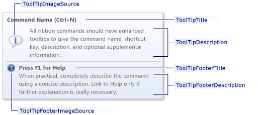
The following example shows the markup used to create the enhanced ToolTip.
 Enhanced ToolTip
<ribbon:RibbonToggleButton Label="Ribbon Control"
                SmallImageSource="Images/Lightbulb16.png"
                LargeImageSource="Images/Lightbulb32.png"
                KeyTip="N"
                ToolTipTitle="Command Name (Ctrl+N)"
                ToolTipDescription="All ribbon commands should have enhanced tooltips to give the command name, shortcut key, description, and optional supplemental information."
                ToolTipImageSource="Images/Suggestion32.png"
                ToolTipFooterTitle="Press F1 for Help"
                ToolTipFooterDescription="When practical, completely describe the command using a concise description. Link to Help only if further explanation is really necessary."
                ToolTipFooterImageSource="Images/Help16.png" />
Remarks
Warning
Each ribbon control inherits a FrameworkElement.ToolTip property. If the FrameworkElement.ToolTip property is set, the ribbon's enhanced ToolTip will not be shown; the standard ToolTip will be shown instead.
Dependency Property Information
| Item | Value |
|---|---|
| Identifier field | ToolTipFooterTitleProperty |
Metadata properties set to true |
None |
Applies to
See also
.NET
