Use cards with entity value data types
This article describes how to use the Excel JavaScript API to create card modal windows in the Excel UI with entity value data types. These cards can display additional information contained within an entity value, beyond what's already visible in a cell, such as related images, product category information, and data attributions.
Note
This article expands on information described in the Excel data types core concepts article. We recommend reading that article before learning about entity cards.
An entity value, or EntityCellValue, is a container for data types and similar to an object in object-oriented programming. This article shows how to use entity value card properties, layout options, and data attribution functionality to create entity values that display as cards.
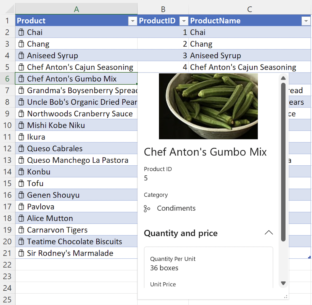
The following screenshot shows an example of an open entity value card, in this case for the Chef Anton's Gumbo Mix product from a list of grocery store products.
Card properties
The entity value properties property allows you to set customized information about your data types. The properties key accepts nested data types. Each nested property, or data type, must have a type and basicValue setting.
Important
The nested properties data types are used in combination with the Card layout values described in the subsequent article section. After defining a nested data type in properties, it must be assigned in the layouts property to display on the card.
The following code snippet shows the JSON for an entity value with multiple data types nested within properties.
Note
To experiment with this code snippet in a complete sample, open Script Lab in Excel and select Data types: Create entity cards from data in a table in our Samples library.
const entity: Excel.EntityCellValue = {
    type: Excel.CellValueType.entity,
    text: productName,
    properties: {
        "Product ID": {
            type: Excel.CellValueType.string,
            basicValue: productID.toString() || ""
        },
        "Product Name": {
            type: Excel.CellValueType.string,
            basicValue: productName || ""
        },
        "Image": {
            type: Excel.CellValueType.webImage,
            address: product.productImage || ""
        },
        "Quantity Per Unit": {
            type: Excel.CellValueType.string,
            basicValue: product.quantityPerUnit || ""
        },
        "Unit Price": {
            type: Excel.CellValueType.formattedNumber,
            basicValue: product.unitPrice,
            numberFormat: "$* #,##0.00"
        },
        Discontinued: {
            type: Excel.CellValueType.boolean,
            basicValue: product.discontinued || false
        }
    },
    layouts: {
        // Enter layout settings here.
    }
};
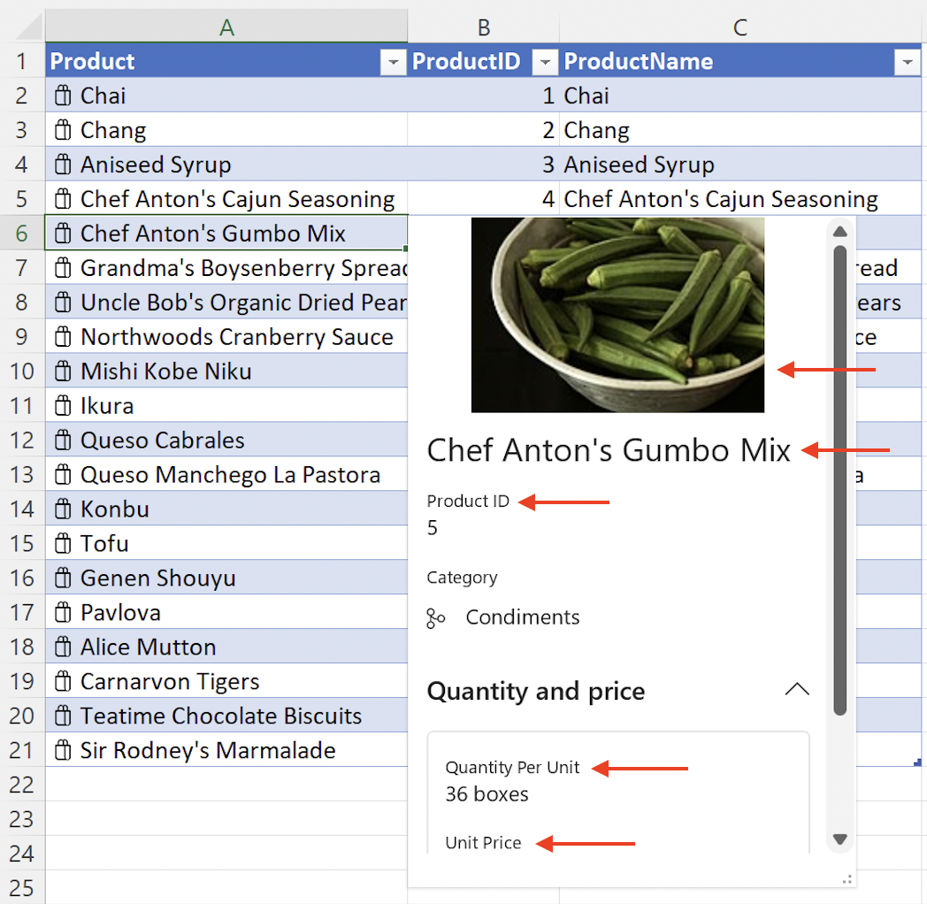
The following screenshot shows an entity value card that uses the preceding code snippet. The screenshot shows the Product ID, Product Name, Image, Quantity Per Unit, and Unit Price information from the preceding code snippet.
Property metadata
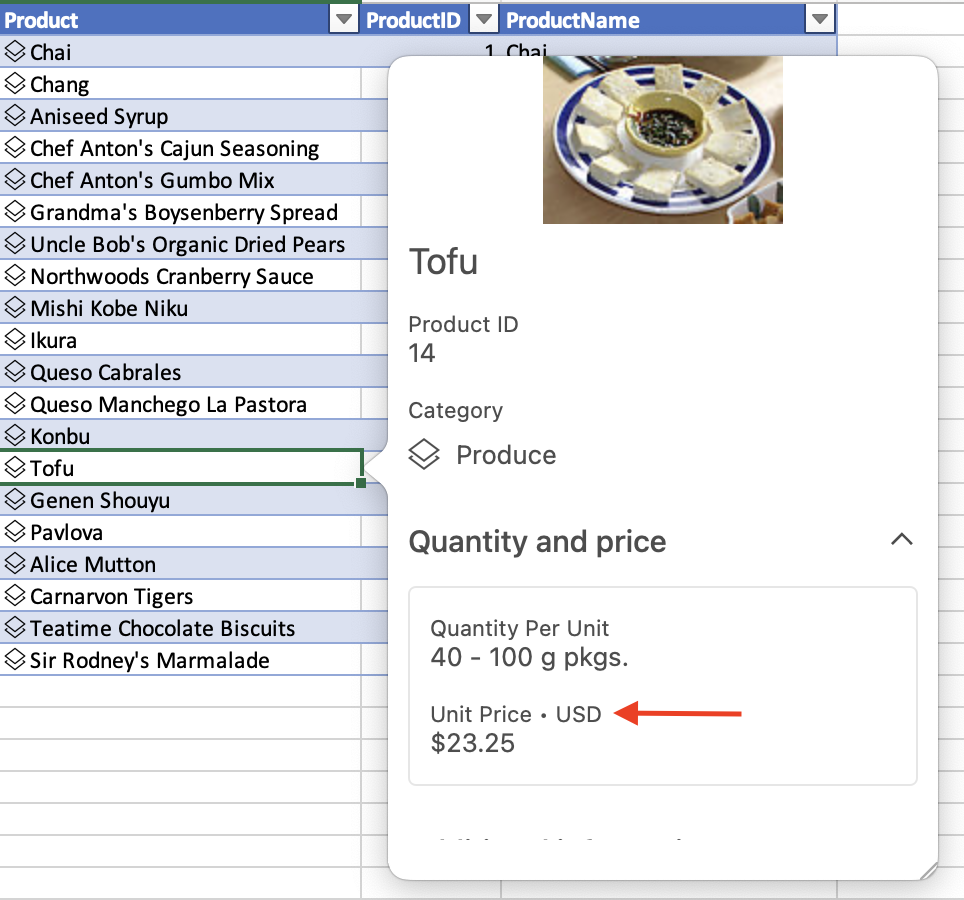
Entity properties have an optional propertyMetadata field that uses the CellValuePropertyMetadata object and offers the properties attribution, excludeFrom, and sublabel. The following code snippet shows how to add a sublabel to the "Unit Price" property from the preceding code snippet. In this case, the sublabel identifies the currency type.
Note
The propertyMetadata field is only available on data types that are nested within entity properties.
// This code snippet is an excerpt from the `properties` field of the
// preceding `EntityCellValue` snippet. "Unit Price" is a property of
// an entity value.
        "Unit Price": {
            type: Excel.CellValueType.formattedNumber,
            basicValue: product.unitPrice,
            numberFormat: "$* #,##0.00",
            propertyMetadata: {
              sublabel: "USD"
            }
        },
The following screenshot shows an entity value card that uses the preceding code snippet, displaying the property metadata sublabel of USD next to the Unit Price property.
Card layout
The entity value layouts property defines the appearance of the entity. Use layouts to specify attributes such as an entity icon, card title, image for a card, and the number of sections to display.
Important
The nested layouts values are used in combination with the Card properties data types described in the preceding article section. A nested data type must be defined in properties before it can be assigned in layouts to display on the card.
The layouts property contains two direct subproperties, compact and card. The card property specifies the appearance of a card when the entity card is open. The compact property only defines the icon for an entity, and this icon only displays when the card is in its compact, or unopened state. See the EntityCompactLayoutIcons enum for a full list of available icons. The next code snippet shows how to display the shoppingBag icon.
Within the card property, use the CardLayoutStandardProperties object to define the components of the card like title, subTitle, and sections.
The entity value JSON in the next code snippet shows a card layout with nested title and mainImage objects, as well as three sections within the card. Note that the title property "Product Name" has a corresponding data type in the preceding Card properties article section. The mainImage property also has a corresponding "Image" data type in the preceding section. The sections property takes a nested array and uses the CardLayoutSectionStandardProperties object to define the appearance of each section.
Within each card section you can specify elements like layout, title, and properties. The layout key uses the CardLayoutListSection object and accepts the value "List". The properties key accepts an array of strings. Note that the properties values, such as "Product ID", have corresponding data types in the preceding Card properties article section. Sections can also be collapsible and can be defined with boolean values as collapsed or not collapsed when the entity card is opened in the Excel UI.
Note
To experiment with this code snippet in a complete sample, open Script Lab in Excel and select Data types: Create entity cards from data in a table in our Samples library.
const entity: Excel.EntityCellValue = {
    type: Excel.CellValueType.entity,
    text: productName,
    properties: {
        // Enter property settings here.
    },
    layouts: {
        compact: {
            icon: Excel.EntityCompactLayoutIcons.shoppingBag
        },
        card: {
            title: {
                property: "Product Name"
            },
            mainImage: {
                property: "Image"
            },
            sections: [
                {
                    layout: "List",
                    properties: ["Product ID"]
                },
                {
                    layout: "List",
                    title: "Quantity and price",
                    collapsible: true,
                    collapsed: false, // This section will not be collapsed when the card is opened.
                    properties: ["Quantity Per Unit", "Unit Price"]
                },
                {
                    layout: "List",
                    title: "Additional information",
                    collapsible: true,
                    collapsed: true, // This section will be collapsed when the card is opened.
                    properties: ["Discontinued"]
                }
            ]
        }
    }
};
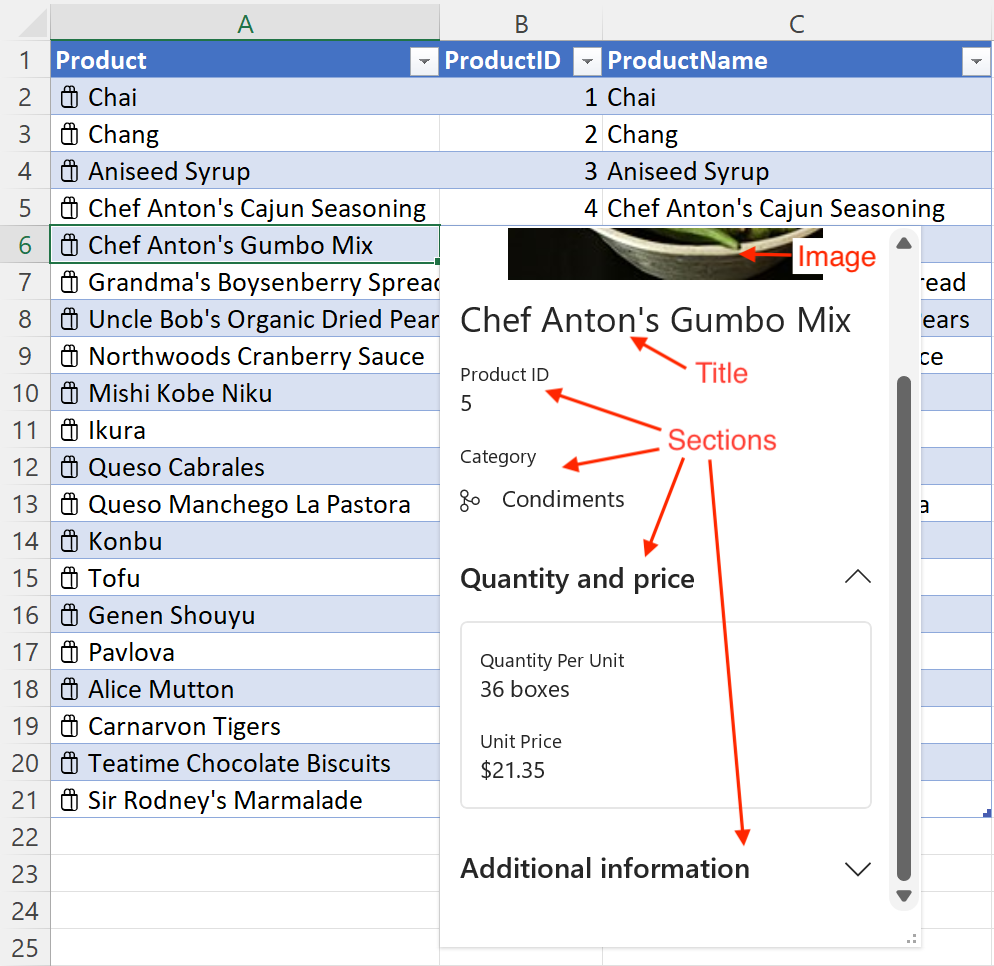
The following screenshot shows an entity value card that uses the preceding code snippets. In the screenshot, the shoppingBag icon displays alongside the product names in the spreadsheet. In the entity card, the mainImage object displays at the top, followed by the title object which uses the Product Name and is set to Chef Anton's Gumbo Mix. The screenshot also shows sections. The Quantity and price section is collapsible and contains Quantity Per Unit and Unit Price. The Additional information field is collapsible and is collapsed when the card is opened.
Note
In the preceding screenshot, the branch icon displays alongside Condiments in the Category section. See the Data types: Create entity cards from data in a table sample to learn how to set nested icons like the Category section icon.
There is a known issue with nested icons in Excel on Mac. In that environment, nested icons will always display as the generic icon, regardless of which icon is selected with the EntityCompactLayoutIcons enum.
Card data attribution
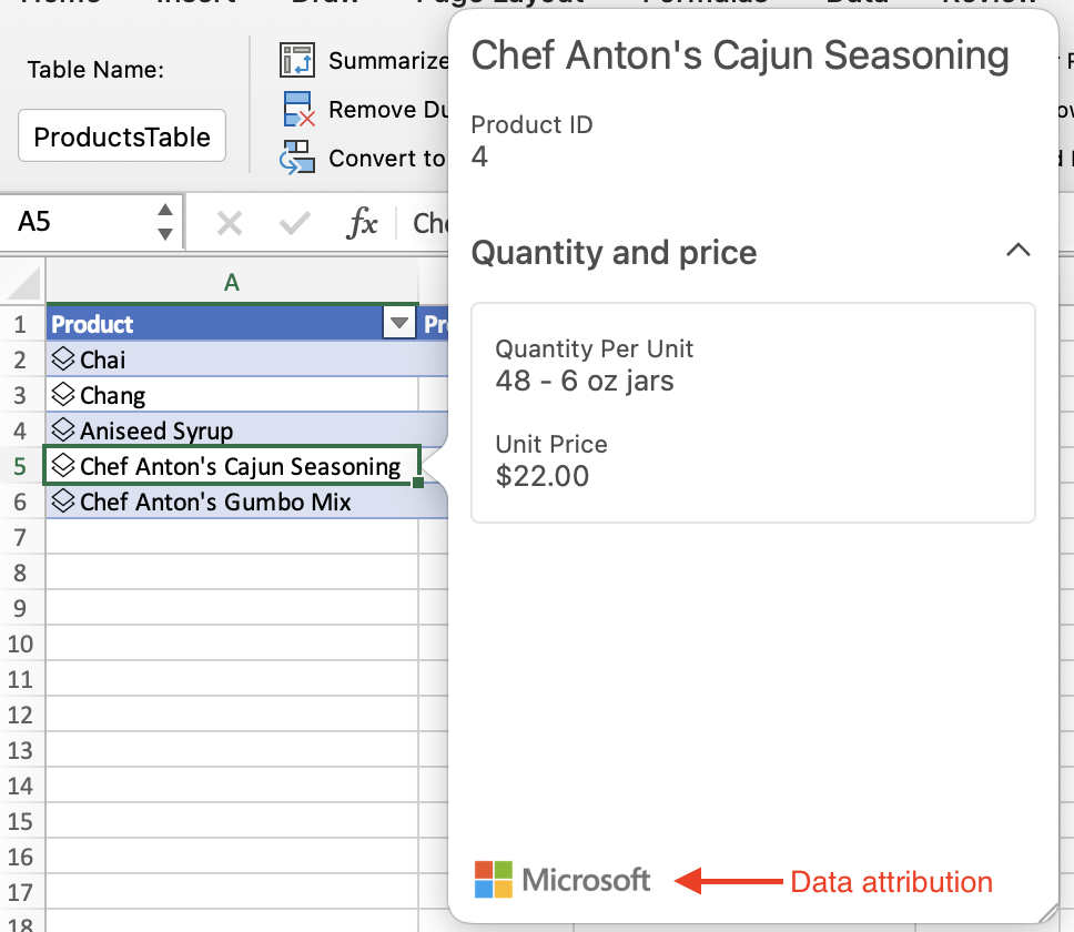
Entity value cards can display a data attribution to give credit to the provider of the information in the entity card. The entity value provider property uses the CellValueProviderAttributes object, which defines the description, logoSourceAddress, and logoTargetAddress values.
The data provider property displays an image in the lower left corner of the entity card. It uses the logoSourceAddress to specify a source URL for the image. The logoTargetAddress value defines the URL destination if the logo image is selected. The description value displays as a tooltip when hovering over the logo. The description value also displays as a plain text fallback if the logoSourceAddress is not defined or if the source address for the image is broken.
The JSON in the following code snippet shows an entity value that uses the provider property to specify a data provider attribution for the entity.
Note
To experiment with this code snippet in a complete sample, open Script Lab in Excel and select Data types: Entity value attribution properties in our Samples library.
const entity: Excel.EntityCellValue = {
    type: Excel.CellValueType.entity,
    text: productName,
    properties: {
        // Enter property settings here.
    },
    layouts: {
        // Enter layout settings here.
    },
    provider: {
        description: product.providerName, // Name of the data provider. Displays as a tooltip when hovering over the logo. Also displays as a fallback if the source address for the image is broken.
        logoSourceAddress: product.sourceAddress, // Source URL of the logo to display.
        logoTargetAddress: product.targetAddress // Destination URL that the logo navigates to when selected.
    }
};
The following screenshot shows an entity value card that uses the preceding code snippet. The screenshot shows the data provider attribution in the lower left corner. In this instance, the data provider is Microsoft and the Microsoft logo is displayed.
Next steps
Try out the Create and explore data types in Excel sample in our OfficeDev/Office-Add-in-samples repository. This sample guides you through building and then sideloading an add-in that creates and edits data types in a workbook.
See also
Office Add-ins