TFS 2010 Code Churn Report – Getting Additional Detail
It’s great to see more TFS users use a tool they know, Excel, in conjunction with a tool they may not know so well, Analysis Services to answer questions about their software project. The default TFS reports provide a great first level of detail but you will frequently need to get to the next (and next-next) levels of detail to answer questions about your project. No matter what your role in the project the more you can visit the “self serve business intelligence counter” via Excel connected to the TFS data warehouse the more productive conversations you can have with your team.
Turning “hmmm… we had a bunch of code churn yesterday” to “I see most of the code churn yesterday were added class files in our queuing component… is that related to the bug fix we approved yesterday? I wouldn’t expect new files to be added for a bug fix” Now that is real world and just one example how data can turn a conversation productive!
I’ll use the code churn as an example on how the default TFS reports are a great starting point for project information and how you will need to get some additional detail.
On a project I’m involved with they use the TFS 2010 Build Quality Indicators Report, a default report in the Agile process template, to make sure most tests are passing and increasing in number, code coverage is at the target level and code churn is trending down as we close an iteration.
They hit a couple builds with high code coverage (see to the right, circled) and wanted to confirm if this was expected or not. Here is how you can get more detail on code churn.
You can modify the existing default code churn report that comes in the Agile process template. The example below I start with a new Excel workbook.
1. Follow the excellent instructions here, https://www.woodwardweb.com/vsts/getting_started.html, to connect Excel to your TFS Warehouse.
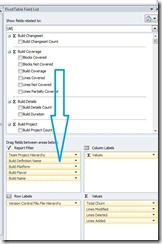
 2. Add filters – Since the question I’m trying to answer is related to a particular build I’m going to drag the following dimensions from the pivot table field list to the report filter
- Team Project Hierarchy
- Build Definition Name
- Build Platform
- Build Flavor
- Build Name
3. Add Rows – I’m interested in what files have changes so I’m going to drag the Version Control File.File Hierarchy dimension from the pivot table filed list to the row label. If I wanted to know who was churning code I could drag the “Version Control change set checked in by” dimension in to the row label instead. Bonus – have both the checked in and File Hierarchy dimensions in your row label!
4. Add values – This is the “show me the money” moment! Drag in the following calculated fields from the pivot table filed list into the values area.
- Code Churn Count
- Total Churn
- Lines Modified
- Lines Deleted
- Lines Added
Below is what your finished product should look like. This will give you the “next” level of detail on what code churned and what type of change it was. Since we are working with a pivot table connected to the Version control file file hierarchy dimension you can drill down to see churn down to the file level.
My preference is to have these more detailed reports answer 1-2 questions really well instead of trying to create a “shock and awe” report that is flashy but difficult to take action on. I save these in the TFS project SharePoint for other folks to use.
Once you have this basic report down you can begin spelunking into the other dimensions available to you in the data warehouse.
Data can be used for good and for evil so be sure to supplement this information with your own experience and expertise. Enjoy!

