Summary of Chapter 23. Triggers and behaviors
Note
This book was published in the spring of 2016, and has not been updated since then. There is much in the book that remains valuable, but some of the material is outdated, and some topics are no longer entirely correct or complete.
Triggers and behaviors are similar, in that they are both intended to be used in XAML files to simplify element interactions beyond the use of data bindings, and to extend the functionality of XAML elements. Both triggers and behaviors are almost always used with visual user-interface objects.
To support triggers and behaviors, both VisualElement and Style support two collection properties:
VisualElement.TriggersandStyle.Triggersof typeIList<TriggerBase>VisualElement.BehaviorsandStyle.Behaviorsof typeIList<Behavior>
Triggers
A trigger is a condition (a property change or the firing of an event) that results in a response (another property change or running some code). The Triggers property of VisualElement and Style is of type IList<TriggersBase>. TriggerBase is an abstract class from which four sealed classes derive:
Triggerfor responses based on property changesEventTriggerfor responses based on event firingsDataTriggerfor responses based on data bindingsMultiTriggerfor responses based on multiple triggers
The trigger is always set on the element whose property is being changed by the trigger.
The simplest trigger
The Trigger class checks for a change of a property value and responds by setting another property of the same element.
Trigger defines three properties:
Propertyof typeBindablePropertyValueof typeObjectSettersof typeIList<SetterBase>, the content property ofTrigger
In addition, Trigger requires that the following property inherited from TriggerBase be set:
TargetTypeto indicate the type of the element on which theTriggeris attached
The Property and Value comprise the condition, and the Setters collection is the response. When the indicated Property has the value indicated by Value, then the Setter objects in the Setters collection are applied. When the Property has a different value, the setters are removed. Setter defines two properties that are the same as the first two properties of Trigger:
The EntryPop sample demonstrates how a Trigger applied to an Entry can increase the size of the Entry via the Scale property when the IsFocused property of the Entry is true.
Although it's not common, the Trigger can be set in code, as the EntryPopCode sample demonstrates.
The StyledTriggers sample demonstrates how the Trigger can be set in a Style to apply to multiple Entry elements.
Trigger actions and animations
It is also possible to run a little code based on a trigger. This code can be an animation that targets a property. One common way is to use an EventTrigger, which defines two properties:
Eventof typestring, the name of an eventActionsof typeIList<TriggerAction>, a list of actions to run in response.
To use this, you need to write a class that derives from TriggerAction<T>, generally TriggerAction<VisualElement>. You can define properties in this class. These are plain CLR properties rather than bindable properties because TriggerAction doesn't derive from BindableObject. You must override the Invoke method that is called when the action is invoked. The argument is the target element.
The ScaleAction class in the Xamarin.FormsBook.Toolkit library is an example. It calls the ScaleTo property to animate the Scale property of an element. Because one of its properties is of type Easing, the EasingConverter class lets you use the standard Easing static fields in XAML.
The EntrySwell sample demonstrates how to invoke the ScaleAction from EventTrigger objects that monitor the Focused and Unfocused events.
The CustomEasingSwell sample shows how to define a custom easing function for ScaleAction in a code-behind file.
You can also invoke actions using a Trigger (as distinguished from EventTrigger). This requires that you are aware that TriggerBase defines two collections:
EnterActionsof typeIList<TriggerAction>ExitActionsof typeIList<TriggerAction>
The EnterExitSwell sample demonstrates how to use these collections.
More event triggers
The ScaleUpAndDownAction class in the Xamarin.FormsBook.Toolkit library calls ScaleTo twice to scale up and down. The
ButtonGrowth sample uses this in a styled EventTrigger to provide visual feedback when a Button is pressed. This double animation is also possible using two actions in the collection of type DelayedScaleAction
The ShiverAction class in the Xamarin.FormsBook.Toolkit library defines a customizable shiver action. The
ShiverButtonDemo sample demonstrates it.
The NumericValidationAction class in the Xamarin.FormsBook.Toolkit library is restricted to Entry elements and sets the TextColor property to red if the Text property is not a double. The
TriggerEntryValidation sample demonstrates it.
Data triggers
The DataTrigger is similar to the Trigger except that instead of monitoring a property for value changes, it monitors a data binding. This allows a property in one element to affect a property in another element.
DataTrigger defines three properties:
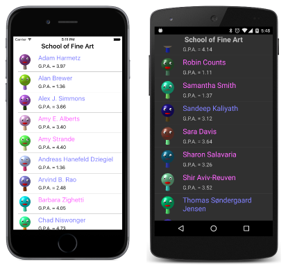
The GenderColors sample requires the SchoolOfFineArt library and sets the colors of the names of the students to blue or pink based on the Sex property:
The ButtonEnabler sample sets the IsEnabled property of an Entry to False if the Length property of the Text property of the Entry equals 0. Notice that the Text property is initialized to an empty string; by default it is null, and the DataTrigger wouldn't work correctly.
Combining conditions in the MultiTrigger
The MultiTrigger is a collection of conditions. When they are all true, then setters are applied. The class defines two properties:
Conditionsof typeIList<Condition>Settersof typeIList<Setter>
Condition is an abstract class and has two descendent classes:
PropertyCondition, which hasPropertyandValueproperties likeTriggerBindingCondition, which hasBindingandValueproperties likeDataTrigger
In the AndConditions sample, a BoxView is only colored when four Switch elements are all turned on.
The OrConditions sample demonstrates how you can make a BoxView a color when any of four Switch elements are turned on. This requires an application of De Morgan's Law and reversing all the logic.
Combining AND and OR logic is not so easy and generally requires invisible Switch elements for intermediate results. The
XorConditions sample demonstrates how a Button can be enabled if either of two Entry elements have some text typed in, but not if they both have some text typed in.
Behaviors
Anything you can do with a trigger, you can also do with a behavior, but behaviors always require a class that derives from Behavior<T> and overrides the following two methods:
The argument is the element that the behavior is attached to. Generally, the OnAttachedTo method attaches some event handlers, and OnDetachingFrom detaches them. Because such a class usually saves some state, it generally cannot be shared in a Style.
BehaviorEntryValidation sample is similar to TriggerEntryValidation except that it uses a behavior — the NumericValidationBehavior class in the Xamarin.FormsBook.Toolkit library.
Behaviors with properties
Behavior<T> derives from Behavior, which derives from BindableObject, so bindable properties can be defined on a behavior. These properties can be active in data bindings.
This is demonstrated in the
EmailValidationDemo program that makes use of the ValidEmailBehavior class in the Xamarin.FormsBook.Toolkit library. ValidEmailBehavior has a read-only bindable property and serves as a source in data bindings.
The EmailValidationConv sample uses this same behavior to display another type of indicator to signal that an email address is valid.
The EmailValidationTrigger sample is a variation on the previous sample. ButtonGlide uses a DataTrigger in combination with that behavior.
Toggles and check boxes
It's possible to encapsulate the behavior of a toggle button in a class such as ToggleBehavior in the Xamarin.FormsBook.Toolkit library, and then define all the visuals for the toggle entirely in XAML.
The ToggleLabel sample uses the ToggleBehavior with a DataTrigger to use a Label with two text strings for the toggle.
The FormattedTextToggle sample extends this concept by switching between two FormattedString objects.
The ToggleBase class in the Xamarin.FormsBook.Toolkit library derives from ContentView, defines an IsToggled property, and incorporates a ToggleBehavior for the toggle logic. This makes it easier to define the toggle button in XAML, as demonstrated by the TraditionalCheckBox sample.
The SwitchCloneDemo includes a SwitchClone class that derives from ToggleBase and uses a TranslateAction class to construct a toggle button that resembles the Xamarin.Forms Switch.
A RotateAction in the Xamarin.FormsBook.Toolkit provides an animation used to make an animated lever in the LeverToggle sample.
Responding to taps
One drawback of EventTrigger is that you can't attach it to a TapGestureRecognizer to respond to taps. Getting around that problem is the purpose of TapBehavior in the Xamarin.FormsBook.Toolkit
The BoxViewTapShiver sample uses TapBehavior to use the earlier ShiverAction for tapped BoxView elements.
The ShiverViews sample shows how to cut down on the markup by encapsulating a ShiverView class.
Radio buttons
The Xamarin.FormsBook.Toolkit library also has a RadioBehavior class for making radio buttons that are grouped by a string group name.
The RadioLabels program uses text strings for its radio button. The RadioStyle sample uses a Style for the difference in appearance between checked and unchecked buttons. The
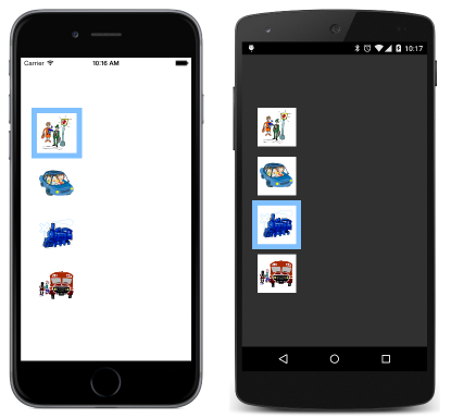
RadioImages sample uses boxed images for its radio buttons:
The TraditionalRadios sample draws traditional appearing radio buttons with a dot inside a circle.
Fades and orientation
The final sample, MultiColorSliders allows you to switch between three different color-selection views using radio buttons. The three views fade in and out using a FadeEnableAction in the Xamarin.FormsBook.Toolkit library.
The program also responds to changes in orientation between portrait and landscape using a GridOrientationBehavior in the Xamarin.FormsBook.Toolkit library.

