Xamarin.Forms ActivityIndicator
The Xamarin.Forms ActivityIndicator control displays an animation to show that the application is engaged in a lengthy activity. Unlike the ProgressBar, the ActivityIndicator gives no indication of progress. The ActivityIndicator inherits from View.
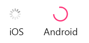
The following screenshots show an ActivityIndicator control on iOS and Android:

The ActivityIndicator control defines the following properties:
Coloris aColorvalue that defines the display color of theActivityIndicator.IsRunningis aboolvalue that indicates whether theActivityIndicatorshould be visible and animating, or hidden. When the value isfalsetheActivityIndicatorisn't visible.
These properties are backed by BindableProperty objects, which means that the ActivityIndicator can be styled and be the target of data bindings.
Create an ActivityIndicator
The ActivityIndicator class can be instantiated in XAML. Its IsRunning property determines if the control is visible and animating. The IsRunning property defaults to false. The following example shows how to instantiate an ActivityIndicator in XAML with the optional IsRunning property set:
<ActivityIndicator IsRunning="true" />
An ActivityIndicator can also be created in code:
ActivityIndicator activityIndicator = new ActivityIndicator { IsRunning = true };
ActivityIndicator appearance properties
The Color property defines the ActivityIndicator color. The following example shows how to instantiate an ActivityIndicator in XAML with the Color property set:
<ActivityIndicator Color="Orange" />
The Color property can also be set when creating an ActivityIndicator in code:
ActivityIndicator activityIndicator = new ActivityIndicator { Color = Color.Orange };
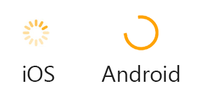
The following screenshots show the ActivityIndicator with the Color property set to Color.Orange on iOS and Android:
