Xamarin.Forms CarouselView Layout
CarouselView defines the following properties that control layout:
ItemsLayout, of typeLinearItemsLayout, specifies the layout to be used.PeekAreaInsets, of typeThickness, specifies how much to make adjacent items partially visible by.
These properties are backed by BindableProperty objects, which means that the properties can be targets of data bindings.
By default, a CarouselView will display its items in a horizontal orientation. A single item will be displayed on screen, with swipe gestures resulting in forwards and backwards navigation through the collection of items. However, a vertical orientation is also possible. This is because the ItemsLayout property is of type LinearItemsLayout, which inherits from the ItemsLayout class. The ItemsLayout class defines the following properties:
Orientation, of typeItemsLayoutOrientation, specifies the direction in which theCarouselViewexpands as items are added.SnapPointsAlignment, of typeSnapPointsAlignment, specifies how snap points are aligned with items.SnapPointsType, of typeSnapPointsType, specifies the behavior of snap points when scrolling.
These properties are backed by BindableProperty objects, which means that the properties can be targets of data bindings. For more information about snap points, see Snap points in the Xamarin.Forms CollectionView Scrolling guide.
The ItemsLayoutOrientation enumeration defines the following members:
Verticalindicates that theCarouselViewwill expand vertically as items are added.Horizontalindicates that theCarouselViewwill expand horizontally as items are added.
The LinearItemsLayout class inherits from the ItemsLayout class, and defines an ItemSpacing property, of type double, that represents the empty space around each item. The default value of this property is 0, and its value must always be greater than or equal to 0. The LinearItemsLayout class also defines static Vertical and Horizontal members. These members can be used to create vertical or horizontal lists, respectively. Alternatively, a LinearItemsLayout object can be created, specifying an ItemsLayoutOrientation enumeration member as an argument.
Note
CarouselView uses the native layout engines to perform layout.
Horizontal layout
By default, CarouselView will display its items horizontally. Therefore, it's not necessary to set the ItemsLayout property to use this layout:
<CarouselView ItemsSource="{Binding Monkeys}">
    <CarouselView.ItemTemplate>
        <DataTemplate>
            <StackLayout>
                <Frame HasShadow="True"
                       BorderColor="DarkGray"
                       CornerRadius="5"
                       Margin="20"
                       HeightRequest="300"
                       HorizontalOptions="Center"
                       VerticalOptions="CenterAndExpand">
                    <StackLayout>
                        <Label Text="{Binding Name}"
                               FontAttributes="Bold"
                               FontSize="Large"
                               HorizontalOptions="Center"
                               VerticalOptions="Center" />
                        <Image Source="{Binding ImageUrl}"
                               Aspect="AspectFill"
                               HeightRequest="150"
                               WidthRequest="150"
                               HorizontalOptions="Center" />
                        <Label Text="{Binding Location}"
                               HorizontalOptions="Center" />
                        <Label Text="{Binding Details}"
                               FontAttributes="Italic"
                               HorizontalOptions="Center"
                               MaxLines="5"
                               LineBreakMode="TailTruncation" />
                    </StackLayout>
                </Frame>
            </StackLayout>
        </DataTemplate>
    </CarouselView.ItemTemplate>
</CarouselView>
Alternatively, this layout can also be accomplished by setting the ItemsLayout property to a LinearItemsLayout object, specifying the Horizontal ItemsLayoutOrientation enumeration member as the Orientation property value:
<CarouselView ItemsSource="{Binding Monkeys}">
    <CarouselView.ItemsLayout>
        <LinearItemsLayout Orientation="Horizontal" />
    </CarouselView.ItemsLayout>
    ...
</CarouselView>
The equivalent C# code is:
CarouselView carouselView = new CarouselView
{
    ...
    ItemsLayout = LinearItemsLayout.Horizontal
};
This results in a layout that grows horizontally as new items are added:
Vertical layout
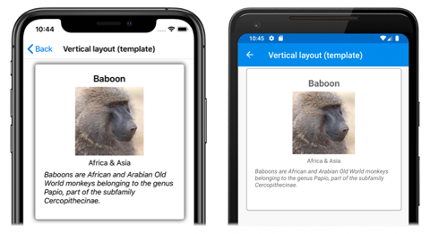
CarouselView can display its items vertically by setting the ItemsLayout property to a LinearItemsLayout object, specifying the Vertical ItemsLayoutOrientation enumeration member as the Orientation property value:
<CarouselView ItemsSource="{Binding Monkeys}">
    <CarouselView.ItemsLayout>
        <LinearItemsLayout Orientation="Vertical" />
    </CarouselView.ItemsLayout>
    <CarouselView.ItemTemplate>
        <DataTemplate>
            <StackLayout>
                <Frame HasShadow="True"
                       BorderColor="DarkGray"
                       CornerRadius="5"
                       Margin="20"
                       HeightRequest="300"
                       HorizontalOptions="Center"
                       VerticalOptions="CenterAndExpand">
                    <StackLayout>
                        <Label Text="{Binding Name}"
                               FontAttributes="Bold"
                               FontSize="Large"
                               HorizontalOptions="Center"
                               VerticalOptions="Center" />
                        <Image Source="{Binding ImageUrl}"
                               Aspect="AspectFill"
                               HeightRequest="150"
                               WidthRequest="150"
                               HorizontalOptions="Center" />
                        <Label Text="{Binding Location}"
                               HorizontalOptions="Center" />
                        <Label Text="{Binding Details}"
                               FontAttributes="Italic"
                               HorizontalOptions="Center"
                               MaxLines="5"
                               LineBreakMode="TailTruncation" />
                    </StackLayout>
                </Frame>
            </StackLayout>
        </DataTemplate>
    </CarouselView.ItemTemplate>
</CarouselView>
The equivalent C# code is:
CarouselView carouselView = new CarouselView
{
    ...
    ItemsLayout = LinearItemsLayout.Vertical
};
This results in a layout that grows vertically as new items are added:
Partially visible adjacent items
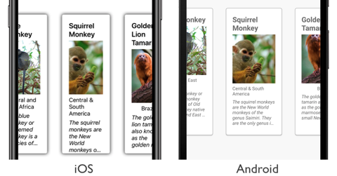
By default, CarouselView displays full items at once. However, this behavior can be changed by setting the PeekAreaInsets property to a Thickness value that specifies how much to make adjacent items partially visible by. This can be useful to indicate to users that there are additional items to view. The following XAML shows an example of setting this property:
<CarouselView ItemsSource="{Binding Monkeys}"
              PeekAreaInsets="100">
    ...
</CarouselView>
The equivalent C# code is:
CarouselView carouselView = new CarouselView
{
    ...
    PeekAreaInsets = new Thickness(100)
};
The result is that adjacent items are partially exposed on screen:
Item spacing
By default, there is no space between each item in a CarouselView. This behavior can be changed by setting the ItemSpacing property on the items layout used by the CarouselView.
When a CarouselView sets its ItemsLayout property to a LinearItemsLayout object, the LinearItemsLayout.ItemSpacing property can be set to a double value that represents the space between items:
<CarouselView ItemsSource="{Binding Monkeys}">
    <CarouselView.ItemsLayout>
        <LinearItemsLayout Orientation="Vertical"
                           ItemSpacing="20" />
    </CarouselView.ItemsLayout>
    ...
</CarouselView>
Note
The LinearItemsLayout.ItemSpacing property has a validation callback set, which ensures that the value of the property is always greater than or equal to 0.
The equivalent C# code is:
CarouselView carouselView = new CarouselView
{
    ...
    ItemsLayout = new LinearItemsLayout(ItemsLayoutOrientation.Vertical)
    {
        ItemSpacing = 20
    }
};
This code results in a vertical layout, that has a spacing of 20 between items.
Dynamic resizing of items
Items in a CarouselView can be dynamically resized at runtime by changing layout related properties of elements within the DataTemplate. For example, the following code example changes the HeightRequest and WidthRequest properties of an Image object, and the HeightRequest property of its parent Frame:
void OnImageTapped(object sender, EventArgs e)
{
    Image image = sender as Image;
    image.HeightRequest = image.WidthRequest = image.HeightRequest.Equals(150) ? 200 : 150;
    Frame frame = ((Frame)image.Parent.Parent);
    frame.HeightRequest = frame.HeightRequest.Equals(300) ? 350 : 300;
}
The OnImageTapped event handler is executed in response to an Image object being tapped, and changes the dimensions of the image (and its parent Frame), so that it's more easily viewed:
Right-to-left layout
CarouselView can layout its content in a right-to-left flow direction by setting its FlowDirection property to RightToLeft. However, the FlowDirection property should ideally be set on a page or root layout, which causes all the elements within the page, or root layout, to respond to the flow direction:
<ContentPage xmlns="http://xamarin.com/schemas/2014/forms"
             xmlns:x="http://schemas.microsoft.com/winfx/2009/xaml"
             x:Class="CarouselViewDemos.Views.HorizontalTemplateLayoutRTLPage"
             Title="Horizontal layout (RTL FlowDirection)"
             FlowDirection="RightToLeft">
    <CarouselView ItemsSource="{Binding Monkeys}">
        ...
    </CarouselView>
</ContentPage>
The default FlowDirection for an element with a parent is MatchParent. Therefore, the CarouselView inherits the FlowDirection property value from the ContentPage.
For more information about flow direction, see Right-to-left localization.


