One of the key user interface features of Windows Internet Explorer is the toolbar. It not only gives users access to a wide array of features, it also allows users to customize its layout according to their personal preferences.
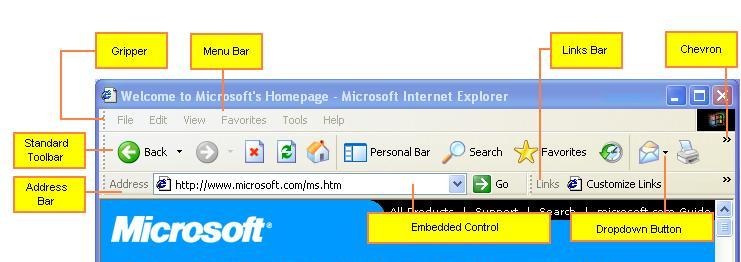
The following screen shot shows the Internet Explorer toolbar, and highlights some of the key features.

This toolbar essentially consists of a rebar control with four bands: three toolbars and a menu bar. Because it is implemented with the common controls API, developers can create toolbars with any or all of its features. This topic discusses the essential features of the Internet Explorer toolbar and how to implement them in your application.
The Rebar Control
The underlying structure of the Internet Explorer toolbar is provided by a rebar control. This control provides a way for users to customize the arrangement of a collection of tools. Each rebar contains one or more bands, which are typically long, narrow rectangles that contain a child window, commonly a toolbar control.
The rebar control displays its bands in a rectangular area, typically at the top of the window. This rectangle is subdivided into one or more strips that are the height of a band. Each band can be on a separate strip, or multiple bands can be placed on the same strip.
A rebar control provides users with two ways to arrange their tools:
- Each band usually has a gripper at its left edge. Grippers are used when two or more bands on a single strip exceed the width of the window. By dragging the gripper to the left or right, users can control how much space is allocated to each band.
- Users can move the bands within the rebar's display rectangle by dragging and dropping. The rebar control then changes the display to accommodate the new arrangement of bands. If all the bands are removed from a strip, the height of the rebar will be reduced, enlarging the viewing area.
An application can add or remove bands as needed. Typically, applications enable users to select which bands they want to have displayed through the View menu or a shortcut menu.
If the combined width of the bands on a strip exceeds the width of the window, the rebar control will adjust their widths as needed. Some of the tools might be covered by the adjacent band.
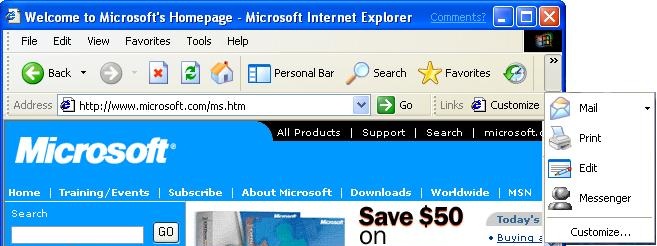
Version 5.80 of the common controls provides a way to make tools that have been covered by another band accessible to the user. If you set the RBBS_USECHEVRON flag in the fStyle member of the band's REBARBANDINFO structure, a chevron will be displayed for toolbars that have been covered. When a user clicks the chevron, a menu is displayed that allows him or her to use the hidden tools. The following screen shot from Microsoft Internet Explorer 6 shows the menu that is displayed when part of the standard toolbar is covered.

Since each band contains a control, you can provide additional flexibility through the control's API. For example, you can implement toolbar customization to enable the user to add, move, or delete buttons on a toolbar.
Implementing the Rebar Control
Most of the features of the Internet Explorer toolbar are actually implemented in the individual bands. The implementation of the rebar control itself is straightforward and is listed below.
Create the rebar control with CreateWindowEx. Set dwExStyle to WS_EX_TOOLWINDOW and lpClassName to REBARCLASSNAME. Internet Explorer uses the following window styles:
- RBS_BANDBORDERS
- RBS_DBLCLKTOGGLE
- RBS_REGISTERDROP
- RBS_VARHEIGHT
- CCS_NODIVIDER
- CCS_NOPARENTALIGN
- WS_BORDER
- WS_CHILD
- WS_CLIPCHILDREN
- WS_CLIPSIBLINGS
- WS_VISIBLE
Set the other parameters as appropriate for your application.
Create a control with CreateWindowEx or a specialized control creation function such as CreateToolbarEx.
Initialize a band for the control by filling in the members of REBARBANDINFO. Include the RBBS_USECHEVRON style with the fStyle member to enable chevrons.
Add the band to the rebar control with an RB_INSERTBAND message.
Repeat steps 2-4 for the remaining bands.
Implement handlers for the rebar notifications. In particular, you will need to handle RBN_CHEVRONPUSHED to display a drop-down menu when a chevron is clicked. For further information, see Handling Chevrons.
The grippers are included by default. To omit the gripper for a band, set the RBBS_NOGRIPPER flag in the fStyle member of the band's REBARBANDINFO structure. For further information on implementing rebar controls, see About Rebar Controls.
Handling Chevrons
When a user clicks a chevron, the rebar control sends your application an RBN_CHEVRONPUSHED notification. The NMREBARCHEVRON structure that is passed with the notification contains the band's identifier and a RECT structure with the rectangle that is occupied by the chevron. Your handler must determine which buttons are hidden and display the associated commands on a pop-up menu.
The following procedure outlines how to handle an RBN_CHEVRONPUSHED notification:
- Retrieve the current bounding rectangle for the selected band by sending the rebar control an RB_GETRECT message.
- Retrieve the total number of buttons by sending the band's toolbar control a TB_BUTTONCOUNT message.
- Starting from the leftmost button, retrieve the button's bounding rectangle by sending the toolbar control a TB_GETITEMRECT message.
- Pass the band and button rectangles to the IntersectRect function. This function will return a RECT structure that corresponds to the visible portion of the button.
- Pass the button rectangle and the rectangle for the visible portion of the button to the EqualRect function.
- If EqualRect returns TRUE, the entire button is visible. Repeat steps 3-5 for the next button on the toolbar. If EqualRect returns FALSE, the button is at least partially hidden and all remaining buttons will be completely hidden. Continue to the next step.
- Create a pop-up menu with items for each of the hidden buttons.
- Display the pop-up menu by using the TrackPopupMenu function. Use the chevron rectangle that was passed with the RBN_CHEVRONPUSHED notification to position the menu. The menu should be immediately below the chevron, with the left edges aligned.
- Handle the menu commands.
The Toolbars
Most of the complexity of the Internet Explorer toolbar lies in the implementation of controls that make up the rebar bands. Internet Explorer commonly displays four bands:
- The menu bar
- The standard toolbar
- The links toolbar
- The address toolbar
All of these bands, including the menu bar, actually hold toolbar controls. This section discusses the implementation of the standard and links toolbars. The menu bar is somewhat more complicated and is discussed separately in How to Create an Internet Explorer-Style Menu Bar.
The basic procedures for implementing toolbar controls are discussed in About Toolbar Controls. This section focuses on some of the newer toolbar features that are used by Internet Explorer to increase the usability of the control.
Drop-down Buttons
Drop-down buttons support multiple commands. When the user clicks a drop-down button, the button displays a pop-up menu instead of launching a command. The user launches a command by selecting it from the menu. The following screen shot shows a drop-down button and menu from the Internet Explorer standard toolbar.

Drop-down functionality can be added to any button style by adding a style flag to the fStyle member of the button's TBBUTTON structure. There are three styles of drop-down button, all of which are used by Internet Explorer:
Plain drop-down buttons have the BTNS_DROPDOWN style. They look like normal buttons, but they display a menu when clicked instead of launching a command.
Simple drop-down arrow buttons have the BTNS_WHOLEDROPDOWN style. They have an arrow displayed next to the button image or text. Other than the difference in appearance, they are identical to plain drop-down buttons. The Mail button used as the example in the preceding illustration is a drop-down arrow button.
Drop-down arrow buttons that add the TBSTYLE_EX_DRAWDDARROWS extended style to BTNS_DROPDOWN have an arrow that is separated from the text or image. This button style combines the functionality of drop-down and standard buttons. If the user clicks the arrow, a menu is displayed and the user can choose from several commands. If the user clicks the adjacent button, it launches a default command. The following screen shot shows the Internet Explorer Back button, which uses a separated arrow.

When the user clicks a drop-down button with either the plain or simple arrow styles, the toolbar control sends your application a TBN_DROPDOWN notification. When your application receives this message, it is responsible for creating and displaying the menu, and for handling the selected command.
When the user clicks a separated arrow, the toolbar control sends your application a TBN_DROPDOWN notification. Your application should handle it the same way as it handles the other two types of drop-down buttons. If the user clicks the main button, your application receives a WM_COMMAND message with the button's command ID, just as if it were a standard button. Applications typically respond by launching the top command in the drop-down menu, but you are free to respond in any suitable way.
List-Style Buttons
With standard buttons, if you add text, it is displayed below the bitmap. The following screen shot shows the Internet Explorer Searchand Favorites buttons with standard button text.

Microsoft Internet Explorer 5 and later versions use the TBSTYLE_LIST style. The text is to the right of the bitmap, reducing the height of the button and enlarging the viewing region. The following illustration shows the Internet Explorer 6 Search and Favorites buttons with the TBSTYLE_LIST style.

Chevrons
When the user rearranges the bands in the rebar control, part of a toolbar might be covered up. If the band was created with the RBBS_USECHEVRON style, the rebar control will display a chevron at the right edge of the toolbar. The user clicks the chevron to display a menu with the hidden tools.
Hot-Tracking
When hot-tracking is enabled, a button becomes hot when the cursor is over it. The hot button is normally distinguished from the other buttons on the toolbar by a distinctive image. By default, a hot button appears to be raised above the rest of the toolbar. When a new button becomes hot, your application receives a TBN_HOTITEMCHANGE notification. The following illustration shows the Internet Explorer 5 Search and Favorites buttons, with a hot Search button. In addition to having a raised appearance, the button's gray bitmap has been replaced with a colored one.

To enable hot-tracking, create a toolbar control with either the TBSTYLE_FLAT or TBSTYLE_LIST style. These are referred to as flat toolbars because the individual buttons are not ordinarily highlighted in any way. The bitmaps are simply displayed next to each other. They take on a button-like appearance only when they are hot. These two styles are also transparent, which means that the background of the icons will be the color of the underlying client window.
To have a different bitmap displayed when the button is hot, create a second image list that contains hot images for all the buttons on the toolbar. The size and order of these images should be the same as in the default image list. Send the toolbar control a TB_SETHOTIMAGELIST message to set the hot image list.