Using The Virtual User Activity Chart to Understand the VS Load Engine
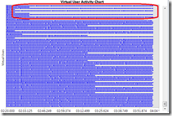
In dev10 we’ve added a new Virtual User Activity Chart that shows virtual user activity. Each row on the chart is a virtual user.
Covering the Basics of the Chart
See Sean Lumley’s post VSTS 2010 Feature- Load test virtual user activity visualization to see an over view of the Virtual User Activity Chart.
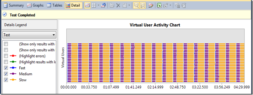
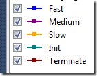
Below is the test view of the chart, which shows which shows which test a user is running. This load test has 25 user constant load, with three unit tests in it: Fast (takes 1 second to execute), Medium (takes 5 seconds to execute), and Slow (takes 10 seconds to execute), using the Sequential Test Mix (which I will go into more detail on later in the post).
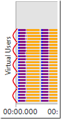
Zooming in and using Paint to group 5 users at a time for easy counting, the chart shows 25 rows, one for each user.
Zooming in using the zoom bar on the chart, you can see user 0 first ran the fast test, then the medium test, then the slow test:
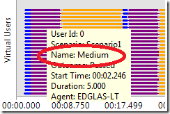
Which is confirmed by hovering over the purple Medium test bar:
This view shows you exactly what each virtual user was executing during the test, so it will enable you to see patterns of user activity, load patterns, and correlate failed or slow tests and requests with other virtual user activity.
Another use of this view is it really helps you understand what the load engine does.
In this post, I’ll review various properties in the load engine and show the details view so you can see the effect these properties have.
Understanding Test Mixes
First, I’ll show different test mixes and their corresponding details view, using tests that will accentuate the differences in the mixes.
I’ll use three tests, long, medium and short. Long runs for 10 seconds, medium for 5 seconds, and short for 1 second.
Test Mix Based on Number of Tests Started
Here is the Activity Chart for this test mix, with 34% Fast, 33% Medium, 33% Slow. With this mix, as each user finishes a test, the user randomly selects the next test based on the test weightings.
One think you’ll notice is the predominance of Yellow, and lack of Blue. You wouldn’t think it to look at the user details view, but at the end of this test, the count for each test type is roughly the same. Since the Slow test runs 10x slower than the fast test, there is 10x more yellow than blue.
Name |
Scenario |
Total Tests |
Avg. Test Time (sec) |
Slow |
Scenario1 |
912 |
10.0 |
Medium |
Scenario1 |
934 |
5.00 |
Fast |
Scenario1 |
1,012 |
1.00 |
34/33/33 Test Mix Based on the Number of Virtual Users Starting Tests
What this mix is doing is trying to keep, and any given time, the mix of virtual users running the tests to hit the percentage specified. Given the fast test starts and ends so quickly, you would expect a lot of more iterations of the fast test which is exactly what we see, a lot more blue:
Name |
Scenario |
Total Tests |
Avg. Test Time (sec) |
Slow |
Scenario1 |
472 |
10.0 |
Medium |
Scenario1 |
952 |
5.00 |
Fast |
Scenario1 |
5,329 |
1.00 |
Test Mix Based on User Pace
In this test, I’ll run the same three tests, and specify they each run 120 times per hour. I chose 120 since it will take 16 seconds to run all three tests, so if I run each twice a minute, I should get a nice graph with about half the time spent running tests. Of course, this mix is not intended to be used this way, it should be used to model your user behavior (how many times an hour do you expect a user to do a particular action).
Now we see a very different graph, with a lot of pacing time between iterations:
Name |
Scenario |
Total Tests |
Avg. Test Time (sec) |
Scenario1 |
174 |
10.0 |
|
Scenario1 |
177 |
5.00 |
|
Scenario1 |
183 |
1.00 |
Test Mix Based on Sequential Test Order
With this mix, each user simply runs the tests in the order you specify in the mix, which is easy to conceptualize and super-easy to see:
The Effect of Think Time Between Iterations and Warmup Duration Properties
As you can see from this last detail view, this test has all users going lock step through the application, all doing exactly the same thing at the same time. While this may be useful for doing stress testing, it is not realistic user behavior, which is why we have the other test mixes which do a better job of varying what users are doing.
Another way to vary what users are doing and introduce pacing into a scenario is by using Warmup Duration and Think Time Between Iterations. Think Time Between Iterations is especially important if your test only has a single web test in it (thus no think time), or you are running a unit test with no pacing (for unit tests this is implemented via sleep calls, but never use sleep calls in a web test).
Here’s what happens when I put a 30 second warmup in the last test:
Now you can see the virtual users stagger their start over 30 seconds.
And here is the same test (no warmup) with a 5 second think time between iterations:
The variations are due to the Normal Distribution think time profile that is applied by default. This profile will vary the specified think time using a normal distribution (bell curve).
The Effect of Percentage of New Users
Now I am going to clear the delay between iterations, and use 100% new users. What I’d expect here is that each user will only run one test, leading to a lot of rows in the view, which is exactly what happens:
Scrolling up vertically one screen shows this:
So you can see the load engine repeatedly starting new users. As one group of 10 users completes, the next group of 10 starts. New users have a clean cache and cookie container, which matter for web tests.
Different mixes interact differently with the percentage of new users:
- Sequential Mix as you can plainly see above, we made the design decision on sequential mix to have each new user run each test once.
- With Test Mix Based on Sequential Test Order and Test Mix Based on Number of Tests Started, each user runs one test.
- Test Mix Based on User Pace ignores the percentage of new users altogether, as the mix relies on a repeat user to establish the proper pacing.
The Effect of Test Mix Init and Terminate Tests
Init and terminate tests one once per each user. Switching my test back to 0 percent new users, and adding an init and terminate test shows the following:
Where the legend shows
This clearly shows the init test running once per virtual user, as the very first test executed, exactly as it should.
But wait! Where is the terminate test? It is not in the legend, and does not show up scrolling the view all the way to the end of the test. This shows the terminate test only gets called when a cooldown period is configured in the load test. Re-running with a 30 second cool down demonstrates this:
Understanding Load Patterns with the Virtual Users Activity Chart
Each of the above tests uses a constant user load of 25 users. Now I’ll use the chart to show how Step Load and Goal-based load based loads add users. For these tests, I’m going to use just one test in the mix, the 1 second fast test, to draw attention to the load pattern rather than the test mix.
Step Load
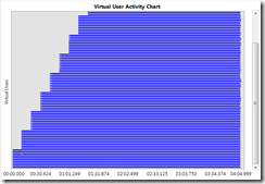
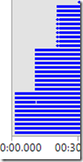
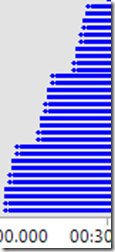
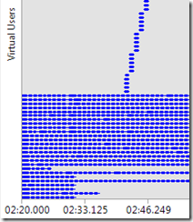
Here’s the Activity Chart for a step load pattern adding 10 users every 10 seconds until 100 users is reached. Notice the vertical scroll bar to scroll up to see the remaining users. Zooming in on the first 30 seconds shows the first 30 users created.
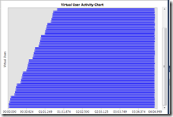
The step load Step Ramp Time property enables you to ramp the users added at each step. I highly recommend using this for every step load pattern, particularly if you are using large steps. Here I set a step ramp of 5 seconds, which shows users ramped up for each step over 5 seconds.
Goal Based Load
For a goal based load pattern, it is important that the counter you are seeking the goal on has a direct correlation with the load at each interval. So for this demonstration I put a tight loop in my test to provide a direct correlation between CPU on the load agent and the virtual user count. For this test, I also did a step load before hand to see what a good CPU range would be.
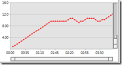
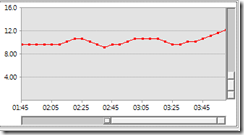
Here’s user load:
Let’s look at the Activity Chart for the areas where the dips are:
Here you can see virtual users stopping as they finish an iteration in order to achieve a lower load.
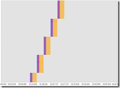
Scrolling up, you can see that new users are added to the test to move the load back up.
One thing that surprised me here is that users are not recycled. That looks like a bug to me!
Conclusion
Hopefully this post unravels some of the properties of the load engine, and it shows you just one of the ways you can leverage the new Virtual User Activity Chart in dev10 to understand exactly what your load test is doing!
Comments
Anonymous
December 09, 2010
The comment has been removedAnonymous
February 07, 2011
if theuser pauses at init status how will it take the use in runstatusAnonymous
February 12, 2014
theuser pauses at init status how will it take the use in runstatus
