Build your first SharePoint Adaptive Card Extension
Adaptive Card Extensions (ACEs) are a new SharePoint Framework component type, which enables developers to build rich, native extensions to Viva Connections' Dashboards and SharePoint Pages. Since Adaptive Card Extensions use Microsoft's Adaptive Card Framework to generate UI with its declarative JSON schema, you only need to focus on your component's business logic and let the SharePoint Framework (SPFx) handle making your component look good and work across all platforms.
Important
This tutorial assumes you have installed the SPFx v1.18. For more information on installing the SPFx v1.18, see SharePoint Framework v1.18 release notes.
Scaffold an Adaptive Card Extension project
Create a new project directory for your project and change your current folder to that directory.
Create a new project by running the Yeoman SharePoint Generator from within the new directory you created:
yo @microsoft/sharepoint
When prompted, enter the following values (select the default option for all prompts omitted below):
- Do you want to allow tenant admin the choice of deploying the solution to all sites immediately without running any feature deployment or adding apps in sites? Yes
- Which type of client-side component to create? Adaptive Card Extension
- Which template do you want to use? Generic Card Template
- What is your Adaptive Card Extension name? HelloWorld
At this point, Yeoman installs the required dependencies and scaffolds the solution files. This process might take few minutes.
Serve the ACE in the workbench
Before digging into the code, run the scaffolded output and see what an Adaptive Card Extension looks like.
The inner development loop with ACEs is similar to SPFx Web Parts. We can serve locally and run the code on the workbench.
gulp serve
Once local web server is running, navigate to the hosted Workbench: https://{tenant}.sharepoint.com/_layouts/15/workbench.aspx
Open the Web Part Toolbox and select your ACE:
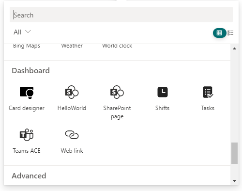
Explore the Card View
ACEs can render in two distinct ways. The first way an ACE can render is called the Card View.
When rendered on a Dashboard or a Page, ACEs will always start in this view.
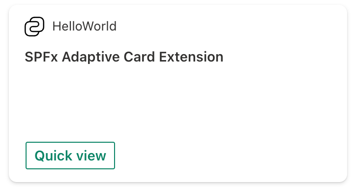
Explore the Quick View
The second way an ACE can render is called the Quick View. When you interact with an ACE, ACEs can launch a larger, customized experience.
Note
ACE interaction is disabled while in Edit mode. The Workbench or Page must be in Preview or Read mode to interact with the ACE.
Switch the Workbench to Preview mode.

Select the Quick View button on the ACE:
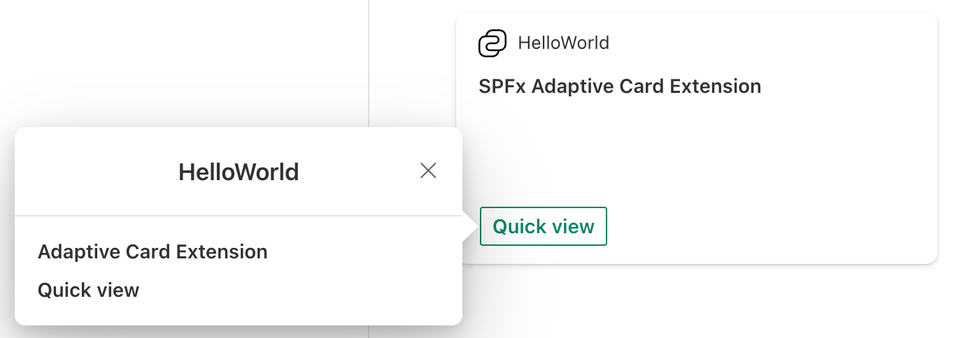
Examine the scaffolded code
Explore the base class
Locate and open the following file in your project: ./src/adaptiveCardExtensions/helloWorld/HelloWorldAdaptiveCardExtension.ts.
export default class HelloWorldAdaptiveCardExtension
  extends BaseAdaptiveCardExtension<IHelloWorldAdaptiveCardExtensionProps,IHelloWorldAdaptiveCardExtensionState> {
  // ...
}
All ACEs must extend from the BaseAdaptiveCardExtension class. You can optionally implement two generics:
- TProperties: Similar to Web Parts, this is the set of persisted properties of the component (property bag).
- TState: Unique to ACEs and can optionally define the set of renderable data.
Rendering the ACE
protected renderCard(): string | undefined {
  return CARD_VIEW_REGISTRY_ID;
}
The renderCard() method is virtual that returns a string identifier to a registered View; more on View registration later. This method is invoked during the initial render of the Card View.
If renderCard() isn't overridden, then a default Card View will be rendered.
Comment out the renderCard() method and see what happens:
/*
protected renderCard(): string | undefined {
  return CARD_VIEW_REGISTRY_ID;
}
*/
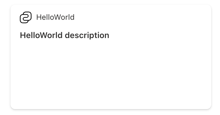
Uncomment the renderCard() method to go back to the original state.
The default Card View will render using the following properties from the manifest:
- Icon:
iconProperty - Title:
title - Card text:
description
Note
Unlike with the Card View, there is no default Quick View.
Register a view for the ACE
For a View to be used, it must be registered with its respective ViewNavigator. Two ViewNavigators are exposed on the ACE: cardNavigator and quickViewNavigator:
this.cardNavigator.register(CARD_VIEW_REGISTRY_ID, () => new CardView());
this.quickViewNavigator.register(QUICK_VIEW_REGISTRY_ID, () => new QuickView());
Note
You must register a view before it can be used. You can do this within the class' constructor or onInit() method.
Card Views
Locate and open the file: ./src/adaptiveCardExtensions/helloWorld/cardView/CardView.ts.
Card Views must extend BaseComponentsCardView and override cardViewParameters property to specify the look and data for the view.
There are multiple helper methods to simplify the creation of the predefined views:
BasicCardView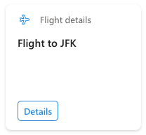
ImageCardView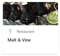
PrimaryTextCardView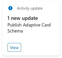
TextInputCardView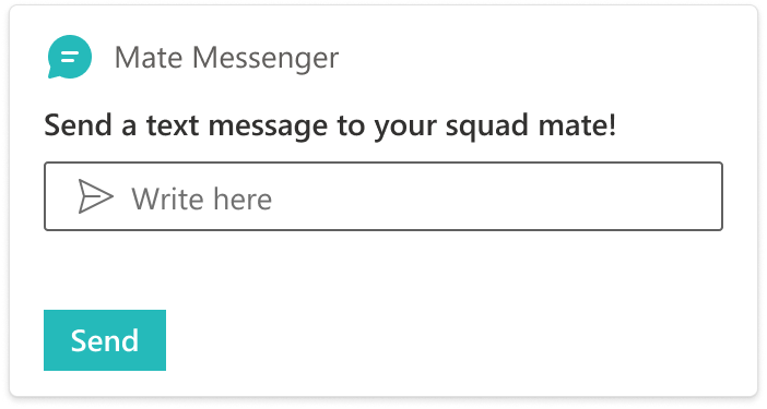
Each of these Views will render differently and have different constraints on what data can be provided to the template.
As part of the cardViewParameters property, you can specify the following:
- image: Image parameters for the Card View.
- cardBar: Card bar component for the Card View (title and icon).
- header: Header components for the Card View.
- body: Body components for the Card View.
- footer: Footer components for the Card View.
Note
The Card Views for Adaptive Card templates are limited to predefined permutations and cannot be changed. The parameters type (ComponentsCardViewParameters) is defined to only accept the properties that are supported by the permutations.
Additionally, there are two generics for the properties and state objects shared between the view and the ACE.
- TProperties: The View's properties interface, the same interface used by persisted properties of the ACE (property bag).
- TState: Unique to ACEs and can optionally define the set of renderable data.
Note
SPFx will automatically propagate changes to the ACE's state to each View.
Note
Whereas the initial Card View is specified in the ACE's renderCard() method, the initial Quick View is specified as part of a cardButton component's action parameters in the footer. This allows two buttons to potentially open different views.
Add a second button by adding another object to the footer property returned from cardViewParameters property:
public get cardViewParameters(): ComponentsCardViewParameters {
    return BasicCardView({
      cardBar: {
        componentName: 'cardBar',
        title: this.properties.title
      },
      header: {
        componentName: 'text',
        text: strings.PrimaryText
      },
      footer: [{
        componentName: 'cardButton',
        title: strings.QuickViewButton,
        action: {
          type: 'QuickView',
          parameters: {
            view: QUICK_VIEW_REGISTRY_ID
          }
        }
      }, {
        componentName: 'cardButton',
        title: 'Bing',
        action: {
          type: 'ExternalLink',
          parameters: {
            target: 'https://www.bing.com'
          }
        }
      }]
    });
  }
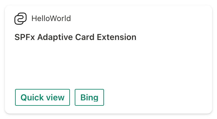
Now, when you select the Bing button, Bing will open in a new browser tab.
Initially, the Card is displayed in Large Card size. Let's switch to the Medium size to validate how the Card is looking in this size.
Change the Card size by going to the Property Pane and selecting Medium.
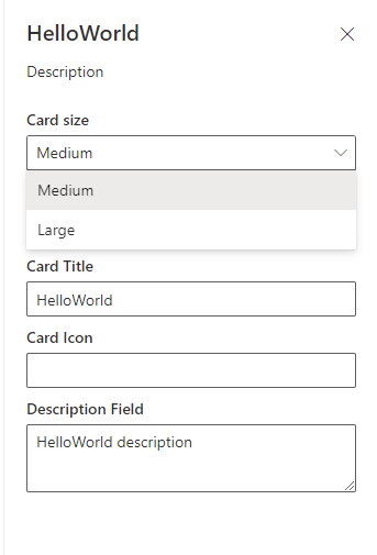
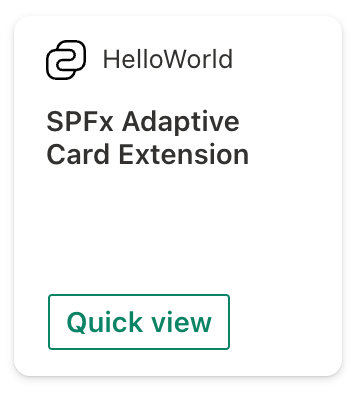
Now, the Bing button is hidden because Medium Card size for cards without an image only shows one button in the footer.
The onCardSelection() method determines what will happen if the Card is clicked. If the onCardSelection() method isn't implemented, then nothing will happen when the Card is clicked.
Change the Card selection to open the Quick View by modifying the
onCardSelection()method:public get onCardSelection(): IQuickViewCardAction | IExternalLinkCardAction | undefined { return { type: 'QuickView', parameters: { view: QUICK_VIEW_REGISTRY_ID } }; }Now, when you select the Card, it will open the Quick View.
ACE Quick Views
Locate and open the following file: ./src/adaptiveCardExtensions/helloWorld/quickView/QuickView.ts.
Quick Views must extend the BaseAdaptiveCardView base class. There are three optional generics that can be defined:
- TData: The type returned from the
data()getter method. - TProperties: Similar to the Card View, this is the same interface used by persisted properties of the ACE (property bag).
- TState Similar to the Card View, this is the set of stateful data the View needs to render. TState must share properties with the ACE's state interface.
A Quick View has more control over the Adaptive Card template schema than a Card View. The
template() getter must return valid Adaptive Card template JSON. SPFx ACEs support Adaptive Card
templating. The properties on the object returned from the data getter will automatically be mapped
to the bound template slot.
For example, ${subTitle} is bound to strings.SubTitle.
// QuickView.ts
public get data(): IQuickViewData {
  return {
    // ...
    subTitle: strings.SubTitle
  };
}
// QuickViewTemplate.json.ts
{
  "type": "TextBlock",
  "weight": "Bolder",
  "text": "${subTitle}",
  "wrap": true
}
Note
You must use the Adaptive Card binding syntax that uses $ and {} brackets.
Let's change this:
Make
subTitlea part ofIHelloWorldAdaptiveCardExtensionState, and add two buttons.Update the
data()method as shown in the following code:public get data(): IQuickViewData { return { subTitle: this.state.subTitle, title: strings.Title }; }Locate and open the following file: ./src/adaptiveCardExtensions/helloWorld/HelloWorldAdaptiveCardExtension.ts.
Update the
IHelloWorldAdaptiveCardExtensionStateinterface andonInit()method as follows:export interface IHelloWorldAdaptiveCardExtensionState { subTitle: string; } .. public onInit(): Promise<void> { this.state = { subTitle: 'No button clicked' }; // ... }
In its template() getter, the Quick View of the ACE you generated returns the object from a JSON file. Let's now modify that template:
Locate and open the following file: ./src/adaptiveCardExtensions/helloWorld/quickView/template/QuickViewTemplate.json.
Replace the contents of this file with the following JSON:
{
  "schema": "http://adaptivecards.io/schemas/adaptive-card.json",
  "type": "AdaptiveCard",
  "version": "1.5",
  "body": [
    {
      "type": "TextBlock",
      "weight": "Bolder",
      "text": "${title}"
    },
    {
      "type": "ColumnSet",
      "columns": [
        {
          "type": "Column",
          "items": [
            {
              "type": "TextBlock",
              "weight": "Bolder",
              "text": "${subTitle}",
              "wrap": true
            }
          ]
        }
      ]
    },
    {
      "type": "ActionSet",
      "actions": [
        {
          "type": "Action.Submit",
          "title": "Button One",
          "style": "positive",
          "data": {
            "id": "button1",
            "message": "Clicked Button One"
          }
        },
        {
          "type": "Action.Submit",
          "title": "Button Two",
          "data": {
            "id": "button2",
            "message": "Clicked Button Two"
          }
        }
      ]
    }
  ]
}
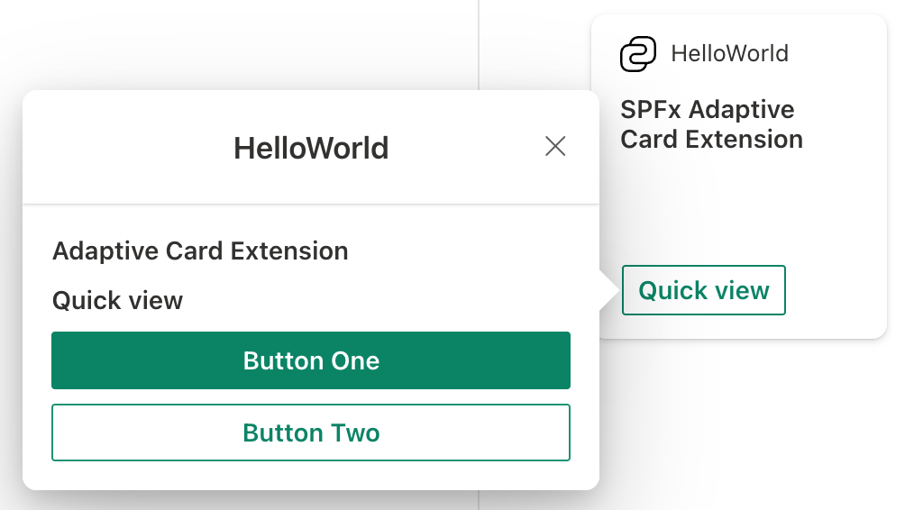
Test your changes by refreshing the hosted workbench in the browser. It should pickup the changes you've applied to the project if gulp serve is still running:
Tip
Learn more about Adaptive Cards at adaptivecards.io. This site also includes an Adaptive Cards Designer that lets you preview the rendering and structure of adaptive cards as you create them.
At this point, you've modified your ACE to include two new buttons in the Quick View card. The next step is to implement what happens when these buttons are selected. This is done using action handlers.
Action handlers
Actions are handled by the views where they're defined.
The Quick View has two buttons, but the view is currently not handling the Submit action. The onAction() method is invoked whenever an Adaptive Card Action is executed, for instance when the Action.Submit action is initiated.
Locate and open the file QuickView.ts and override the onAction() to handle the two button selections as shown in the following code:
import { ISPFxAdaptiveCard, BaseAdaptiveCardQuickView, IActionArguments } from '@microsoft/sp-adaptive-card-extension-base';

..

public onAction(action: IActionArguments): void {
  if (action.type === 'Submit') {
    const { id, message } = action.data;
    switch (id) {
      case 'button1':
      case 'button2':
        this.setState({
          subTitle: message
        });
        break;
    }
  }
}
Test your changes by refreshing the hosted workbench in the browser. It should pickup the changes you've applied to the project if gulp serve is still running.
Selecting either button will now set the state's subTitle to the data.message value, causing a re-render (more on this later). The Quick View's Adaptive Card will now display this message, since its template binds to subTitle.
Property Pane
Similar to web parts, ACE's can have configurable properties that are set by users with appropriate permissions. These enable you to customize each implementation of your ACE. This is done using the property pane.
ACEs can be configured just like Web Parts. The API signatures are identical for the following methods, found in the HelloWorldAdaptiveCardExtension.ts file:
getPropertyPaneConfiguration()onPropertyPaneFieldChanged()
The default scaffolding for ACEs uses a new API that aims to minimize the bundle size when the component isn't in Edit mode. The loadPropertyPaneResources() method utilizes Webpack's chunking feature to separate the Property Pane specific code into its own JS file, which can then be loaded on demand.
In addition to returning the Property Pane configuration, the HelloWorldPropertyPane class is used to encapsulate all your Edit mode logic.
Properties
Other than the Card size field, the scaffolded ACE has one (1) configurable field, which is defined in getPropertyPaneConfiguration() method & defined in the IHelloWorldAdaptiveCardExtensionProperties interface:
title
Card Views are designed to automatically work across all card sizes. Aside from specifying a default card size, ACEs cannot control this property.
The title value is used in the title of the Property Pane and the title displayed on the Card.
 public get cardViewParameters(): ComponentsCardViewParameters {
    return BasicCardView({
      cardBar: {
        componentName: 'cardBar',
        title: this.properties.title,
        // ...
You can also use the iconProperty property to specify an icon for your ACE. By default the value is specified as iconImageUrl in the manifest.
protected get iconProperty(): string {
  // return icon url string
}
State
The state property must be initialized before calling the setState() method, and it can only be initialized once.
public onInit(): Promise<void> {
  this.state = {
    subTitle: 'No button clicked'
  };
  // ...
}
Unlike with properties, state isn't persisted past the current session and should only be used for ephemeral View state.
Re-rendering
Re-rendering happens when a property is updated in the PropertyPane or if setState() is called.
As described above, when changing a subTitle property during Quick View action handling, the setState() method is called:
public onAction(action: IActionArguments): void {
  if (action.type === 'Submit') {
    const { id, message } = action.data;
    switch (id) {
      case 'button1':
      case 'button2':
        this.setState({
          subTitle: message
        });
        break;
    }
  }
}
Passing a Partial<TState> object to setState() method will update all Views with the new values.
If no value or identical values are passed, a re-render will still occur.
The setState() method isn't just limited to the Property Pane. It can be used in response to receiving new data or as a result of some user action.
Conclusion
After this tutorial you should be familiar with:
- Scaffolding an Adaptive Card Extension
- Registering Views
- Changing the Card View and Quick View
- Basic action handling
- Changing the Property Pane
- Defer loading the Property Pane
- How to use
state - Difference between
propertiesandstate