ItemsControl.ItemContainerStyle Property
Definition
Important
Some information relates to prerelease product that may be substantially modified before it’s released. Microsoft makes no warranties, express or implied, with respect to the information provided here.
Gets or sets the Style that is applied to the container element generated for each item.
public:
 property System::Windows::Style ^ ItemContainerStyle { System::Windows::Style ^ get(); void set(System::Windows::Style ^ value); };
[System.ComponentModel.Bindable(true)]
public System.Windows.Style ItemContainerStyle { get; set; }[<System.ComponentModel.Bindable(true)>]
member this.ItemContainerStyle : System.Windows.Style with get, setPublic Property ItemContainerStyle As StyleProperty Value
The Style that is applied to the container element generated for each item. The default is null.
- Attributes
Examples
The following example demonstrates how to use this property. Consider the following data-bound ListBox:
<ListBox ItemsSource="{Binding Source={StaticResource MyPhotos}}"
         Background="Silver" Width="600" Margin="10" SelectedIndex="0"/>
To create a style for the elements that contain the data items, create a ListBoxItem style, as shown in the following example. The style is applied to all ListBoxItem elements within the scope the style is defined in.
<Style TargetType="ListBoxItem">
  <Setter Property="Opacity" Value="0.5" />
  <Setter Property="MaxHeight" Value="75" />
  <Style.Triggers>
    <Trigger Property="IsSelected" Value="True">
      <Trigger.Setters>
        <Setter Property="Opacity" Value="1.0" />
      </Trigger.Setters>
    </Trigger>
    <EventTrigger RoutedEvent="Mouse.MouseEnter">
      <EventTrigger.Actions>
        <BeginStoryboard>
          <Storyboard>
            <DoubleAnimation
              Duration="0:0:0.2"
              Storyboard.TargetProperty="MaxHeight"
              To="90"  />
          </Storyboard>
        </BeginStoryboard>
      </EventTrigger.Actions>
    </EventTrigger>
    <EventTrigger RoutedEvent="Mouse.MouseLeave">
      <EventTrigger.Actions>
        <BeginStoryboard>
          <Storyboard>
            <DoubleAnimation
              Duration="0:0:1"
              Storyboard.TargetProperty="MaxHeight"  />
          </Storyboard>
        </BeginStoryboard>
      </EventTrigger.Actions>
    </EventTrigger>
  </Style.Triggers>
</Style>
The ListBoxItem is the container element for the ListBox control. Therefore, an alternative to the preceding is to set the ItemContainerStyle property of the ListBox to the defined style. To do that, give the ListBoxItem style an x:Key so it is available as a resource:
<Style TargetType="ListBoxItem" x:Key="ContainerStyle">
  <Setter Property="Opacity" Value="0.5" />
  <Setter Property="Opacity" Value="0.5" />
  <Setter Property="MaxHeight" Value="75" />
  <Style.Triggers>
    <Trigger Property="IsSelected" Value="True">
      <Setter Property="Opacity" Value="1.0" />
    </Trigger>
Next, set the ItemContainerStyle property to the resource, as in the following example:
<ListBox ItemsSource="{Binding Source={StaticResource MyPhotos}}"
         ItemContainerStyle="{StaticResource ContainerStyle}"
         Background="Silver" Width="600" Margin="10" SelectedIndex="0"/>
Both of the preceding scenarios produce the same result. However, one of the advantages of making the style available as a resource is that you can reuse the style. Setting the ItemContainerStyle property explicitly can also provide greater readability.
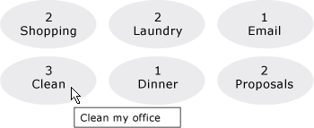
The following example is designed to illustrate the function of the different styling and templating related properties provided by the ItemsControl. The ItemsControl in this example is bound to a collection of Task objects. For demonstration purposes, the styles and templates in this example are all declared inline.
<ItemsControl Margin="10"
              ItemsSource="{Binding Source={StaticResource myTodoList}}">
  <!--The ItemsControl has no default visual appearance.
      Use the Template property to specify a ControlTemplate to define
      the appearance of an ItemsControl. The ItemsPresenter uses the specified
      ItemsPanelTemplate (see below) to layout the items. If an
      ItemsPanelTemplate is not specified, the default is used. (For ItemsControl,
      the default is an ItemsPanelTemplate that specifies a StackPanel.-->
  <ItemsControl.Template>
    <ControlTemplate TargetType="ItemsControl">
      <Border BorderBrush="Aqua" BorderThickness="1" CornerRadius="15">
        <ItemsPresenter/>
      </Border>
    </ControlTemplate>
  </ItemsControl.Template>
  <!--Use the ItemsPanel property to specify an ItemsPanelTemplate
      that defines the panel that is used to hold the generated items.
      In other words, use this property if you want to affect
      how the items are laid out.-->
  <ItemsControl.ItemsPanel>
    <ItemsPanelTemplate>
      <WrapPanel />
    </ItemsPanelTemplate>
  </ItemsControl.ItemsPanel>
  <!--Use the ItemTemplate to set a DataTemplate to define
      the visualization of the data objects. This DataTemplate
      specifies that each data object appears with the Priority
      and TaskName on top of a silver ellipse.-->
  <ItemsControl.ItemTemplate>
    <DataTemplate>
      <DataTemplate.Resources>
        <Style TargetType="TextBlock">
          <Setter Property="FontSize" Value="18"/>
          <Setter Property="HorizontalAlignment" Value="Center"/>
        </Style>
      </DataTemplate.Resources>
      <Grid>
        <Ellipse Fill="Silver"/>
        <StackPanel>
          <TextBlock Margin="3,3,3,0"
                     Text="{Binding Path=Priority}"/>
          <TextBlock Margin="3,0,3,7"
                     Text="{Binding Path=TaskName}"/>
        </StackPanel>
      </Grid>
    </DataTemplate>
  </ItemsControl.ItemTemplate>
  <!--Use the ItemContainerStyle property to specify the appearance
      of the element that contains the data. This ItemContainerStyle
      gives each item container a margin and a width. There is also
      a trigger that sets a tooltip that shows the description of
      the data object when the mouse hovers over the item container.-->
  <ItemsControl.ItemContainerStyle>
    <Style>
      <Setter Property="Control.Width" Value="100"/>
      <Setter Property="Control.Margin" Value="5"/>
      <Style.Triggers>
        <Trigger Property="Control.IsMouseOver" Value="True">
          <Setter Property="Control.ToolTip"
                  Value="{Binding RelativeSource={x:Static RelativeSource.Self},
                          Path=Content.Description}"/>
        </Trigger>
      </Style.Triggers>
    </Style>
  </ItemsControl.ItemContainerStyle>
</ItemsControl>
The following is a screenshot of the example when it is rendered:

Two other style-related properties of the ItemsControl that are not shown here are GroupStyle and GroupStyleSelector.
Remarks
You use this property or the ItemContainerStyleSelector property to set a style to affect the appearance of the elements that contain the data items. For example, for ListBox, the generated containers are ListBoxItem controls; for ComboBox, they are ComboBoxItem controls.
The ItemsControl provides great flexibility for visual customization and provides many styling and templating properties. To affect the layout of the items, use the ItemsPanel property. If you are using grouping on your control, you can use the GroupStyle or GroupStyleSelector property. To specify the visualization of data objects, use the ItemTemplate or ItemTemplateSelector property. For more information about when to specify an ItemTemplate, see Data Templating Overview.
XAML Attribute Usage
<object ItemContainerStyle="ResourceExtension StyleResourceKey"/>
XAML Values
ResourceExtension
One of the following: StaticResource, or DynamicResource. Unless the styles themselves contain references to potential run-time references such as system resources or user preferences, StaticResource reference to a style is usually recommended for performance.
StyleResourceKey
x:Key string value referring to the style being requested as a resource.
Dependency Property Information
| Item | Value |
|---|---|
| Identifier field | ItemContainerStyleProperty |
Metadata properties set to true |
None |
