Add and navigate screens in canvas apps
Create modern, responsive apps by adding prebuilt screens for common app scenarios. The screens feature responsive containers and modern controls that adapt to different screen sizes. You can also add custom screens with different layouts and controls.
The following new prebuilt screens are available:
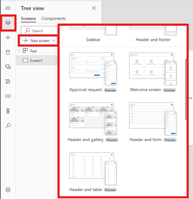
Add a new screen
Sign in to Power Apps.
Create a canvas app or open one for editing.
On the command bar, select New screen, and then select a screen layout.
Preview the app to determine how it looks on different devices. Learn more in Preview an app.
Tip
To make the app adapt to the size of the device display it's being run on, turn off the Scale to fit option.
Welcome screen
The Welcome screen is ideal for the first screen of an app, where you can customize tiles such as an image, a title, and a description. You can change the number of tiles by adding or removing them in the main container. Use the tiles to navigate users to other parts of the app.
The Welcome screen has the following template for controls:
- Screen container
- Header container
- Header
- Main container
- Container
- Image container
- Image
- Title container
- Feature item button
- Description text
- Image container
- Container
- Header container

Add and customize the Welcome screen
Select New screen > Welcome screen.
To change the image of a tile, select it and then select Edit.
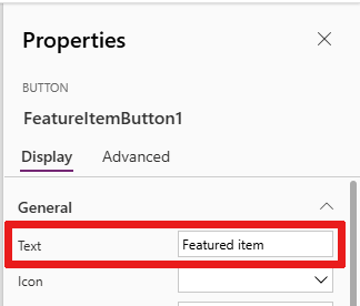
Select the Feature Item button control and add your own text in the Properties pane.
Select the Short description or engaging message text and add your own.
Add and remove tiles if needed.
To add tiles in the tree view, copy and paste a Container item.
To remove a tile in the tree view, right-click a Container, and then select Delete.
Header and gallery screen
Use the Header and gallery screen to show a range of product or service information, like a product catalog. When you connect a gallery control to a data source, a catalog is automatically created with little customization required.
The gallery control in the Header and gallery screen is a classic control. When the modern gallery control is released, the Header and gallery screen uses it. Learn more in Overview of modern controls and themes in canvas apps.
The Header and gallery screen has the following template for controls:
- Screen container
- Header container
- Header
- Main container
- Gallery
- Gallery container
- Image container
- Image
- Title container
- Title text
- Description text
- Button container
- Button
- Image container
- Gallery container
- Gallery
- Header container

Add and customize the Header and gallery screen
Select New Screen > Header and gallery.
In the tree view, select Gallery and connect it to a data source such as Dataverse.
Select specific controls inside the gallery, such as the image, title text, and text description. In the control's properties, use the ThisItem syntax to set the desired image, title text, and description.
For example, to add the Account name to the title text control, find it by typing
ThisItemin the formula bar to see a list of available items to add from your data set.

Approval request screen
The Approval request screen has a header, a form with a submit button, and a gallery with predefined stages. The Approval request screen is useful for scenarios where actions are triggered by form submissions, such as submitting an approval request or displaying a workflow process for a business.
Tip
When you add an approval request screen, you're asked to connect it with a data source. The data source determines the field names in the request form.
The Approval request screen has the following template for controls:
- Screen container
- Header container
- Header
- Main container
- Form container
- Form title text
- Approval form
- Submit button
- Sidebar container
- Reviewers text
- Reviewers gallery
- Form container
- Header container

Add and customize the Approval request screen
Select New Screen > Approval request.
In the tree view on ApprovalForm, you're prompted to connect to a data source such as Dataverse.
Choose a data source.
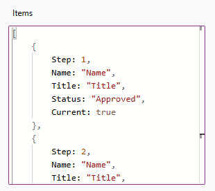
To view the details of the approval stages, in the tree view, select ReviewersGallery under the SidebarContainer node. Then in the properties pane, select the Advanced tab and go to Items.
The approval stages have the following details:
- Name: Name of the stage or approver
- Title: Subtitle of the stage or approver
- Status: Stage status
- Current: Whether this stage is the current stage of the approval request
You can add a Power Automate approval workflow in the button to notify the approver. Learn more in Create and test an approval workflow with Power Automate.
Header and form
The Header and form screen has a header, a form, and two buttons to submit the form or cancel form submission. This screen is great for using a full-screen form.
The Header and form screen has the following template for controls:
- Screen container
- Header container
- Header
- Main container
- Form container
- Form
- Button container
- Cancel button
- Submit button
- Form container
- Header container

Add and customize the Header and form screen
Select New Screen > Header and form.
In the tree view, you see Form selected and a prompt appears for you to connect the form to a data source.
Choose a data source.
Optionally, to ensure the best screen responsiveness, select each data card on the form and set its Width Fit property to On in the Display tab of the Properties pane.
Header and table
The Header and table screen has two controls, a header control and a table control. This template is great for showing a detailed data table on a screen.
The Header and table screen has the following controls:
- Header container
- Header
- Main container
- Table
Add and customize the Header and table screen
Select New Screen > Header and table.
In the tree view, select Table and connect it to a data source.
Table and form
The Table and form screen contains two main controls: the modern table control and the modern form control. This template has built-in Power Fx formulas to allow easy data connection and customization. This template is ideal for selecting and editing a record using a form.
The Table and form screen contains the following controls:
- Screen container
- Header container
- Header control
- Body container
- Text input (Search)
- Table control
- Form control
- Button
- New
- Edit
- Delete
- Submit
- Cancel
- Header container

Add and customize Table and form screen
In Power Apps Studio:
Select New Screen > Table and form.
Select Data in the inline action bar.
Select the desired data source.
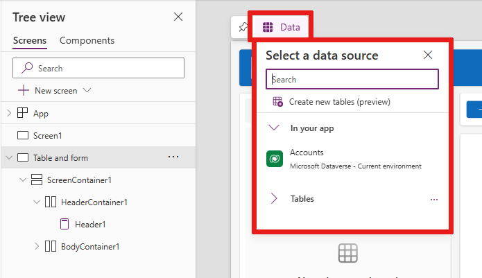
Once connected, the table and form controls are both bound to the data source.
You can select a record in the table control and the form displays the details of the selected record.
All buttons in this template have prebuilt Power Fx, so there's no need for further customization. When you connect the screen to the selected data source, the screen is now fully functional.

Reorder screens
When you have more than one screen in your app, you can put them in a different order in your tree view.
Select the overflow menu of a screen that you want to reorder, and then select Move up or Move down.
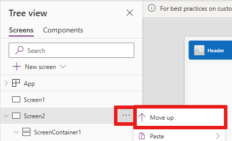
Use the StartScreen property to set the screen to be displayed first.
Add navigation
When you have more than one screen in your app, you can add navigation so that your users can move between them.
With the screen selected, select Insert. In the search box, type Next arrow and then select it.
Move the arrow to where you want it to appear on the screen.
With the arrow selected, set the OnSelect property to the Navigate function; for example, Navigate(Target, Fade).
Replace Target with the name of the screen where you want to navigate.

In this example, when a user selects the arrow, the target screen fades in.
On the Target screen, add a Back arrow icon the same way. Set its OnSelect property, for example,
Navigate(Target, ScreenTransition.Fade).Replace Target with the name of the screen where you want to return.
