Exercise - Gain insights using Executive dashboard
In this exercise, you assume the persona of Amber Rodriguez, sustainability specialist for Contoso Corp, and use the executive dashboard to view insights on total emissions, revenue intensity, and renewable energy. These metrics are categorized by scope, geography, organizational unit, and facility.
Use an In-Private or Incognito window and open the go to Sustainability Environment you created in Set up the Microsoft Cloud for Sustainability trial exercise.
Sign in with the credentials of Amber Rodriguez.
Important
Make sure that you completed the previous modules to set up organization and reference data, ingest activity data and define emission calculations to ensure that the dashboards and reports show meaningful data.
Explore the Executive dashboard
In this task, Amber explores the executive dashboard, which provides an overview of total emissions, revenue intensity, and renewable energy broken down by scope, geography, organizational unit, and facility.
Select Analytics > Executive dashboard on the left navigation pane.
You can filter the dashboard by Reporting year, Accounting method, Alternate result basis (preview), and Organizational hierarchy.
The options for Accounting method include:
Location Based - This method provides the average emissions intensity of grids on which energy consumption occurs.
Market Based - This method provides emissions from electricity you purposefully chose.
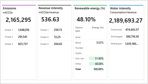
The top tiles show summary statistics, including:
Emissions - Total emissions with details for Scope 1, Scope 2, and Scope 3.
Revenue intensity - Emissions divided by revenue, with details for Scope 1, Scope 2, and Scope 3.
Renewable energy (%) - Percentage of total energy from renewable sources, with details by source.
Water intensity - The amount of water a company consumes per unit of revenue.
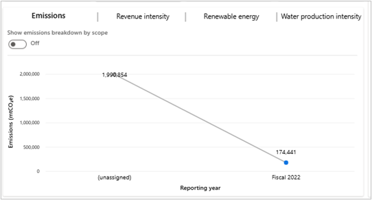
At the bottom of the dashboard, you can view current trends. There are four tabs that display graphical representations of emissions, revenue intensity score, renewable energy, and water production intensity.
Emissions - Toggle between total emissions (trend line) and emissions by scope (column charts).
Revenue Intensity Score - Toggle between revenue intensity (trend line) and by scope (column charts).
Renewable Energy - Toggle between renewable energy percentage (column chart) and by source (column charts).
Water Production Intensity - Shows water used, discharged, and withdrawn relative to product weight.
On the right area of the dashboard, you can select three tabs:
By country/region
By organization unit
By facility
Each tab shows total emissions, revenue intensity score, and renewable energy for the corresponding delineation of data.
Note
To see revenue intensity for an organizational unit, make sure emissions are linked to the same reporting year as the revenue records. If data is missing, include a month in the revenue records and refresh the report.
View the calculated carbon fees
The calculated carbon fees can be reviewed on the Executive dashboard in Microsoft Sustainability Manager with currency defined in the Report settings. This dashboard provides a detailed view of the carbon fees by country/region, organizational unit, and facility, helping organizations understand the financial impact of their emissions and make informed decisions about reductions.
Note
You can view the calculated carbon fees if you set up the carbon fee in the Exercise - Set up a company profile and reference data.
To access the dashboard, select Analytics > Executive dashboard on the left navigation pane.
On the Executive dashboard, you can review the calculated carbon fees.
- By country/region
- By organization unit
- By facility
You successfully explored the executive dashboard. You can use this dashboard to gain insights into your emissions data. You can use these insights to drive business decisions and then use the information to create scorecards and goals to track your progress.


