DropDownGallery element
Represents a Drop-Down Gallery control with a gallery-based menu.
Usage
<DropDownGallery
  ApplicationModes = "xs:string"
  CommandName = "xs:positiveInteger or xs:string"
  HasLargeItems = "Boolean"
  ItemHeight = "xs:integer"
  ItemWidth = "xs:integer"
  TextPosition = "TextPositionType"
  Type = "xs:string">
  child elements
</DropDownGallery>
Attributes
| Attribute | Type | Required | Description |
|---|---|---|---|
| ApplicationModes |
xs:string |
No |
Valid only if MenuGroup is the parent element. White space is valid and ignored. Maximum length: 250 characters. |
| CommandName |
xs:positiveInteger or xs:string |
No |
Associates the element with a Command. The value must be unique within the Ribbon XML document. Maximum length: 100 characters. |
| HasLargeItems |
Boolean |
No |
Determines whether the large or small image resource of the Command is displayed in the gallery control. Note:
|
| ItemHeight |
xs:integer |
No |
|
| ItemWidth |
xs:integer |
No |
|
| TextPosition |
TextPositionType |
No |
Restricted to one of the following values: |
| Type |
xs:string |
No |
Restricted to one of the following values: |
Child elements
| Element | Description |
|---|---|
| Button |
May occur one or more times |
| CheckBox |
May occur one or more times |
| DropDownGallery.MenuGroups |
Must occur exactly once |
| DropDownGallery.MenuLayout |
May occur at most once |
| SplitButton |
May occur one or more times |
| ToggleButton |
May occur one or more times |
Parent elements
| Element | Description |
|---|---|
| ControlGroup |
|
| Group |
|
| MenuGroup |
When contained in an ApplicationMenu. This element is only supported on the first level and must have no child elements. |
| QuickAccessToolbar.ApplicationDefaults |
Note: Windows 8 and newer.
|
| SplitButton |
Remarks
Optional.
May occur one or more times for each ControlGroup, DropDownButton, Group, MenuGroup, or SplitButton element.
DropDownGallery supports application modes.
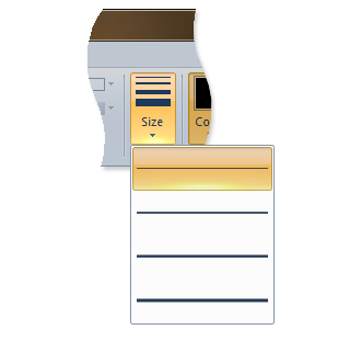
The following screen shot illustrates the Ribbon Drop-Down Gallery control in Microsoft Paint for Windows 7.

Examples
The following example demonstrates the basic markup for the DropDownGallery.
This section of code shows the DropDownGallery Command declarations, with an associated Group that acts as the parent container for the DropDownGallery element.
<!-- DropDownGallery -->
<Command Name="cmdDropDownGalleryGroup"
         Symbol="cmdDropDownGalleryGroup"
         Comment="DropDownGallery Group"
         LabelTitle="DropDownGallery"/>
<Command Name="cmdDropDownGallery"
         Symbol="cmdDropDownGallery"
         Comment="DropDownGallery"
         LabelTitle="DropDownGallery"/>
This section of code shows the DropDownGallery control declarations.
<!-- DropDownGallery -->
<Group CommandName="cmdDropDownGalleryGroup">
  <DropDownGallery CommandName="cmdDropDownGallery"
                   TextPosition="Hide"
                   Type="Commands"
                   ItemHeight="32"
                   ItemWidth="32">
    <DropDownGallery.MenuLayout>
      <FlowMenuLayout Rows="2"
                      Columns="3"
                      Gripper="None"/>
    </DropDownGallery.MenuLayout>
    <DropDownGallery.MenuGroups>
      <MenuGroup>
        <Button CommandName="cmdButton1"></Button>
        <Button CommandName="cmdButton2"></Button>
       </MenuGroup>
       <MenuGroup>
        <Button CommandName="cmdButton3"></Button>
      </MenuGroup>
    </DropDownGallery.MenuGroups>
  </DropDownGallery>
</Group>
Element information
- Minimum supported system: Windows 7
- Can be empty: No