Teams Voice Apps에 대한 Azure Communication Services UI 라이브러리 호출 시작
이 프로젝트는 개발자가 Azure Communication Services Calling Web SDK에서 Azure Communication UI 라이브러리를 사용하여 Teams 통화 큐 및 자동 전화 교환으로 통화를 시작하도록 안내하는 것을 목표로 합니다.
요구 사항에 따라 복잡한 설정 없이 고객에게 쉽게 연락할 수 있는 방법을 제공해야 할 수도 있습니다.
Teams 통화 큐 및 자동 전화 교환을 호출하는 것은 고객 지원, 재무 고문 및 기타 고객 관련 팀과의 즉각적인 상호 작용을 용이하게 하는 간단하면서도 효과적인 개념입니다. 이 자습서의 목표는 고객이 웹에서 단추를 클릭할 때 고객과의 상호 작용을 시작하도록 돕는 것입니다.
사용해 보려는 경우 GitHub에서 코드를 다운로드하면 됩니다.
이 자습서에 따라 다음을 수행합니다.
- 고객 시나리오에 따라 고객 오디오 및 비디오 환경을 제어할 수 있습니다.
- UI 라이브러리를 사용하여 웹앱에서 통화를 시작하기 위한 위젯을 빌드하는 방법을 알려드립니다.
필수 조건
이 자습서를 따르려면 다음 단계가 필요합니다. 마지막 두 항목에 대해 Teams 관리자에게 문의하여 적절하게 설정되었는지 확인합니다.
- 지원되는 플랫폼 중 하나인 Visual Studio Code.
- Node.js 활성 LTS(장기 지원) 및 버전 노드 20을 사용하는 것이 좋습니다.
node --version명령을 사용하여 버전을 확인합니다. - Azure Communication Services 리소스. 통신 리소스 만들기
- Azure Communication Services 리소스와의 상호 운용을 위한 Teams 테넌트 설정 완료
- Teams 통화 큐 및 Azure Communication Services를 사용합니다.
- Teams 자동 전화 교환 및 Azure Communication Services를 사용합니다.
노드 및 Visual Studio Code 확인
이 명령을 사용하여 노드가 올바르게 설치되었는지 확인할 수 있습니다.
node -v
출력은 사용자가 가지고 있는 버전을 알려줍니다. 노드가 설치되어 있지 않아서 해당 버전에 추가되지 않으면 실패합니다 PATH. 노드와 마찬가지로 이 명령을 사용하여 VS Code 가 설치되었는지 확인할 수 있습니다.
code --version
Node와 마찬가지로 컴퓨터에 VS Code를 설치하는 데 문제가 있는 경우 이 명령이 실패합니다.
시작
이 자습서에는 7단계가 있으며, 결국 앱은 Teams 음성 애플리케이션을 호출할 수 있습니다. 수행하는 단계는 다음과 같습니다.
1. 프로젝트 설정
새 애플리케이션을 만드는 경우에만 이 단계를 사용합니다.
반응 앱을 설정하려면 create-react-app 명령줄 도구를 사용합니다. 이 도구는 React에서 제공하는 TypeScript 애플리케이션을 쉽게 실행할 수 있도록 만듭니다.
컴퓨터에 Node가 설치되어 있는지 확인하려면 PowerShell 또는 터미널에서 다음 명령을 실행하여 노드 버전을 확인합니다.
node -v
컴퓨터에 create-react-app가 설치되어 있지 않은 경우 다음 명령을 실행하여 전역 명령으로 설치합니다.
npm install -g create-react-app
해당 명령이 설치된 후 다음 명령을 실행하여 샘플을 빌드할 새 반응 애플리케이션을 만듭니다.
# Create an Azure Communication Services App powered by React.
npx create-react-app ui-library-calling-widget-app --template typescript

# Change to the directory of the newly created App.
cd ui-library-calling-widget-app
이러한 명령이 완료되면 VS Code에서 만든 프로젝트를 열려고 합니다. 다음 명령을 사용하여 프로젝트를 열 수 있습니다.
code .
2. 종속성 가져오기
그런 다음, 작동하도록 빌드할 위젯 환경에 대해 Azure Communication Services의 일부 패키지를 포함하도록 package.json의 종속성 배열을 업데이트해야 합니다.
"@azure/communication-calling": "^1.23.1",
"@azure/communication-chat": "^1.4.0",
"@azure/communication-react": "^1.15.0",
"@azure/communication-calling-effects": "1.0.1",
"@azure/communication-common": "2.3.0",
"@fluentui/react-icons": "~2.0.203",
"@fluentui/react": "~8.98.3",
필요한 패키지를 설치하려면 다음 Node 패키지 관리자 명령을 실행합니다.
npm install
이러한 패키지를 설치한 후에는 애플리케이션을 빌드하는 코드 작성을 시작하도록 설정됩니다. 이 자습서에서는 src 디렉터리의 파일을 수정합니다.
3. 초기 앱 설정
시작하려면 제공된 App.tsx 콘텐츠를 다음을 수행할 기본 페이지로 바꿉니다.
- 통화 환경을 강화하기 위해 CallAdapter를 만드는 데 필요한 모든 Azure 통신 정보를 저장합니다.
- 최종 사용자에게 노출되는 위젯을 표시합니다.
App.tsx 파일은 다음과 같이 표시됩니다.
src/App.tsx
import "./App.css";
import {
  CommunicationIdentifier,
  MicrosoftTeamsAppIdentifier,
} from "@azure/communication-common";
import {
  Spinner,
  Stack,
  initializeIcons,
  registerIcons,
  Text,
} from "@fluentui/react";
import { CallAdd20Regular, Dismiss20Regular } from "@fluentui/react-icons";
import logo from "./logo.svg";

import { CallingWidgetComponent } from "./components/CallingWidgetComponent";

registerIcons({
  icons: { dismiss: <Dismiss20Regular />, callAdd: <CallAdd20Regular /> },
});
initializeIcons();
function App() {
  /**
   * Token for local user.
   */
  const token = "<Enter your ACS Token here>";

  /**
   * User identifier for local user.
   */
  const userId: CommunicationIdentifier = {
    communicationUserId: "Enter your ACS Id here",
  };

  /**
   * Enter your Teams voice app identifier from the Teams admin center here
   */
  const teamsAppIdentifier: MicrosoftTeamsAppIdentifier = {
    teamsAppId: "<Enter your Teams Voice app id here>",
    cloud: "public",
  };

  const widgetParams = {
    userId,
    token,
    teamsAppIdentifier,
  };

  if (!token || !userId || !teamsAppIdentifier) {
    return (
      <Stack verticalAlign="center" style={{ height: "100%", width: "100%" }}>
        <Spinner
          label={"Getting user credentials from server"}
          ariaLive="assertive"
          labelPosition="top"
        />
      </Stack>
    );
  }

  return (
    <Stack
      style={{ height: "100%", width: "100%", padding: "3rem" }}
      tokens={{ childrenGap: "1.5rem" }}
    >
      <Stack tokens={{ childrenGap: "1rem" }} style={{ margin: "auto" }}>
        <Stack
          style={{ padding: "3rem" }}
          horizontal
          tokens={{ childrenGap: "2rem" }}
        >
          <Text style={{ marginTop: "auto" }} variant="xLarge">
            Welcome to a Calling Widget sample
          </Text>
          <img
            style={{ width: "7rem", height: "auto" }}
            src={logo}
            alt="logo"
          />
        </Stack>

        <Text>
          Welcome to a Calling Widget sample for the Azure Communication
          Services UI Library. Sample has the ability to connect you through
          Teams voice apps to a agent to help you.
        </Text>
        <Text>
          As a user all you need to do is click the widget below, enter your
          display name for the call - this will act as your caller id, and
          action the <b>start call</b> button.
        </Text>
      </Stack>
      <Stack
        horizontal
        tokens={{ childrenGap: "1.5rem" }}
        style={{ overflow: "hidden", margin: "auto" }}
      >
        <CallingWidgetComponent
          widgetAdapterArgs={widgetParams}
          onRenderLogo={() => {
            return (
              <img
                style={{ height: "4rem", width: "4rem", margin: "auto" }}
                src={logo}
                alt="logo"
              />
            );
          }}
        />
      </Stack>
    </Stack>
  );
}

export default App;
이 코드 조각에서는 두 개의 새 아이콘(<Dismiss20Regular/> 및 <CallAdd20Regular>)을 등록합니다. 이러한 새 아이콘은 다음 섹션에서 만드는 위젯 구성 요소 내에서 사용됩니다.
4. 위젯 만들기
이제 세 가지 모드로 표시할 수 있는 위젯을 만들어야 합니다.
- 대기 중: 이 위젯 상태는 호출 전후에 구성 요소가 있는 방식입니다.
- 설치: 이 상태는 위젯이 사용자에게 이름과 같은 정보를 요청하는 경우입니다.
- 호출 중: 여기서 위젯이 UI 라이브러리 호출 복합으로 대체됩니다. 이 위젯 모드는 사용자가 Voice 앱에 전화를 걸거나 에이전트와 대화하는 경우에 사용합니다.
src/components라는 폴더를 만들어 보겠습니다. 이 폴더에서 CallingWidgetComponent.tsx라는 새 파일을 만듭니다. 이 파일은 다음 코드 조각과 같습니다.
CallingWidgetComponent.tsx
import {
  IconButton,
  PrimaryButton,
  Stack,
  TextField,
  useTheme,
  Checkbox,
  Icon,
  Spinner,
} from "@fluentui/react";
import React, { useEffect, useRef, useState } from "react";
import {
  callingWidgetSetupContainerStyles,
  checkboxStyles,
  startCallButtonStyles,
  callingWidgetContainerStyles,
  callIconStyles,
  logoContainerStyles,
  collapseButtonStyles,
} from "../styles/CallingWidgetComponent.styles";

import {
  AzureCommunicationTokenCredential,
  CommunicationUserIdentifier,
  MicrosoftTeamsAppIdentifier,
} from "@azure/communication-common";
import {
  CallAdapter,
  CallAdapterState,
  CallComposite,
  CommonCallAdapterOptions,
  StartCallIdentifier,
  createAzureCommunicationCallAdapter,
} from "@azure/communication-react";
// lets add to our react imports as well
import { useMemo } from "react";

import { callingWidgetInCallContainerStyles } from "../styles/CallingWidgetComponent.styles";

/**
 * Properties needed for our widget to start a call.
 */
export type WidgetAdapterArgs = {
  token: string;
  userId: CommunicationUserIdentifier;
  teamsAppIdentifier: MicrosoftTeamsAppIdentifier;
};

export interface CallingWidgetComponentProps {
  /**
   *  arguments for creating an AzureCommunicationCallAdapter for your Calling experience
   */
  widgetAdapterArgs: WidgetAdapterArgs;
  /**
   * Custom render function for displaying logo.
   * @returns
   */
  onRenderLogo?: () => JSX.Element;
}

/**
 * Widget for Calling Widget
 * @param props
 */
export const CallingWidgetComponent = (
  props: CallingWidgetComponentProps
): JSX.Element => {
  const { onRenderLogo, widgetAdapterArgs } = props;

  const [widgetState, setWidgetState] = useState<"new" | "setup" | "inCall">(
    "new"
  );
  const [displayName, setDisplayName] = useState<string>();
  const [consentToData, setConsentToData] = useState<boolean>(false);
  const [useLocalVideo, setUseLocalVideo] = useState<boolean>(false);
  const [adapter, setAdapter] = useState<CallAdapter>();

  const callIdRef = useRef<string>();

  const theme = useTheme();

  // add this before the React template
  const credential = useMemo(() => {
    try {
      return new AzureCommunicationTokenCredential(widgetAdapterArgs.token);
    } catch {
      console.error("Failed to construct token credential");
      return undefined;
    }
  }, [widgetAdapterArgs.token]);

  const adapterOptions: CommonCallAdapterOptions = useMemo(
    () => ({
      callingSounds: {
        callEnded: { url: "/sounds/callEnded.mp3" },
        callRinging: { url: "/sounds/callRinging.mp3" },
        callBusy: { url: "/sounds/callBusy.mp3" },
      },
    }),
    []
  );

  const callAdapterArgs = useMemo(() => {
    return {
      userId: widgetAdapterArgs.userId,
      credential: credential,
      targetCallees: [
        widgetAdapterArgs.teamsAppIdentifier,
      ] as StartCallIdentifier[],
      displayName: displayName,
      options: adapterOptions,
    };
  }, [
    widgetAdapterArgs.userId,
    widgetAdapterArgs.teamsAppIdentifier.teamsAppId,
    credential,
    displayName,
  ]);

  useEffect(() => {
    if (adapter) {
      adapter.on("callEnded", () => {
        /**
         * We only want to reset the widget state if the call that ended is the same as the current call.
         */
        if (
          adapter.getState().acceptedTransferCallState &&
          adapter.getState().acceptedTransferCallState?.id !== callIdRef.current
        ) {
          return;
        }
        setDisplayName(undefined);
        setWidgetState("new");
        setConsentToData(false);
        setAdapter(undefined);
        adapter.dispose();
      });

      adapter.on("transferAccepted", (e) => {
        console.log("transferAccepted", e);
      });

      adapter.onStateChange((state: CallAdapterState) => {
        if (state?.call?.id && callIdRef.current !== state?.call?.id) {
          callIdRef.current = state?.call?.id;
          console.log(`Call Id: ${callIdRef.current}`);
        }
      });
    }
  }, [adapter]);

  /** widget template for when widget is open, put any fields here for user information desired */
  if (widgetState === "setup") {
    return (
      <Stack
        styles={callingWidgetSetupContainerStyles(theme)}
        tokens={{ childrenGap: "1rem" }}
      >
        <IconButton
          styles={collapseButtonStyles}
          iconProps={{ iconName: "Dismiss" }}
          onClick={() => {
            setDisplayName(undefined);
            setConsentToData(false);
            setUseLocalVideo(false);
            setWidgetState("new");
          }}
        />
        <Stack tokens={{ childrenGap: "1rem" }} styles={logoContainerStyles}>
          <Stack style={{ transform: "scale(1.8)" }}>
            {onRenderLogo && onRenderLogo()}
          </Stack>
        </Stack>
        <TextField
          label={"Name"}
          required={true}
          placeholder={"Enter your name"}
          onChange={(_, newValue) => {
            setDisplayName(newValue);
          }}
        />
        <Checkbox
          styles={checkboxStyles(theme)}
          label={
            "Use video - Checking this box will enable camera controls and screen sharing"
          }
          onChange={(_, checked?: boolean | undefined) => {
            setUseLocalVideo(!!checked);
            setUseLocalVideo(true);
          }}
        ></Checkbox>
        <Checkbox
          required={true}
          styles={checkboxStyles(theme)}
          disabled={displayName === undefined}
          label={
            "By checking this box, you are consenting that we will collect data from the call for customer support reasons"
          }
          onChange={async (_, checked?: boolean | undefined) => {
            setConsentToData(!!checked);
            if (callAdapterArgs && callAdapterArgs.credential) {
              setAdapter(
                await createAzureCommunicationCallAdapter({
                  displayName: displayName ?? "",
                  userId: callAdapterArgs.userId,
                  credential: callAdapterArgs.credential,
                  targetCallees: callAdapterArgs.targetCallees,
                  options: callAdapterArgs.options,
                })
              );
            }
          }}
        ></Checkbox>
        <PrimaryButton
          styles={startCallButtonStyles(theme)}
          onClick={() => {
            if (displayName && consentToData && adapter) {
              setWidgetState("inCall");
              adapter?.startCall(callAdapterArgs.targetCallees, {
                audioOptions: { muted: false },
              });
            }
          }}
        >
          {!consentToData && `Enter your name`}
          {consentToData && !adapter && (
            <Spinner ariaLive="assertive" labelPosition="top" />
          )}
          {consentToData && adapter && `StartCall`}
        </PrimaryButton>
      </Stack>
    );
  }

  if (widgetState === "inCall" && adapter) {
    return (
      <Stack styles={callingWidgetInCallContainerStyles(theme)}>
        <CallComposite
          adapter={adapter}
          options={{
            callControls: {
              cameraButton: useLocalVideo,
              screenShareButton: useLocalVideo,
              moreButton: false,
              peopleButton: false,
              displayType: "compact",
            },
            localVideoTile: !useLocalVideo ? false : { position: "floating" },
          }}
        />
      </Stack>
    );
  }

  return (
    <Stack
      horizontalAlign="center"
      verticalAlign="center"
      styles={callingWidgetContainerStyles(theme)}
      onClick={() => {
        setWidgetState("setup");
      }}
    >
      <Stack
        horizontalAlign="center"
        verticalAlign="center"
        style={{
          height: "4rem",
          width: "4rem",
          borderRadius: "50%",
          background: theme.palette.themePrimary,
        }}
      >
        <Icon iconName="callAdd" styles={callIconStyles(theme)} />
      </Stack>
    </Stack>
  );
};
CallAdapterOptions에서 참조되는 일부 사운드 파일을 볼 수 있습니다. 이러한 파일은 .에서 CallComposite소리 호출 기능을 사용하는 것입니다. 소리 사용에 관심이 있는 경우 완성된 코드를 참조하여 사운드 파일을 다운로드합니다.
5. 위젯 스타일 지정
위젯이 적절해 보이는 호출 복합을 유지할 수 있도록 몇 가지 스타일을 작성해야 합니다. CallingWidgetComponent.tsx 파일에 추가한 코드 조각을 복사하는 경우 이러한 스타일은 위젯에서 이미 사용되어야 합니다.
이 폴더에 src/styles라는 새 폴더를 만들어 CallingWidgetComponent.styles.ts라는 파일을 만듭니다. 파일은 다음 코드 조각과 같습니다.
import {
  IButtonStyles,
  ICheckboxStyles,
  IIconStyles,
  IStackStyles,
  Theme,
} from "@fluentui/react";

export const checkboxStyles = (theme: Theme): ICheckboxStyles => {
  return {
    label: {
      color: theme.palette.neutralPrimary,
    },
  };
};

export const callingWidgetContainerStyles = (theme: Theme): IStackStyles => {
  return {
    root: {
      width: "5rem",
      height: "5rem",
      padding: "0.5rem",
      boxShadow: theme.effects.elevation16,
      borderRadius: "50%",
      bottom: "1rem",
      right: "1rem",
      position: "absolute",
      overflow: "hidden",
      cursor: "pointer",
      ":hover": {
        boxShadow: theme.effects.elevation64,
      },
    },
  };
};

export const callingWidgetSetupContainerStyles = (
  theme: Theme
): IStackStyles => {
  return {
    root: {
      width: "18rem",
      minHeight: "20rem",
      maxHeight: "25rem",
      padding: "0.5rem",
      boxShadow: theme.effects.elevation16,
      borderRadius: theme.effects.roundedCorner6,
      bottom: 0,
      right: "1rem",
      position: "absolute",
      overflow: "hidden",
      cursor: "pointer",
      background: theme.palette.white,
    },
  };
};

export const callIconStyles = (theme: Theme): IIconStyles => {
  return {
    root: {
      paddingTop: "0.2rem",
      color: theme.palette.white,
      transform: "scale(1.6)",
    },
  };
};

export const startCallButtonStyles = (theme: Theme): IButtonStyles => {
  return {
    root: {
      background: theme.palette.themePrimary,
      borderRadius: theme.effects.roundedCorner6,
      borderColor: theme.palette.themePrimary,
    },
    textContainer: {
      color: theme.palette.white,
    },
  };
};

export const logoContainerStyles: IStackStyles = {
  root: {
    margin: "auto",
    padding: "0.2rem",
    height: "5rem",
    width: "10rem",
    zIndex: 0,
  },
};

export const collapseButtonStyles: IButtonStyles = {
  root: {
    position: "absolute",
    top: "0.2rem",
    right: "0.2rem",
    zIndex: 1,
  },
};

export const callingWidgetInCallContainerStyles = (
  theme: Theme
): IStackStyles => {
  return {
    root: {
      width: "35rem",
      height: "25rem",
      padding: "0.5rem",
      boxShadow: theme.effects.elevation16,
      borderRadius: theme.effects.roundedCorner6,
      bottom: 0,
      right: "1rem",
      position: "absolute",
      overflow: "hidden",
      cursor: "pointer",
      background: theme.semanticColors.bodyBackground,
    },
  };
};
6. ID 값 설정
앱을 App.tsx 실행하기 전에 자리 표시자 값을 Azure Communication Services ID 및 Teams Voice 애플리케이션의 리소스 계정 식별자로 바꿉니다. 다음은 token, userId 및 teamsAppIdentifier에 대한 입력 값입니다.
./src/App.tsx
/**
 * Token for local user.
 */
const token = "<Enter your ACS Token here>";

/**
 * User identifier for local user.
 */
const userId: CommunicationIdentifier = {
  communicationUserId: "Enter your ACS Id here",
};

/**
 * Enter your Teams voice app identifier from the Teams admin center here
 */
const teamsAppIdentifier: MicrosoftTeamsAppIdentifier = {
  teamsAppId: "<Enter your Teams Voice app id here>",
  cloud: "public",
};
7. 앱 실행
마지막으로 애플리케이션을 실행하여 호출할 수 있습니다. 다음 명령을 실행하여 종속성을 설치하고 앱을 실행합니다.
# Install the newe dependencies
npm install

# run the React app
npm run start
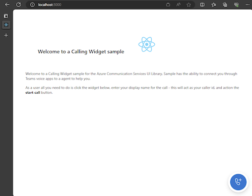
앱이 실행되면 브라우저의 http://localhost:3000에서 볼 수 있습니다. 다음과 같은 시작 화면이 표시됩니다.
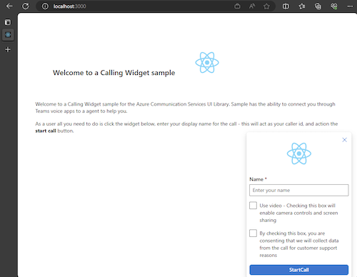
그런 다음, 위젯 단추를 실행하면 작은 메뉴가 표시됩니다.
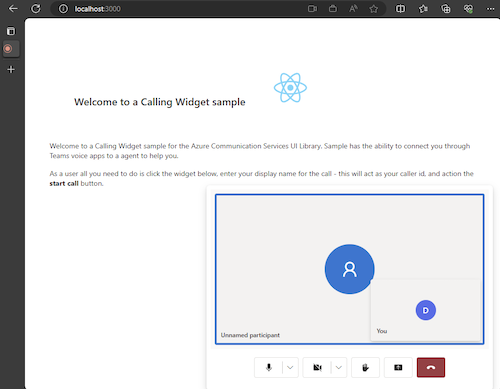
이름을 입력한 후 통화 시작을 클릭하면 통화가 시작됩니다. 위젯은 호출을 시작한 후 다음과 같이 표시됩니다.
다음 단계
Teams 음성 애플리케이션에 대한 자세한 내용은 Teams 자동 전화 교환 및 Teams 통화 큐에 대한 설명서를 확인합니다. 또는 JavaScript 번들로 비슷한 환경을 빌드하는 방법에 대한 자습서도 참조하세요.
빠른 시작: Teams 통화 큐 및 자동 전화 교환을 호출하는 Azure Communication Services UI 라이브러리 JavaScript 번들 시작